PageSheet


Customizable sheet presentations in SwiftUI. Using UISheetPresentationController under the hood.
Features
- Uses the default
sheetAPI under the hood, ensuring maximum compatibility & stability. - Exposes the exact same API as the default SwiftUI
sheetimplementation. - No hacks, follows the best practices for creating represetable views in SwiftUI.
- Configurable using view modifiers, can configure
UISheetPresentationController
from any child views in the presented sheet’s content view. - Works with the
interactiveDismissDisabled(_:Bool)modifier. - Exposes all of the
UISheetPresentationControllerconfiguration options. - Track the currently selected detent using an
Environmentvalue. - Well documented API, following a similar approach to the Developer Documentation.
- Small footprint, weighing only
34.6kBwhen installed via SwiftPM.
Table of Contents
Requirements
The codebase supports iOS and requires Xcode 12.0 or newer
Installation
Xcode
Open your project. Navigate to File > Swift Packages > Add Package Dependency. Enter the url https://github.com/ericlewis/PageSheet and tap Next.
Select the PageSheet target and press Add Package.
Swift Package Manager
Add the following line to the dependencies in your Package.swift file:
.package(url: "https://github.com/ericlewis/PageSheet.git", .upToNextMajor(from: "1.0.0"))
Next, add PageSheet as a dependency for your targets:
.target(name: "AppTarget", dependencies: ["PageSheet"])
A completed example may look like this:
// swift-tools-version:5.5

import PackageDescription

let package = Package(
    name: "App",
    dependencies: [
        .package(
          url: "https://github.com/ericlewis/PageSheet.git",
          .upToNextMajor(from: "1.0.0"))
    ],
    targets: [
        .target(
          name: "AppTarget",
          dependencies: ["PageSheet"])
    ]
)
Examples
Example Project
If you are using Xcode 13.2.1 you can navigate to the Example folder and open the enclosed Swift App Playground to test various features (and see how they are implemented).
Presentation
PageSheet works similarly to a typical sheet view modifier.
import SwiftUI
import PageSheet
struct ContentView: View {
@State
private var sheetPresented = false
var body: some View {
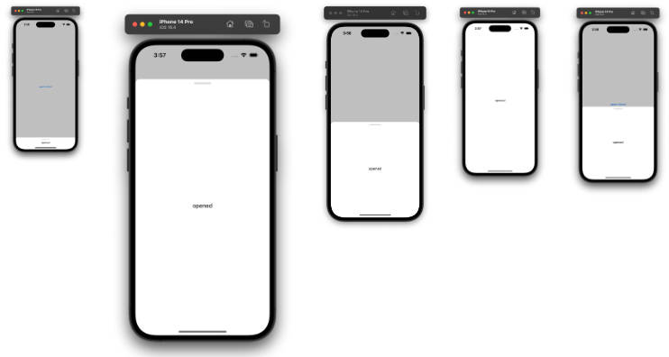
Button("Open Sheet") {
sheetPresented = true
}
.pageSheet(isPresented: $sheetPresented) {
Text("Hello!")
}
}
}
PageSheet also supports presentation via conditional Identifiable objects.
import SwiftUI
import PageSheet

struct ContentView: View {
  @State
  private var string: String?

  var body: some View {
    Button("Open Sheet") {
      string = "Hello!"
    }
    .pageSheet(item: $string) { unwrappedString in
      Text(unwrappedString)
    }
  }
}

extension String: Identifiable {
  public var id: String { self }
}
Customization
PageSheet can also be customized using a collection of view modifiers applied to the sheet’s content.
import SwiftUI
import PageSheet
struct ContentView: View {
@State
private var sheetPresented = false
var body: some View {
Button("Open Sheet") {
sheetPresented = true
}
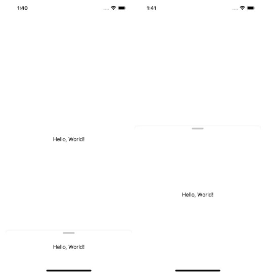
.pageSheet(isPresented: $sheetPresented) {
Text("Hello!")
.preferGrabberVisible(true)
}
}
}
Documentation
Presentation Modifiers
These modifiers behave exactly the same way as the sheet presentation modifiers in SwiftUI.
func pageSheet<Content: View>(isPresented: Binding<Bool>, onDismiss: (() -> Void)? = nil, content: @escaping () -> Content) -> some View
Presents a configurable page sheet when a binding to a Boolean value that you provide is true.
Use this method when you want to present a configurable sheet view to the user when a Boolean value you provide is
true.
Parameters:
isPresented: A binding to a Boolean value that determines whether
to present the sheet that you create in the modifier’s
contentclosure.onDismiss: The closure to execute when dismissing the sheet.content: A closure that returns the content of the sheet.
func pageSheet<Item: Identifiable, Content: View>(item: Binding<Item?>, onDismiss: (() -> Void)? = nil, content: @escaping () -> Content) -> some View
Presents a sheet using the given item as a data source for the sheet’s content.
Use this method when you need to present a customizable sheet view with content from a custom data source.
Parameters:
item: A binding to an optional source of truth for the sheet.
Whenitemis non-nil, the system passes the item’s content to
the modifier’s closure. You display this content in a sheet that you
create that the system displays to the user. Ifitemchanges,
the system dismisses the sheet and replaces it with a new one
using the same process.onDismiss: The closure to execute when dismissing the sheet.content: A closure returning the content of the sheet.
Presentation Customization Modifiers
These modifiers only take effect when the modified view is inside of and visible within a presented PageSheet.
Note: You can apply these modifiers to any view in the sheet’s view hierarchy.
func preferGrabberVisible(_ isVisible: Bool) -> some View
Sets a Boolean value that determines whether the presenting sheet shows a grabber at the top.
The default value is
false, which means the sheet doesn’t show a grabber. A grabber is a visual affordance that indicates that a sheet is resizable.
Showing a grabber may be useful when it isn’t apparent that a sheet can resize or when the sheet can’t dismiss interactively.Set this value to
truefor the system to draw a grabber in the standard system-defined location.
The system automatically hides the grabber at appropriate times, like when the sheet is full screen in a compact-height size class or when another sheet presents on top of it.
Parameters:
isVisible: Default value isfalse, set totrueto display grabber.
Returns:
- A view that wraps this view and sets the presenting sheet’s grabber visiblity.
func detents(_ detents: PageSheet.Detents) -> some View
Sets an array of heights where the presenting sheet can rest.
The default value is an array that contains the value
large().
The array must contain at least one element. When you set this value, specify detents in order from smallest to largest height.
Parameters:
detents: The default value is an array that contains the valuelarge().
Returns:
- A view that wraps this view and sets the presenting sheet’s
UISheetPresentationController/detents.
func largestUndimmedDetent(id identifier: PageSheet.Detent.Identifier?) -> some View
Sets the largest detent that doesn’t dim the view underneath the presenting sheet.
The default value is
nil, which means the system adds a noninteractive dimming view underneath the sheet at all detents.
Set this property to only add the dimming view at detents larger than the detent you specify.
For example, set this property tomediumto add the dimming view at thelargedetent.Without a dimming view, the undimmed area around the sheet responds to user interaction, allowing for a nonmodal experience.
You can use this behavior for sheets with interactive content underneath them.
Parameters:
id: An optionalPageSheet.Detent.Identifiervalue, the default isnil.
Returns:
- A view that wraps this view and sets the presenting sheet’s largest undimmed
Detentidentifier.
func selectedDetent(id identifier: PageSheet.Detent.Identifier?) -> some View
Sets the identifier of the most recently selected detent on the presenting sheet.
This property represents the most recent detent that the user selects or that you set programmatically.
The default value isnil, which means the sheet displays at the smallest detent you specify indetents.
Parameters:
id: An optionalPageSheet.Detent.Identifiervalue, the default isnil.
Returns:
- A view that wraps this view and sets the presenting sheet’s selected
Detentidentifier.
func preferEdgeAttachedInCompactHeight(_ preference: Bool) -> some View
Sets a Boolean value that determines whether the presenting sheet attaches to the bottom edge of the screen in a compact-height size class.
The default value is
false, which means the sheet defaults to a full screen appearance at compact height.
Set this value totrueto use an alternate appearance in a compact-height size class, causing the sheet to only attach to the screen on its bottom edge.
Parameters:
preference: Default value isfalse.
Returns:
- A view that wraps this view and sets the presenting sheet’s
prefersEdgeAttachedInCompactHeightproperty.
func widthFollowsPreferredContentSizeWhenEdgeAttached(_ preference: Bool) -> some View
Sets a Boolean value that determines whether the presenting sheet’s width matches its view’s preferred content size.
The default value is
false, which means the sheet’s width equals the width of its container’s safe area.
Set this value totrueto use your view controller’spreferredContentSizeto determine the width of the sheet instead.This property doesn’t have an effect when the sheet is in a compact-width and regular-height size class, or when
prefersEdgeAttachedInCompactHeightisfalse.
Parameters:
preference: Default value isfalse.
Returns:
- A view that wraps this view and sets the presenting sheet’s
prefersEdgeAttachedInCompactHeightproperty.
func preferScrollingExpandsWhenScrolledToEdge(_ preference: Bool) -> some View
Sets a Boolean value that determines whether scrolling expands the presenting sheet to a larger detent.
The default value is
true, which means if the sheet can expand to a larger detent thanselectedDetentIdentifier,
scrolling up in the sheet increases its detent instead of scrolling the sheet’s content. After the sheet reaches its largest detent, scrolling begins.Set this value to
falseif you want to avoid letting a scroll gesture expand the sheet.
For example, you can set this value on a nonmodal sheet to avoid obscuring the content underneath the sheet.
Parameters:
preference: Default value istrue.
Returns:
- A view that wraps this view and sets the presenting sheet’s
prefersScrollingExpandsWhenScrolledToEdgeproperty.
func preferredSheetCornerRadius(CGFloat?) -> some View
Sets the preferred corner radius on the presenting sheet.
The default value is
nil. This property only has an effect when the presenting sheet is at the front of its sheet stack.
Parameters:
preference: Default value isnil.
Returns:
- A view that wraps this view and sets the presenting sheet’s
cornerRadius.
func preferredSheetCornerRadius(_ cornerRadius: CGFloat?) -> some View
Known Issues
- Largest undimmed detent seems to affect the dimming of accent color elements in parent views.
- The
selectedDetentIdentifiervalue inEnvironmentmay not update if the selectedDetentidentifier is changed programmatically.
License
PageSheet is released under the MIT license. See LICENSE for details.