Dragger
A customizable SwiftUI Dragger view.
Installation
In Xcode add https://github.com/kwiessle/Dragger.git in your package dependencies.
Usage

import SwiftUI
import Dragger

struct ContentView: View {

    @State var isComplete: Bool = false

    var body: some View {
        Dragger(isComplete: $isComplete)
    }

}
Create your own style
By default the Dragger style mimics the iOS Toggle’s design, but you can create your own !
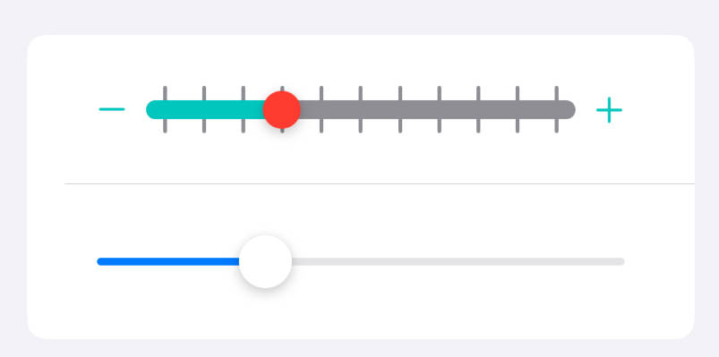
A Dragger view is represented by three components: Body, Track and Thumb

1 – Create a struct and make it conforms to the DraggerStyle protocol
2 – Provide layout constants for insets, thumbSize and trackHeigth
3 – Provide your own view implementation for each component
struct MyCustomStyle: DraggerStyle {

    var insets: CGFloat = 5

    var thumbSize: CGSize = CGSize(width: 46, height: 46)

    var trackHeight: CGFloat = 50

    func makeBody(configuration: Configuration) -> some View {
        Capsule().fill(.gray)
    }

    func makeTrack(configuration: Configuration) -> some View {
        LinearGradient(colors: [.pink, .purple, .blue], startPoint: .topLeading, endPoint: .bottomTrailing)
            .clipShape(Capsule())
            .opacity(3 * configuration.fractionComplete)
    }

    func makeThumb(configuration: Configuration) -> some View {
        Circle()
            .fill(.white)
        Image(systemName:"star.fill")
            .rotationEffect(.radians(2 * .pi * configuration.fractionComplete))
            .foregroundColor(configuration.isComplete ? .green : .red)
    }

}
DraggerStyleConfiguration
Provides real time access of Dragger’s state values
configuration.isComplete: The current state of the draggerconfiguration.fractionComplete: The current progress amount of the thumbconfiguration.isHoldingThumb: Tells if the user is holding the thumb
4 – Pass your style to the dragger using .dragerStyle() modifier.
    var body: some View {
        Dragger(isComplete: $isComplete)
            .draggerStyle(MyCustomStyle())
    }
Layout overview

Notes
- The final heigth of the dragger view is computed from the configuration’s
.insetsand.trackHeight. - If the provided thumb size height lower than the track height the Dragger will add horizontal padding in order to center the thumb.