ImageSlideshow
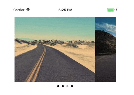
Customizable Swift image slideshow with circular scrolling, timer and full screen viewer.
Swift image slideshow with circular scrolling, timer and full screen viewer.
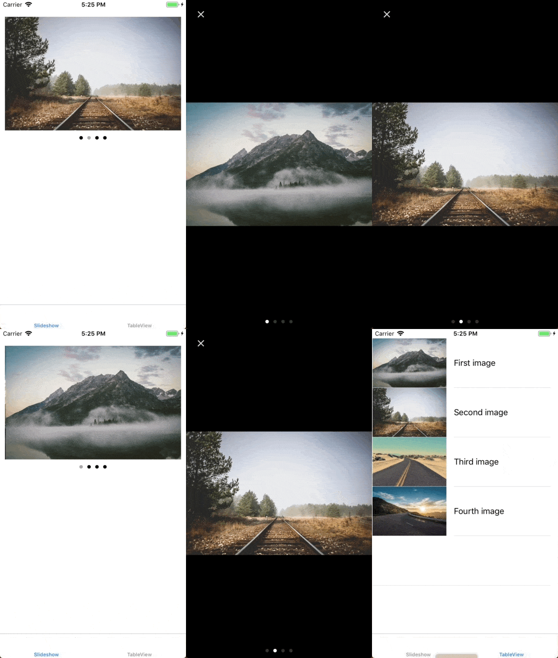
? Example
To run the example project, clone the repo, and run pod install from the Example directory first.
? Installation
CocoaPods
ImageSlideshow is available through CocoaPods. To install
it, simply add the following line to your Podfile:
pod 'ImageSlideshow', '~> 1.8.3'
Carthage
To integrate ImageSlideshow into your Xcode project using Carthage, specify it in your Cartfile:
github "zvonicek/ImageSlideshow" ~> 1.8.3
Carthage does not include InputSources for external providers (due to dependency on those providers) so you need to grab the one you need from ImageSlideshow/Classes/InputSources manually.
Manually
One possibility is to download a built framework (ImageSlideshow.framework.zip) from releases page and link it with your project (underLinked Frameworks and Libraries in your target). This is, however, currently problematic because of rapid Swift development -- the framework is built for a single Swift version and may not work on previous/future versions.
Alternatively can also grab the whole ImageSlideshow directory and copy it to your project. Be sure to remove those external Input Sources you don't need.
Note on Swift 2.3, Swift 3 and Swift 4 support
Version 1.4 supports Swift 4. Swift 3 is supported from version 1.0, for Swift 2.2 and Swift 2.3 compatible code use version 0.6 or branch swift-2.3.
? How to use
Add ImageSlideshow view to your view hiearchy either in Interface Builder or in code.
Loading images
Set images by using setImageInputs method on ImageSlideshow instance with an array of InputSources. By default you can use ImageSource which takes UIImage or few other InputSources for most popular networking libraries. You can also create your own input source by implementing InputSource protocol.
| Library | InputSource name | Pod |
|---|---|---|
| AlamofireImage | AlamofireSource | pod "ImageSlideshow/Alamofire" |
| AFNetworking | AFURLSource | pod "ImageSlideshow/AFURL" |
| SDWebImage | SDWebImageSource | pod "ImageSlideshow/SDWebImage" |
| Kingfisher | KingfisherSource | pod "ImageSlideshow/Kingfisher" |
| Parse | ParseSource | pod "ImageSlideshow/Parse" |
slideshow.setImageInputs([
  ImageSource(image: UIImage(named: "myImage"))!,
  ImageSource(image: UIImage(named: "myImage2"))!,
  AlamofireSource(urlString: "https://images.unsplash.com/photo-1432679963831-2dab49187847?w=1080"),
  KingfisherSource(urlString: "https://images.unsplash.com/photo-1432679963831-2dab49187847?w=1080"),
  ParseSource(file: PFFile(name:"image.jpg", data:data))
])
Configuration
Behaviour is configurable by those properties:
slideshowInterval- slideshow interval in seconds (default0– disabled)zoomEnabled- enables zooming (defaultfalse)circular- enables circular scrolling (defaulttrue)activityIndicator– allows to set custom activity indicator, see Activity indicator sectionpageIndicator– allows to set custom page indicator, see Page indicator section; assignnilto hide page indicatorpageIndicatorPosition- configures position of the page indicatorcontentScaleMode- configures the scaling (defaultScaleAspectFit)draggingEnabled- enables dragging (defaulttrue)currentPageChanged- closure called on page changewillBeginDragging- closure called on scrollViewWillBeginDraggingdidEndDecelerating- closure called on scrollViewDidEndDeceleratingpreload- image preloading configuration (defaultallpreloading, alsofixed)
Page Indicator
Page indicator can be customized using the pageIndicator property on ImageSlideshow. By defualt, a plain UIPageControl is used. If needed, page control can be customized:
let pageIndicator = UIPageControl()
pageIndicator.currentPageIndicatorTintColor = UIColor.lightGray
pageIndicator.pageIndicatorTintColor = UIColor.black
slideshow.pageIndicator = pageIndicator
Also, a simple label page indicator that shows pages in style "5/21" (fifth page from twenty one) is provided:
slideshow.pageIndicator = LabelPageIndicator()
You can also use your own page indicator by adopting the PageIndicatorView protocol.
Position of the page indicator can be configured by assigning a PageIndicatorPosition value to the pageIndicatorPosition property on ImageSlideshow. You may specify the horizontal and vertical positioning separately.
Horizontal positioning options are: .left(padding: Int), .center, .right(padding: Int)
Vertical positioning options are: .top, .bottom, .under, customTop(padding: Int), customBottom(padding: Int), customUnder(padding: Int)
Example:
slideshow.pageIndicatorPosition = PageIndicatorPosition(horizontal: .left(padding: 20), vertical: .bottom)
Activity Indicator
By default activity indicator is not shown, but you can enable it by setting DefaultActivityIndicator instance to Image Slideshow:
slideshow.activityIndicator = DefaultActivityIndicator()
You can customize style and color of the indicator:
slideshow.activityIndicator = DefaultActivityIndicator(style: .white, color: nil)
There's also an option to use your own activity indicator. You just need to implement ActivityIndicatorView and ActivityIndicatorFactory protocols. See ActivityIndicator.swift for more information.
Full Screen view
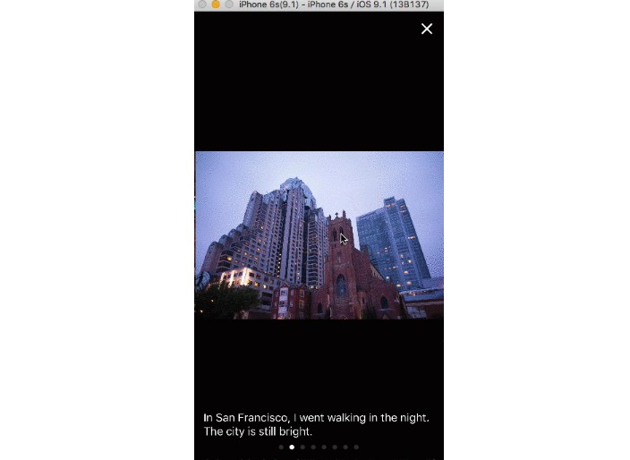
There is also a possibility to open full-screen image view using attached FullScreenSlideshowViewController. The simplest way is to call:
override func viewDidLoad() {
  let gestureRecognizer = UITapGestureRecognizer(target: self, action: #selector(ViewController.didTap))
  slideshow.addGestureRecognizer(gestureRecognizer)
}

func didTap() {
  slideshow.presentFullScreenController(from: self)
}
FullScreenSlideshowViewController can also be instantiated and configured manually if more advanced behavior is needed.
? Author
Petr Zvoníček
? License
ImageSlideshow is available under the MIT license. See the LICENSE file for more info.
