Lima
Lima is an open-source framework for simplifying development of responsive iOS and tvOS applications. The project's name comes from the nautical L or Lima flag, representing the first letter of the word "layout":
This guide introduces the Lima framework and provides an overview of its key features.
Getting Lima
Lima is distributed as a universal binary that will run in the iOS simulator as well as on an actual device. Either iOS 10 or tvOS 10 or later is required.
To install:
- Download the latest release archive and expand
- In Xcode, select the project root node in the Project Navigator view
- Select the application target
- Select the "General" tab
- Drag Lima.framework to the "Embedded Binaries" section
- In the dialog that appears, ensure that "Copy items if needed" is checked and click "Finish"
Note that the framework binary must be "trimmed" prior to App Store submission. See the Deployment section for more information.
Lima Classes
Auto layout is an iOS feature that allows developers to create applications that automatically adapt to device size, orientation, or content changes. An application built using auto layout generally has little or no hard-coded view positioning logic, but instead dynamically arranges user interface elements based on their preferred or "intrinsic" content sizes.
Auto layout in iOS is implemented primarily via layout constraints, which, while powerful, are not particularly convenient to work with. To simplify the process, Lima provides a set of view classes whose sole responsibility is managing the size and position of their respective subviews:
LMRowView- arranges subviews in a horizontal lineLMColumnView- arranges subviews in a vertical lineLMAnchorView- anchors subviews to one or more edgesLMRootView- provides a margin-independent root for a view hierarchy
These classes use layout constraints internally, allowing developers to easily take advantage of auto layout while eliminating the need to manage constraints directly. They can be nested to create complex layouts that automatically adjust to orientation or screen size changes.
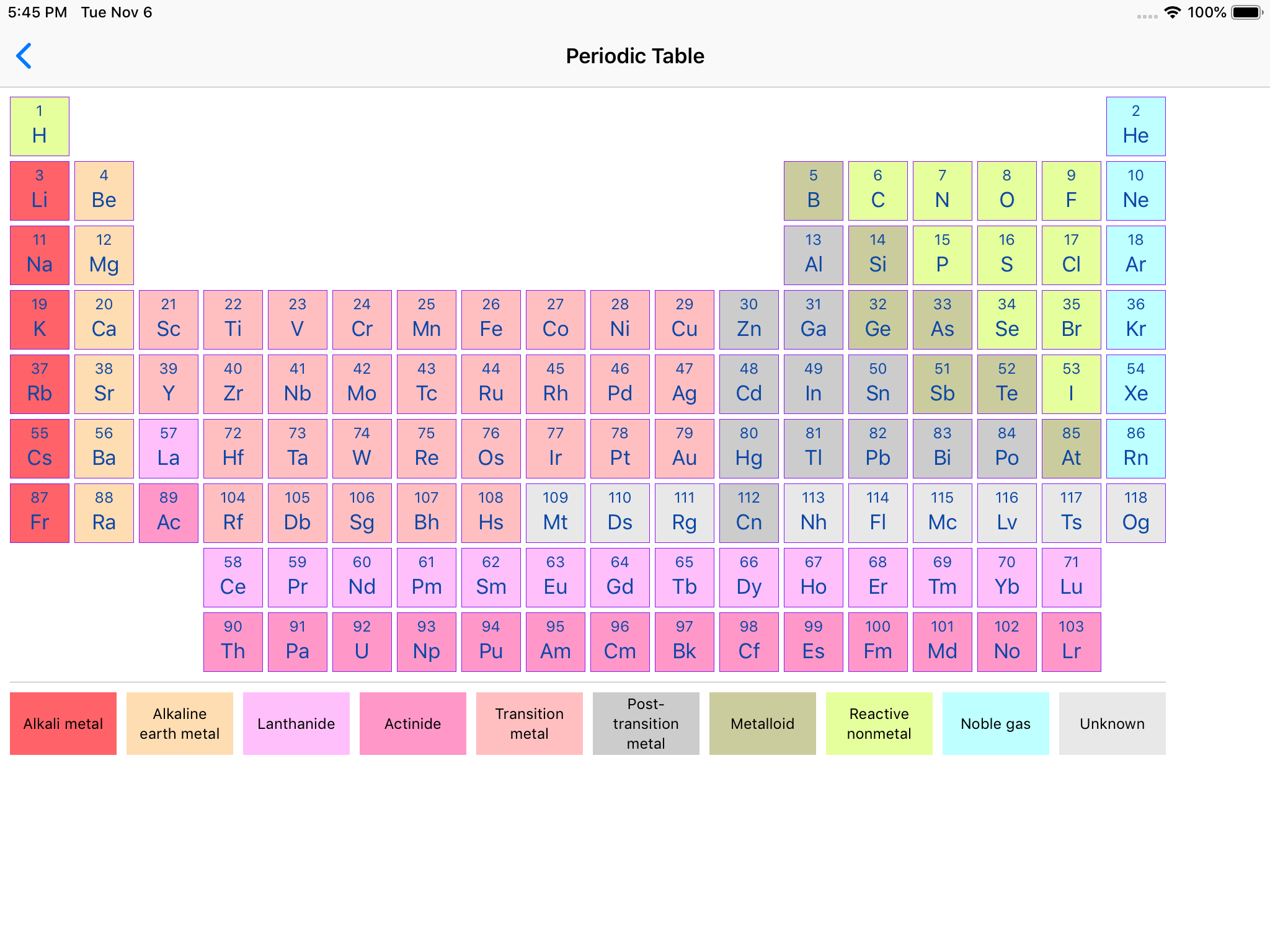
For example, the periodic table shown below was constructed using a combination of Lima's layout views and UILabel instances:
Lima adds the following properties to UIView to customize how subviews are sized and positioned within a parent view:
width- assigns a fixed width to a viewheight- assigns a fixed height to a viewweight- when used with row and column views, determines how excess space is allocated within the parentanchor- when used with anchor views, determines the edges to which the view will be anchored within the parentisDisplayable- determines whether the view will participate in auto layout (trueby default)
Additionally, the LMSpacer class can be used to create fixed or flexible space between other views.
Lima also provides the following view classes to simplify the use of some common UIKit types:
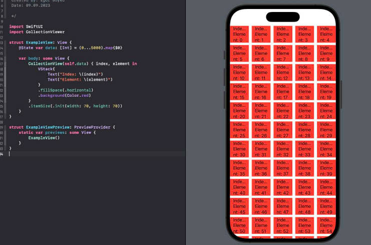
LMScrollView- extendsUIScrollViewto automatically adapt to content sizeLMTableViewCell- extendsUITableViewCellto automatically pin content to edgesLMTableViewHeaderFooterView- extendsUITableViewHeaderFooterViewto automatically pin content to edgesLMCollectionViewCell- extendsUICollectionViewCellto automatically pin content to edges
Finally, Lima adds initializers to common UIKit views and controls to simplify their declaration in a view hieararchy. For example, the following Swift code creates an instance of LMColumnView containing a UIImageView and a UILabel:
let columnView = LMColumnView(
    UIImageView(image: UIImage(named: "world.png"), contentMode: .scaleAspectFit),
    UILabel(text: "Hello, World!", textAlignment: .center)
)
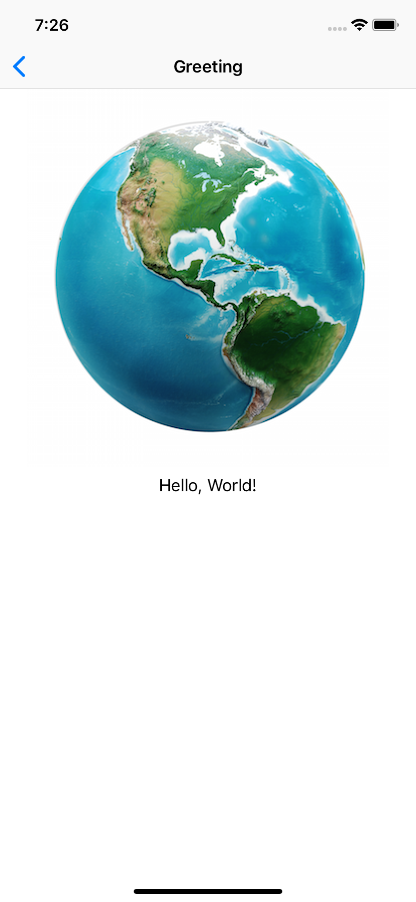
The same result could also be achieved as shown below:
let columnView = LMColumnView()

let imageView = UIImageView()
imageView.image = UIImage(named: "world.png")
imageView.contentMode = .scaleAspectFit

columnView.addSubview(imageView)

let label = UILabel()
label.text = "Hello, World!"
label.textAlignment = .center

columnView.addSubview(label)
Although the two examples produce identical results, the first version is much more concise and easier to read.
LMLayoutView
LMLayoutView is the base class for all layout views in Lima. Among other things, it provides the following initializer, which is used to define the view's layout margins:
public convenience init(margin: CGFloat?,
    topMargin: CGFloat?,
    leadingMargin: CGFloat?,
    bottomMargin: CGFloat?,
    trailingMargin: CGFloat?) {
    ...
}
The first argument specifies a value to apply to all margins. The remaining arguments specify the value for a particular edge. If no value is specified, the default is 0.
Subclasses of LMLayoutView, such as LMColumnView, provide a default of nil for all margin values:
public convenience init(margin: CGFloat? = nil,
    topMargin: CGFloat? = nil,
    leadingMargin: CGFloat? = nil,
    bottomMargin: CGFloat? = nil,
    trailingMargin: CGFloat? = nil,
    ...) {
    ...
}
This allows a layout view's margins to be conveniently established at creation time. For example:
LMColumnView(margin: 8, leadingMargin: 12, trailingMargin: 12,
    ...
)
In iOS 11, the leadingMargin and trailingMargin properties map directly to the view's directional edge insets. In iOS 10, they are applied dynamically based on the system text direction.
By default, layout views do not consume touch events. Touches that occur within the layout view but do not intersect with a subview are ignored, allowing the event to pass through the view. Assigning a non-nil background color to a layout view will cause the view to begin consuming events.
LMRowView and LMColumnView
The LMRowView and LMColumnView classes lay out subviews in a horizontal or vertical line, respectively. Both classes extend the abstract LMBoxView class, which itself extends LMLayoutView and adds the following properties:
var horizontalAlignment: LMHorizontalAlignment
var verticalAlignment: LMVerticalAlignment

var spacing: CGFloat

var isAlignToBaseline: Bool
The first two properties specify the horizontal and vertical alignment, respectively, of the box view's subviews. Horizontal alignment options include fill, leading, trailing, and center. Vertical alignment options include fill, top, bottom, and center. Both values are set to fill by default, which pins subviews along both of the box view's axes. Other values pin subviews to a single edge or center them along a given axis:
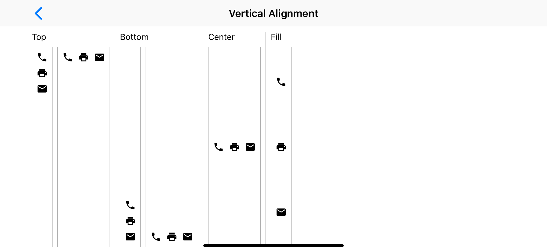
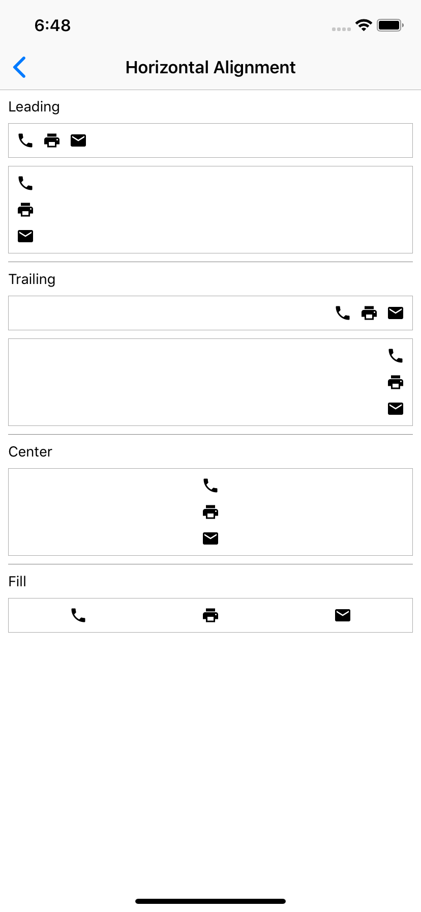
For example, this code creates a row view containing three labels that are aligned horizontally to the row's leading edge and vertically to the top of the row:
LMRowView(horizontalAlignment: .leading, verticalAlignment: .top,
    UILabel(text: "One"),
    UILabel(text: "Two"),
    UILabel(text: "Three")
)
Spacer views can also be used to align subviews within a row or column. This is discussed in more detail later.
The spacing property represents the amount of space reserved between successive subviews. For row views, this refers to the horizontal space between the subviews; for column views, it refers to the vertical space between the views. For example, the following code creates a row view whose labels will each be separated by a gap of 16 pixels:
LMRowView(spacing: 16,
    UILabel(text: "One"),
    UILabel(text: "Two"),
    UILabel(text: "Three")
)
In iOS 10, the default spacing value is 8. In iOS 11 and later, the system default is used.
The isAlignToBaseline property can be used to manage how subviews are vertically aligned with respect to one another. This is discussed in more detail below. Baseline alignmnent is disabled by default.
LMRowView
The LMRowView class arranges its subviews in a horizontal line. Subviews are laid out from leading to trailing edge in the order in which they are declared. For example, the following code creates a row view containing three labels:
LMRowView(
    UILabel(text: "One"),
    UILabel(text: "Two"),
    UILabel(text: "Three")
)
If the row view's vertical alignment is set to fill (the default), the top and bottom edges of each subview will be pinned to the top and bottom edges of the row (excluding layout margins), ensuring that all of the labels are the same height. Otherwise, the subviews will be vertically aligned according to the specified value.
Baseline Alignment
This code creates a row view containing three labels with different font sizes. Because isAlignToBaseline is set to true, the baselines of all three labels will line up:
LMRowView(isAlignToBaseline: true,
    UILabel(text: "abcd", font: UIFont.systemFont(ofSize: 16)),
    UILabel(text: "efg", font: UIFont.systemFont(ofSize: 32)),
    UILabel(text: "hijk", font: UIFont.systemFont(ofSize: 24))
)
Further, the baseline to which subviews will be aligned can be controlled by the baseline property. The default value is first, meaning that subviews will be aligned to the first baseline. However, it is also possible to align subviews to the last baseline; for example:
LMRowView(isAlignToBaseline: true, baseline: .last,
    ...
)
LMColumnView
The LMColumnView class arranges its subviews in a vertical line. Subviews are laid out from top to bottom in the order in which they are declared. For example, the following code creates a column view containing three labels:
LMColumnView(
    UILabel(text: "One"),
    UILabel(text: "Two"),
    UILabel(text: "Three")
)
If the column view's horizontal alignment is set to fill (the default), the left and right edges of each subview will be pinned to the left and right edges of the column (excluding layout margins), ensuring that all of the labels are the same width. Otherwise, the subviews will be horizontally aligned according to the specified value.
Baseline Alignment
This code creates a column view containing three labels with different font sizes. Because isAlignToBaseline is set to true, the labels will be spaced vertically according to their first and last baselines rather than their bounding rectangles:
LMColumnView(isAlignToBaseline: true,
    UILabel(text: "abcd", font: UIFont.systemFont(ofSize: 16)),
    UILabel(text: "efg", font: UIFont.systemFont(ofSize: 32)),
    UILabel(text: "hijk", font: UIFont.systemFont(ofSize: 24))
)
Grid Alignment
LMColumnView defines the following additional property, which specifies that nested subviews should be vertically aligned in a grid, like an HTML table:
var isAlignToGrid: Bool
When this property is set to true, subviews of successive rows will be sized to match the width of the widest subview in the column. For example, the following code would produce a grid containing three rows arranged in two columns:
LMColumnView(isAlignToGrid: true,
    LMRowView(
        UILabel(text: "First row"),
        UILabel(text: "This is row number one.")
    )

    LMRowView(
        UILabel(text: "Second row"),
        UILabel(text: "This is row number two.")
    )

    LMRowView(
        UILabel(text: "Third row"),
        UILabel(text: "This is row number three.")
    )
)
Column view subviews that are not LMRowView instances are excluded from alignment. This allows them to be used as section breaks or headers, for example.
Fixed Dimensions
Although views are typically arranged based on their intrinsic content sizes, it is occasionally necessary to assign a fixed value for a particular view dimension. Lima adds the following properties to UIView to support explicit size definition:
var width: CGFloat
var height: CGFloat
For example, the following code declares an image view whose height property is set to 240 pixels:
UIImageView(image: UIImage(named: "world.png"),
    contentMode: .scaleAspectFit,
    height: 240)
If the image is smaller or larger than 240 pixels tall, it will be scaled up or down to fit within this height. Since the content mode is set to scaleAspectFit, the width will be adjusted accordingly so that the image retains the correct aspect ratio.
View Weights
Often, a row or column view will be given more space than it needs to accommodate the intrinsic sizes of its subviews. Lima adds the following property to UIView that is used to determine how the extra space should be allocated:
var weight: CGFloat
This value specifies the amount of excess space the view would like to be given within its superview (once the sizes of all unweighted views have been determined) and is relative to all other weights specified within the superview. For row views, weight applies to the excess horizontal space, and for column views to the excess vertical space.
For example, both labels below will be sized equally and given 50% of the height of the column view:
LMColumnView(
    UILabel(text: "Hello", weight: 0.5),
    UILabel(text: "World", weight: 0.5)
)
Since weights are relative to each other, this code will produce the same results:
LMColumnView(
    UILabel(text: "Hello", weight: 1),
    UILabel(text: "World", weight: 1)
)
In this example, the first label will be given one-sixth of the available space, the second one-third, and the third one-half:
LMColumnView(
    UILabel(text: "One", weight: 1),
    UILabel(text: "Two", weight: 2),
    UILabel(text: "Three", weight: 3)
)
Weights in LMRowView are handled similarly, but in the horizontal direction.
Note that explicitly defined width and height values take priority over weights. If a view has both a weight and a fixed dimension value, the weight value will be ignored.
LMSpacer
A common use for weights is to add flexible space around a view. For example, the following code could be used to center a label horizontally within a row view (the closures used to initialize the view instances are discussed in more detail later):
LMRowView(
    UIView() { $0.weight = 1 },
    UILabel(text: "Hello, World!"),
    UIView() { $0.weight = 1 }
)
Because spacer views are so common, Lima provides a dedicated UIView subclass called LMSpacer for conveniently creating flexible space between other views. LMSpacer has a default weight of 1, so the previous example could be rewritten as follows, eliminating the closures and improving readability:
LMRowView(
    LMSpacer(),
    UILabel(text: "Hello, World!"),
    LMSpacer()
)
Like layout views, spacer views do not consume touch events by default, so they will not interfere with any user interface elements that appear underneath them. Assigning a non-nil background color to a spacer view causes the view to begin consuming events.
LMAnchorView
The LMAnchorView class optionally anchors subviews to one or more of its own edges:
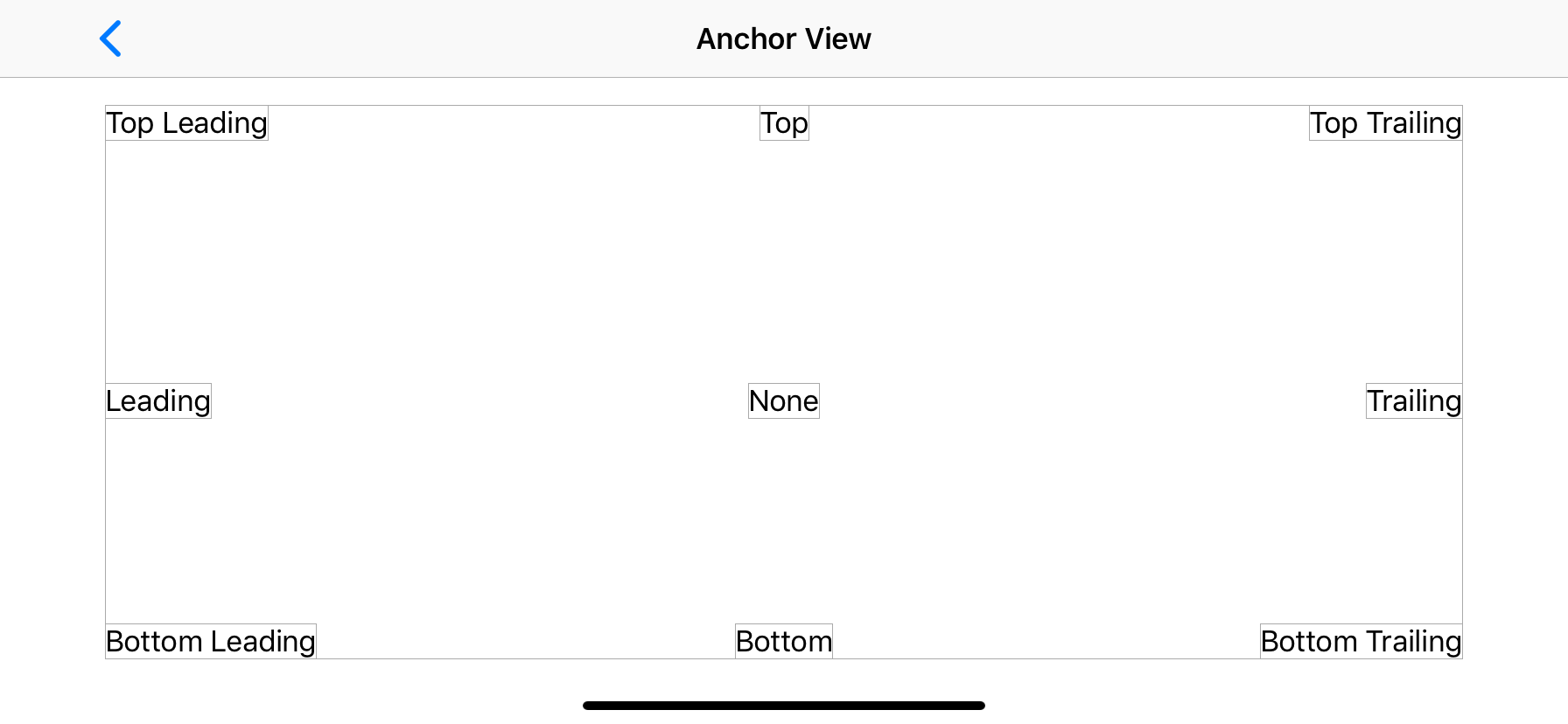
Although it is possible to achieve similar layouts using a combination of row, column, and spacer views, anchor views offer a simpler alternative in some cases. Anchor views are also the only layout container that supports Z-ordering.
Anchors are specified as an option set that defines the edges to which the view will be anchored within its parent. For example, the following code creates an anchor view containing four labels anchored to its top, left, right, and bottom edges. The labels will all be inset by 16 pixels:
LMAnchorView(margin: 16,
    UILabel(text: "Top", anchor: [.top]),
    UILabel(text: "Left", anchor: [.left]),
    UILabel(text: "Right", anchor: [.right]),
    UILabel(text: "Bottom", anchor: [.bottom])
)
Subviews may also be anchored to the leading and trailing edges of the parent view to support right-to-left locales; for example:
LMAnchorView(margin: 16,
    UILabel(text: "Leading", anchor: [.leading]),
    UILabel(text: "Trailing", anchor: [.trailing])
)
Additionally, subviews may be anchored to multiple edges for a given dimension. For example, the following code creates an anchor view containing two labels, each of which will span the entire width of the anchor view:
LMAnchorView(margin: 16,
    UILabel(text: "Top", anchor: [.top, .left, .right]),
    UILabel(text: "Bottom", anchor: [.bottom, .left, .right])
)
If no anchor is specified for a given dimension, the subview will be centered within the anchor view for that dimension.
LMRootView
In iOS 10, UIKit may in some cases assign system-defined, non-overridable values for a view's margins. In such cases, the LMRootView class can be used. This class always pins subviews to its edges instead of its margins, and provides the following properties that can be used to reserve additional space at the top and bottom of the view, respectively:
var topPadding: CGFloat
var bottomPadding: CGFloat
For example, a view controller might override viewWillLayoutSubviews to set the root view's top and bottom spacing to the length of its top and bottom layout guides, respectively, ensuring that any subviews are positioned between the guides:
override func viewWillLayoutSubviews() {
    super.viewWillLayoutSubviews()

    rootView.topPadding = topLayoutGuide.length
    rootView.bottomPadding = bottomLayoutGuide.length
}
Top and bottom layout guides are deprecated in iOS 11. Applications targeting iOS 11 and later can use the viewRespectsSystemMinimumLayoutMargins property of UIViewController instead of LMRootView to disable system-defined margins.
Live Preview
LMRootView can also be used to facilitate live preview in XCode. For example:
@IBDesignable
class PeriodicTableViewControllerPreview: LMRootView {
    override func prepareForInterfaceBuilder() {
        let owner = PeriodicTableViewController(nibName: nil, bundle: nil)

        addSubview(owner.view)
    }
}

LMScrollView
The LMScrollView class extends UIScrollView to simplify the declaration of scrollable content. It presents a single content view, optionally allowing the user to scroll in one or both directions.
The scroll view's content is specified via its content property. The following properties determine how the content will be presented:
var isFitToWidth: Bool
var isFitToHeight: Bool
When both values are set to false (the default), the scroll view will automatically display scroll bars when needed, allowing the user to pan in both directions to see the content in its entirety. For example:
LMScrollView(
    UIImageView(image: UIImage(named: "large_image.png"))
)
When fitToWidth is set to true, the scroll view will ensure that the width of its content matches its own width, causing the content to wrap and scroll in the vertical direction. The vertical scroll bar will be displayed when necessary, but the horizontal scroll bar will never be shown, since the width of the content will never exceed the width of the scroll view:
LMScrollView(fitToWidth: true,
    UILabel(text: "Lorem ipsum dolor sit amet...",
        numberOfLines: 0)
)
Similarly, when fitToHeight is true, the scroll view will ensure that the height of its content matches its own height, causing the content to wrap and scroll in the horizontal direction. The vertical scroll bar will never be shown, and the horizontal scroll bar will appear when necessary.
LMTableViewCell and LMTableViewHeaderFooterView
The LMTableViewCell class facilitates the declaration of custom table view content. It can be used when the content options provided by the default UITableViewCell class are not sufficient. As noted earlier, LMTableViewCell automatically applies constraints to its content to enable self-sizing behavior.
For example, the following code creates a table view cell containing a UIDatePicker. The date picker will be automatically sized to fill the width and height of the cell:
LMTableViewCell(
    UIDatePicker(datePickerMode: .date)
)
LMTableViewCell can also be used as the base class for custom table view cell classes. For example, the following initializer could be used by a custom cell that lays it content out in a vertical line, using a column view:
override init(style: UITableViewCell.CellStyle, reuseIdentifier: String?) {
    super.init(style: style, reuseIdentifier: reuseIdentifier)

    setContent(LMColumnView(
        ...
    ), ignoreMargins: false)
}
The ignoreMargins argument instructs the cell to pin the content to its edges instead of its layout margins. Since this value is false in the preceding example, the cells content will be pinned to its margins.
When the selectionStyle property of an LMTableViewCell instance is set to none, the cell will not consume touch events. Touches that occur within the cell but do not intersect with a subview are ignored, preventing selection.
Like LMTableViewCell, the LMTableViewHeaderFooterView class can be used when the content options provided by the default UITableViewHeaderFooterView class are not sufficient. For example, the following code creates a custom header/footer view containing a label and a switch:
LMTableViewHeaderFooterView(
    LMRowView(
        UILabel(text: "On/Off", weight: 1),
        UISwitch()
    )
)
As with LMTableViewCell, LMTableViewHeaderFooterView can also be used as the base class for custom table view header/footer view classes.
LMCollectionViewCell
Similar to LMTableViewCell, the LMCollectionViewCell class facilitates the declaration of custom collection view content. It extends UICollectionViewCell and automatically applies constraints to its content to enable self-sizing behavior. For example:
override init(frame: CGRect) {
    super.init(frame: frame)

    content = LMColumnView(
        ...
    }
}
UIKit Extensions
In addition to the UIView extensions discussed earlier, Lima provides extenions to the following UIKit types to faciliate view hierarchy declaration:
UILabelUIImageViewUIButtonUITextFieldUIDatePickerUISwitchUISegmentedControlUISliderUIStepperUIPageControlUIActivityIndicatorViewUIProgressViewUITextViewUITableViewCellUITableViewHeaderFooterView
Each extension follows a similar pattern, adding an initializer that provides default values for common properties along with an optional callback that can be used to customize initialization. For example, the initializer for UIButton is defined as follows:
public extension UIButton {
    public convenience init(type: UIButton.ButtonType,
        title: String? = nil, image: UIImage? = nil,
        tintColor: UIColor? = nil,
        weight: CGFloat = .nan,
        anchor: LMAnchor = [],
        with: ((UIButton) -> Void)? = nil) {
        ...
    }
}
This code creates a button with a title of "Press Me!", using a trailing closure to apply styling and register an event listener:
UIButton(type: .system, title: "Press Me!") { button in
    button.contentEdgeInsets = UIEdgeInsets(top: 16, left: 16, bottom: 16, right: 16)

    button.layer.borderWidth = 0.5
    button.layer.borderColor = UIColor.gray.cgColor
    button.layer.cornerRadius = 6

    button.addTarget(self, action: #selector(self.showGreeting), for: .primaryActionTriggered)
}
Initialization callbacks are also commonly used to associate view instances with outlet variables.
Extensions to Lima classes such as LMRowView and LMColumnView are also provided. For example:
public extension LMColumnView {
    public convenience init(margin: CGFloat? = nil,
        topMargin: CGFloat? = nil,
        leadingMargin: CGFloat? = nil,
        bottomMargin: CGFloat? = nil,
        trailingMargin: CGFloat? = nil,
        horizontalAlignment: LMHorizontalAlignment = .fill,
        verticalAlignment: LMVerticalAlignment = .fill,
        spacing: CGFloat = .nan,
        isAlignToBaseline: Bool = false,
        isAlignToGrid: Bool = false,
        backgroundColor: UIColor? = nil,
        weight: CGFloat = .nan,
        anchor: LMAnchor = [],
        _ subviews: UIView...,
        with: ((LMColumnView) -> Void)? = nil) {
        ...
    }
}
Note that the variadic subviews argument is what enables view hierarchies to be constructed declaratively:
LMColumnView(
    UILabel(text: "One"),
    UILabel(text: "Two"),
    UILabel(text: "Three")
)