ListKit

DSL for UICollectionViewCompositionalLayout!
About
ListKit is DSL for building UICollectionViewCompositionalLayout. You can make UICollectionViewCompositionalLayout easy with ListKit. ListKit is Declarative and Component-Based. Also, ListKit supports diffable data source for UICollectionView!
Examples
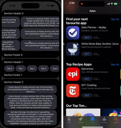
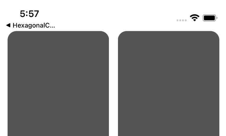
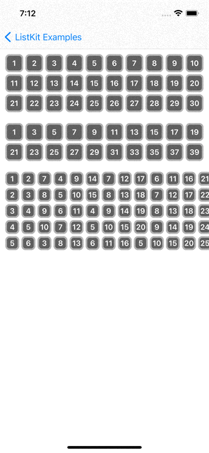
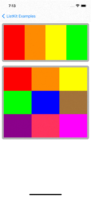
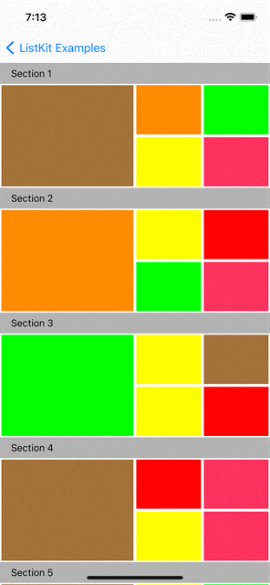
You can checkout examples for ListKit at here:
 |
 |
 |
 |
 |
 |
|---|
renderer.render(of: Array(0..<10)) { index in
    Section(id: index) {
        HGroup(width: .fractionalWidth(1.0), height: .absolute(150)) {
            for _ in 0..<3 {
                ColorBox2Component(color: randomColor, width: .fractionalWidth(0.5), height: .fractionalHeight(1.0))
                VGroup(of: [0, 1], width: .fractionalWidth(0.25), height: .fractionalHeight(1.0)) { _ in
                    ColorBox2Component(color: randomColor, width: .fractionalWidth(1.0), height: .fractionalHeight(0.5))
                }
                VGroup(of: [0, 1], width: .fractionalWidth(0.25), height: .fractionalHeight(1.0)) { _ in
                    ColorBox2Component(color: randomColor, width: .fractionalWidth(1.0), height: .fractionalHeight(0.5))
                }
            }
        }
    }
    .orthogonalScrollingBehavior(.groupPaging)
    .boundarySupplementaryItem(SectionHeaderComponent(title: "Section \(index + 1)"))
}
Layout Elements
Section
Section(id: UUID()) {
    HGroup(width: .fractionalWidth(1.0), height: .absolute(150)) {
        for i in 0..<4 {
            ColorBoxComponent(color: colors[i], width: .fractionalWidth(1.0/4), height: .fractionalHeight(1.0))
        }
    }
}
.contentInsets(top: 16, leading: 16, bottom: 16, trailing: 16)
.decorationItem(SectionBackgroundComponent())
.boundarySupplementaryItem(SectionHeaderComponent(title: "Section \(index + 1)"))
Section is a group of data items. You can define multiple sections in a layout. In UICollectionViewCompositionalLayout, Section has only one root Group.
Group(HGroup and VGroup)
In UICollectionViewCompositionalLayout, individual items are grouped into Group. Group has two types which are HGroup and VGroup. HGroup layouts items in horizontaly direction. VGroup layouts items in vertically. Group can have multiple items(components in ListKit) and groups.
Section(id: UUID()) {
    VGroup(of: [0, 1, 2], width: .fractionalWidth(1.0), height: .estimated(30)) { number in
        HGroup(of: [0, 1, 2], width: .fractionalWidth(1.0), height: .absolute(100)) { index in
            ColorBoxComponent(color: colors[(number * 3) + index], width: .fractionalWidth(1.0/3.0), height: .fractionalHeight(1.0))
        }
    }
}
Component
Component presents UI for the data item. It is the basic unit in ListKit. You can map a data into a component. You can define a component like below:
import UIKit
import ListKit

struct ColorBoxComponent: Component {
    var id: AnyHashable { UUID() }
    let color: UIColor
    let width: NSCollectionLayoutDimension
    let height: NSCollectionLayoutDimension

    public init(color: UIColor, width: NSCollectionLayoutDimension, height: NSCollectionLayoutDimension) {
        self.color = color
        self.width = width
        self.height = height
    }

    func contentView() -> UIView {
        return UIView(frame: .zero)
    }

    func layoutSize() -> NSCollectionLayoutSize {
        return NSCollectionLayoutSize(widthDimension: width, heightDimension: height)
    }

    func edgeSpacing() -> NSCollectionLayoutEdgeSpacing? {
        return nil
    }

    func contentInsets() -> NSDirectionalEdgeInsets {
        return .zero
    }

    func render(in content: UIView) {
        content.backgroundColor = color
    }
}
Component has a content view which is inherited from UIVIew. You can define more complex component with it’s content view.
import UIKit
import SnapKit
import ListKit

struct EmojiBoxComponent: Component {
    let id: AnyHashable
    let emoji: String

    init(emoji: String) {
        self.id = emoji
        self.emoji = emoji
    }

    func contentView() -> EmojiBoxComponentContentView {
        EmojiBoxComponentContentView()
    }

    func layoutSize() -> NSCollectionLayoutSize {
        return NSCollectionLayoutSize(widthDimension: .absolute(30), heightDimension: .absolute(30))
    }

    func edgeSpacing() -> NSCollectionLayoutEdgeSpacing? {
        return nil
    }

    func contentInsets() -> NSDirectionalEdgeInsets {
        return .init(top: 2, leading: 2, bottom: 2, trailing: 2)
    }

    func render(in content: EmojiBoxComponentContentView) {
        content.label.text = emoji
    }
}

final class EmojiBoxComponentContentView: UIView {
    lazy var label: UILabel = {
        let label = UILabel(frame: .zero)
        label.font = UIFont.boldSystemFont(ofSize: 14)
        label.textColor = .white
        label.textAlignment = .center
        return label
    }()

    init() {
        super.init(frame: .zero)
        setupView()
    }

    required init?(coder: NSCoder) {
        fatalError()
    }

    func setupView() {
        addSubview(label)
        label.snp.makeConstraints { make in
            make.edges.equalToSuperview()
        }
        self.backgroundColor = .darkGray
        self.layer.borderWidth = 3
        self.layer.borderColor = UIColor.lightGray.cgColor
        self.layer.cornerRadius = 8.0
    }
}
Define Layout and Render it
Renderer
You can define layout in declarative way and render the layout with Renderer. Rederer is defined with DataSource.
var renderer: ComposeRenderer = ComposeRenderer(dataSource: PlainDataSource())
Also, you can set UICollectionViewDelegate and custom collection view cell.
/// Renderer's initializer.
public init(dataSource: DataSource, delegate: UICollectionViewDelegate? = nil, cellClass: AnyClass? = nil) {
    ...
}
Todo example use cellClass for handling swipe actions.
You can define layout and update it like below:
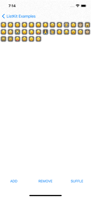
var emojiList: [String] = ["?"] {
    didSet {
        render()
    }
}

override func render() {
    renderer.render(animated: true) {
        Section(id: Sections.main) {
            HGroup(of: emojiList, width: .fractionalWidth(1.0), height: .estimated(30)) { item in
                EmojiBoxComponent(emoji: item)
            }
        }
    }
}
DataSource
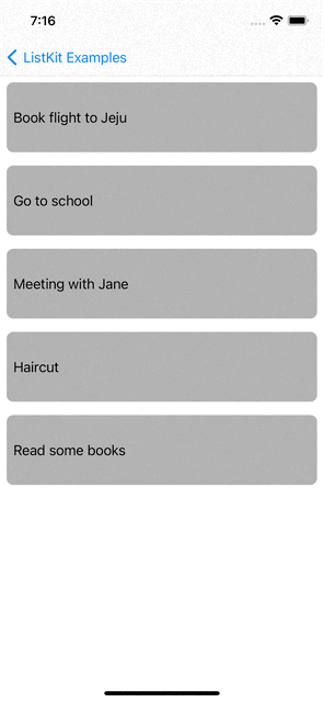
ListKit provides PlainDataSource and DiffableDataSource. PlainDataSource is used for UICollectionView that uses UICollectionViewFlowLayout. DiffableDataSource is used for UICollectionView that uses UICollectionViewDiffableDataSource and NSDiffableDataSourceSnapshot. The emoji example and Todo example use DiffableDataSource
Customizing DataSource
You can customize data source like below:
import UIKit
import ListKit
import SwipeCellKit

class TodoDataSource: DiffableDataSource, SwipeCollectionViewCellDelegate {
    override func configure(cell: UICollectionViewCell) {
        guard let swipableCell = cell as? SwipeCollectionViewCell else { return }
        swipableCell.delegate = self
    }

    func collectionView(_ collectionView: UICollectionView, editActionsForItemAt indexPath: IndexPath, for orientation: SwipeActionsOrientation) -> [SwipeAction]? {
        guard orientation == .right else { return nil }

        guard let deletable = component(at: indexPath, to: Deletable.self) else { return nil }

        let deleteAction = SwipeAction(style: .destructive, title: "Delete") { action, indexPath in
            deletable.delete()
            action.fulfill(with: .delete)
        }

        deleteAction.image = UIImage(systemName: "trash")
        return [deleteAction]
    }
}
TodoDataSource is inherited from DiffableDataSource and customize it to use SwipeCellKit for swipe actions.
Iterable Data
ListKit provides render(of: [T]), HGroup(of: [T]) and VGroup(of: [T]) to handle iterable data and define dynamic layout with that data.
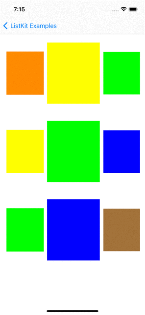
class ComplexLayoutViewController: BaseViewController {

    let colors: [UIColor] = [
        UIColor.red,
        UIColor.orange,
        UIColor.yellow,
        UIColor.green,
        UIColor.blue,
        UIColor.brown,
        UIColor.purple,
        UIColor.systemPink,
        UIColor.magenta
    ]

    var randomColor: UIColor {
        return colors.randomElement() ?? .cyan
    }

    override func render() {
        renderer.render(of: Array(0..<10)) { index in
            Section(id: index) {
                HGroup(width: .fractionalWidth(1.0), height: .absolute(150)) {
                    for _ in 0..<3 {
                        ColorBox2Component(color: randomColor, width: .fractionalWidth(0.5), height: .fractionalHeight(1.0))
                        VGroup(of: [0, 1], width: .fractionalWidth(0.25), height: .fractionalHeight(1.0)) { _ in
                            ColorBox2Component(color: randomColor, width: .fractionalWidth(1.0), height: .fractionalHeight(0.5))
                        }
                        VGroup(of: [0, 1], width: .fractionalWidth(0.25), height: .fractionalHeight(1.0)) { _ in
                            ColorBox2Component(color: randomColor, width: .fractionalWidth(1.0), height: .fractionalHeight(0.5))
                        }
                    }
                }
            }
            .orthogonalScrollingBehavior(.groupPaging)
            .boundarySupplementaryItem(SectionHeaderComponent(title: "Section \(index + 1)"))
        }
    }
}
Installation
ListKit only support Swift Package Manager.
dependencies: [
    .package(url: "https://github.com/ReactComponentKit/ListKit.git", from: "1.1.1"),
]
Requirements
- Swift 5.4+
- ListKit uses @resultBuilder which is available after Swift 5.4.
- iOS 13.0+
- Xcode 12.+
Inspired by and Respect
- Carbon
- Carbon is the awesome library for building user interfaces in UITableView and UICollectionView. It provides declarative and component-based way to buiild UI much like SwiftUI. I learned many things from Carbon to make ListKt. I want to give huge thanks to Carbon and respect it.
API reference
Section
Section(id: Hashable) { // building a group }- Section’s initializer
func orthogonalScrollingBehavior(_ value: UICollectionLayoutSectionOrthogonalScrollingBehavior) -> Section- The section’s scrolling behavior in relation to the main layout axis.
func interGroupSpacing(_ value: CGFloat) -> Section- The amount of space between the groups in the section.
func contentInsets(top: CGFloat = 0, leading: CGFloat = 0, bottom: CGFloat = 0, trailing: CGFloat = 0) -> Section- The amount of space between the content of the section and its boundaries.
func contentInsetsReference(_ value: UIContentInsetsReference) -> Section- @available(iOS 14.0, *)
- The boundary to reference when defining content insets.
func supplementariesFollowContentInsets(_ value: Bool) -> Section- A Boolean value that indicates whether the section’s supplementary items follow the specified content insets for the section.
func boundarySupplementaryItem<S: SupplementaryComponent>(_ value: S) -> Section- A supplementary item that it associated with the boundary edges of the section, such as headers and footers.
- You can set multiple supplementary items with the chain of function calls.
func decorationItem<D: DecorationComponent>(_ value: D) -> Section- A decoration item that it anchored to the section, such as background decoration views.
- You can set multiple supplementary items with the chain of function calls.
func visibleItemsInvalidationHandler(_ value: NSCollectionLayoutSectionVisibleItemsInvalidationHandler?) -> Section- A closure called before each layout cycle to allow modification of the items in the section immediately before they are displayed.
Group(HGroup and VGroup)
[V|H]Group(width: NSCollectionLayoutDimension, height: NSCollectionLayoutDimension) { // builing items }[V|H]Group(of items: [T], width: NSCollectionLayoutDimension, height: NSCollectionLayoutDimension) { // builing items }- Group’s initializer
func interItemSpacing(_ value: NSCollectionLayoutSpacing) -> Group- The amount of space between the items in the group.
func supplementaryItem<S: SupplementaryComponent>(_ value: S) -> Group- The supplementary item that is anchored to the group.
func edgeSpacing(top: NSCollectionLayoutSpacing = .fixed(0), leading: NSCollectionLayoutSpacing = .fixed(0), bottom: NSCollectionLayoutSpacing = .fixed(0), trailing: NSCollectionLayoutSpacing = .fixed(0)) -> Group- The amount of space added around the boundaries of the item between other items and this item’s container.
func contentInsets(top: CGFloat = 0, leading: CGFloat = 0, bottom: CGFloat = 0, trailing: CGFloat = 0) -> Group- The amount of space added around the content of the item to adjust its final size after its position is computed.
Component
var id: AnyHashable { get }- Component’s unique ID
func contentView() -> Content- return component’s content view instance
func layoutSize() -> NSCollectionLayoutSize- The component’s size expressed in width and height dimensions.
func edgeSpacing() -> NSCollectionLayoutEdgeSpacing?- The amount of space added around the boundaries of the item between other components and this component’s container.
func contentInsets() -> NSDirectionalEdgeInsets- The amount of space added around the content of the component to adjust its final size after its position is computed.
func supplementComponents() -> [AnySupplementaryComponent]- An array of the supplementary items attached to the component.
func willDisplay(content: Content)- Component’s content is about to be displayed in the collection view.
func didEndDisplay(content: Content)- Component’s content was removed from the collection view.
func render(in content: Content)- Render data to component’s content view
DataSource
func configure(cell: UICollectionViewCell)- Configure UICollectionViewCell if needed
func component<T>(at indexPath: IndexPath, to: T.Type) -> T?- Query the component at IndexPath and casting it to T type if there is.
MIT License
MIT License
Copyright (c) 2021 ListKit
Permission is hereby granted, free of charge, to any person obtaining a copy
of this software and associated documentation files (the “Software”), to deal
in the Software without restriction, including without limitation the rights
to use, copy, modify, merge, publish, distribute, sublicense, and/or sell
copies of the Software, and to permit persons to whom the Software is
furnished to do so, subject to the following conditions:
The above copyright notice and this permission notice shall be included in all
copies or substantial portions of the Software.
THE SOFTWARE IS PROVIDED “AS IS”, WITHOUT WARRANTY OF ANY KIND, EXPRESS OR
IMPLIED, INCLUDING BUT NOT LIMITED TO THE WARRANTIES OF MERCHANTABILITY,
FITNESS FOR A PARTICULAR PURPOSE AND NONINFRINGEMENT. IN NO EVENT SHALL THE
AUTHORS OR COPYRIGHT HOLDERS BE LIABLE FOR ANY CLAIM, DAMAGES OR OTHER
LIABILITY, WHETHER IN AN ACTION OF CONTRACT, TORT OR OTHERWISE, ARISING FROM,
OUT OF OR IN CONNECTION WITH THE SOFTWARE OR THE USE OR OTHER DEALINGS IN THE
SOFTWARE.