AnimatedCardInput
This library allows you to drop into your project two easily customisable, animated components that will make input of Credit Card information for users much better experience.
Example
To run the example project, clone the repo, and run pod install from the Example directory first.
Requirements
AnimatedCardInput is written in Swift 5.0 and supports iOS 11.0+.
Installation
AnimatedCardInput is available through CocoaPods. To install
it, simply add the following line to your Podfile:
pod 'AnimatedCardInput'
Usage
Both components available in this Pod can be used either individually or in pair on one screen.
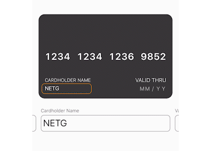
Card View
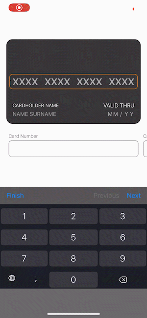
To use Card View on our screen we simply initialise the view and place it in our hierarchy. This will create default credit card view, with 16-digit card number separated into blocks of 4 and CVV number limited to 3 digits.
/// cardNumberDigitsLimit: Indicates maximum length of card number. Defaults to 16.
/// cardNumberChunkLengths: Indicates format of card number,
///                         e.g. [4, 3] means that number of length 7 will be split
///                         into two parts of length 4 and 3 respectively (XXXX XXX).
/// CVVNumberDigitsLimit: Indicates maximum length of CVV number.
let cardView = CardView(
    cardNumberDigitsLimit: 16,
    cardNumberChunkLengths: [4, 4, 4, 4],
    CVVNumberDigitsLimit: 3
)
view.addSubview(cardView)
NSLayoutConstraint.activate([...])
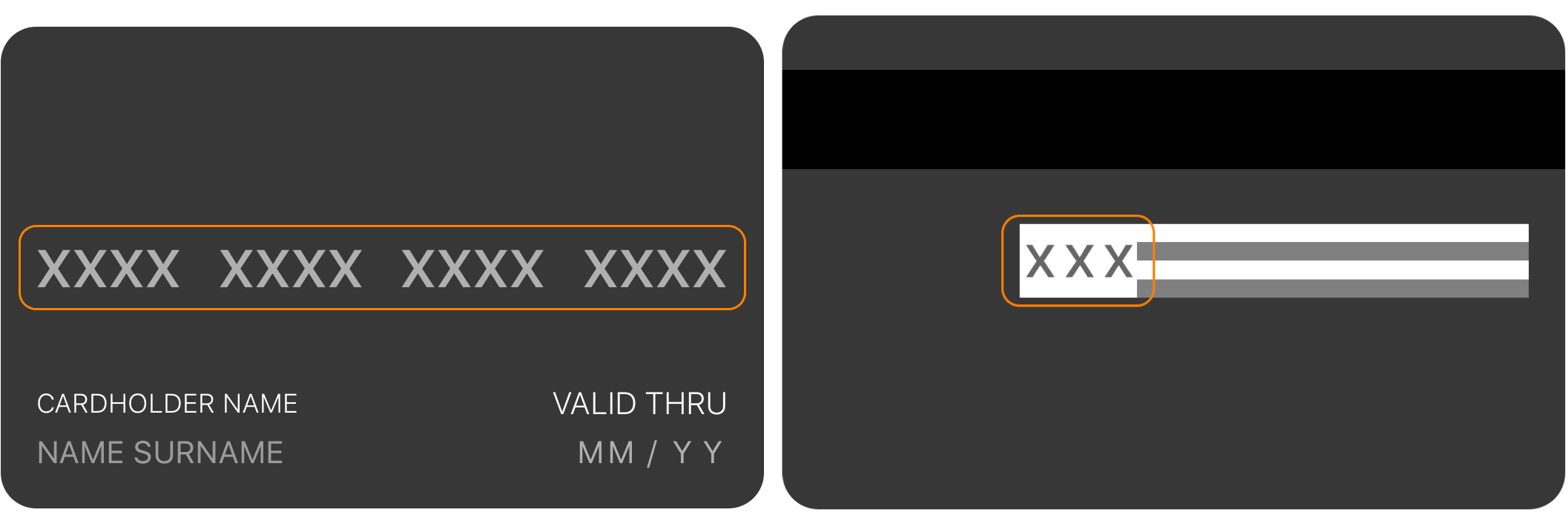
We can customise our card view in almost every way. Starting with the design, both fonts and color can be adjusted. Here's a list of all available properties that can be changed.
isSecureInput- Enables masking of CVV number (defaults to false).validatesDateInput- Enables validation on Validity Date Field (defaults to true).frontSideCardColor- Background color of the card's front side (defaults to #373737).frontSideTextColor- Text color of the card's front side (defaults to #FFFFFF).backSideCardColor- Background color of the card's back side (defaults to #373737).CVVBackgroundColor- Background color of the card's CVV Field (defaults to #FFFFFF).backSideTextColor- Text color of the card's back side (defaults to #000000).selectionIndicatorColor- Border color of a selected field indicator (defaults to #ff8000).numberInputFont- Font of the Card Number Field (defaults to System SemiBold 24).nameLabelFont- Font of the Cardholder Name Label (defaults to System Light 14. Recommended font size is 0.6 of Card Number size).nameInputFont- Font of the Cardholder Name Field (defaults to System Regular 14. Recommended font size is 0.6 of Card Number size).validityLabelFont- Font of the Validity Date Label (defaults to System Light 14. Recommended font size is 0.6 of Card Number size).validityInputFont- Font of the Validity Date Field (defaults to System Regular 14. Recommended font size is 0.6 of Card Number size).CVVInputFont- Font of the CVV Number Field (defaults to System SemiBold 20. Recommended font size is 0.85 of Card Number size).cardNumberSeparator- Character used as the Card Number Separator (defaults to " ").cardNumberEmptyCharacter- Character used as the Card Number Empty Character (defaults to "X").validityDateSeparator- Character used as the Validity Date Separator (defaults to "/").validityDateCustomPlaceHolder- Text used as the Validity Date Placeholder (defaults to "MM/YY").CVVNumberEmptyCharacter- Character used as CVV Number Empty Character (defaults to "X").
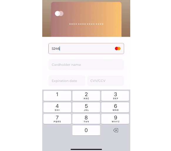
Card Inputs View
To use Card Inputs View on our screen we simply initialise the view and place it in our hierarchy. This will create default default scroll view with four text fields and card number limited to 16 digits.
let cardInputsView = CardInputsView(cardNumberDigitLimit: 16)
view.addSubview(cardInputsView)
NSLayoutConstraint.activate([...])
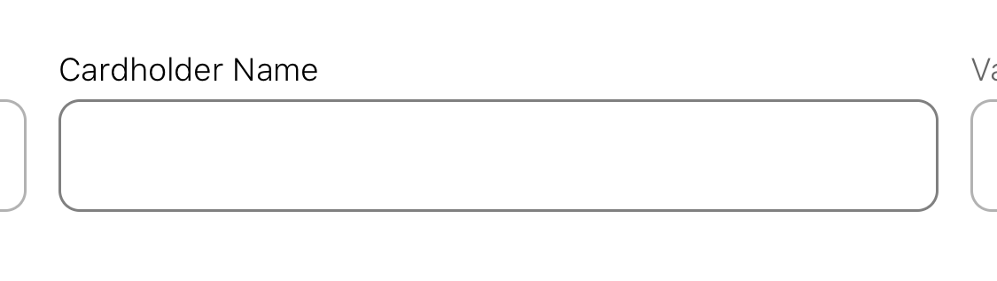
Input views can be customised all at once with following properties.
isSecureInput- Enables masking ov CVV number (defaults to false).validatesDateInput- Enables validation on Validity Date Field (defaults to true).inputTintColor- Color of tint for text fields (defaults to #000000).inputborderColor- Color of border for text fields (defaults to #808080).titleColor- Color of text in title label (defaults to #000000).titleFont- Font of text in title label (defaults to System Light 12).inputColor- Color of text in text field (defaults to #000000).inputFont- Font of text in text field (defaults to System Regular 24).
Connecting both components
If we want users to input data either directly onto card or by selecting textfields we need to pair both components with creditCardDataDelegate property.
cardView.creditCardDataDelegate = inputsView
cardInputsView.creditCardDataDelegate = cardView
From now on both inputs will update to the same data and step in the filling flow.
Roadmap
- [ ] Labels localisation.
- [ ] Adding new, custom credit card providers with icons.
- [ ] Validation errors displayed on the inputs.
- [ ] Even more...