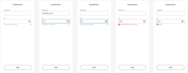
RYFloatingInput
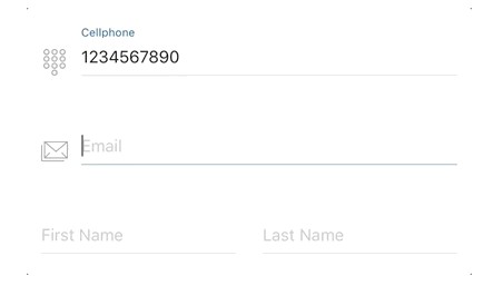
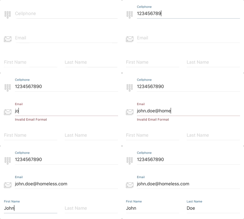
RYFlotingInput, inspired by "Floating Label Pattern" and implemented with RxSwift & mvvm pattern, provides a fully-customizable textfield input control along with a painless input text validation.
Features
- Float label pattern
- Customization support: theme, color, icon
- Straightforward text input validation and callbacks
Installation
CocoaPods
Available on CocoaPods. Simply add the following to your project Podfile, and you're good to go.
pod 'RYFloatingInput'
Getting Started
Setup from InterfaceBuilder
- Drag a UIView instance into your UIViewController/UIView
- Change the class of the UIView instance to
RYFloatingInput. - Change the module of the UIView instance to
RYFloatingInput. - Link to the IBOutlet instance of your UIViewController/UIView.
Setup Programmitacally
Create an RYFloatingInput instance and add to superview
let floatingInput = RYFloatingInput(frame: frame)
self.view.addSubview(floatingInput)
Usage
- Setting Builder
- Input Text Validation
- Theme & Color Customization
- Divider Height
- Icon / Placeholder / Secure Text
Setting Builder
RYFloatingInputSetting is required for RYFloatingInput to work properly, which concise all the settings and customizations together into one single builder function. Here are the steps:
- Initialize
RYFloatingInputSettinginstance by usingRYFloatingInputSetting.Builder - Add features & customizations
- Setup
RYFloatingInputby createdRYFloatingInputSettinginstance
Example:
let setting = RYFloatingInputSetting.Builder.instance()
    .theme(.dark)
    .iconImage(UIImage(named: "image_name")!)
    .placeholer("I AM PLACEHOLDER")
    .secure(true)
    .build()

floatingInput.setup(setting: setting)
Input Text Validation
Setting up text validation is totally painless in RYFloatingInput by simply adding .maxLength or .inputType implementation in setting builder and it's done. You can also customize warning message along with a callback event triggered at any invalid input occurrence. Complex delegation is not needed.
2 options for input Type validation:
.number- only accept numeric input..regex(pattern: String)- check input text with regular expression you want.
Example:
RYFloatingInputSetting.Builder.instance()
    .theme(.standard)
    .maxLength(8, onViolated: (message: "Exceed max length", callback: {
        print("Exceed max length")
    }))
    .inputType(.number, onViolated: (message: "Invalid input, number only", callback: {
        print("Invalid input, number only")
    }))
    .build()
Color & Theme Customization
Color Customization is implemented for almost every component in RYFloatingInput, such as background, divider, placeholer, divider, warning label, and input cursor.
Here are the color customization options provided:
RYFloatingInputSetting.Builder.instance()
    .backgroundColor(.clear)
    .textColor(.darkText)
    .placeholderColor(.lightGray)
    .dividerColor(.lightGray)
    .cursorColor(.blue)
    .accentColor(.cyan)
    .warningColor(.red)
    .build()
Normally, divider and floating label are displayed as accent color while highlighted, and will turn into warning color once invalid text input has entered.

Theme is a easier way to customize colors which covers all color options described above. 3 theme options are definded in RYFloatingInput.Theme:
.standard- default.light.dark
RYFloatingInputSetting.Builder.instance()
    .theme(.light)
    .build()
Please note that if theme and color customization, e.g. textColor, are both setup in builder, the text color from theme will be ignored.
Divider Height
3 divider height options are provided: .thin, .regular, .bold. Defaults to .regular.
RYFloatingInputSetting.Builder.instance()
    .dividerWeight(.thin)
    .build()
Icon / Placeholder / Secure Text
Setting input icon, placeholder, secure text options.
RYFloatingInputSetting.Builder.instance()
    .iconImage(UIImage(named: "image_name")!)
    .placeholer("I AM PLACEHOLDER")
    .secure(true)
    .build()
TODO
- [x] Customizable divider height - v0.1.2
- [ ] Support customized font
- [ ] Multiple text validation conditions
- [ ] Activity indicator & asyncronous task completion event
