BulletinBoard
BulletinBoard is an iOS library that generates and manages contextual cards displayed at the bottom of the screen. It is especially well suited for quick user interactions such as onboarding screens or configuration.
It has an interface similar to the cards displayed by iOS for AirPods, Apple TV/HomePod configuration and NFC tag scanning. It supports both the iPhone, iPhone X and the iPad.
It has built-in support for accessibility features such as VoiceOver and Switch Control.
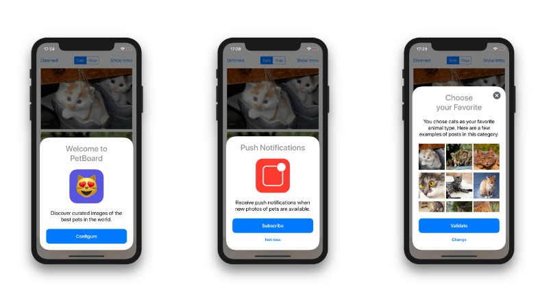
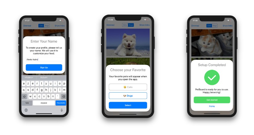
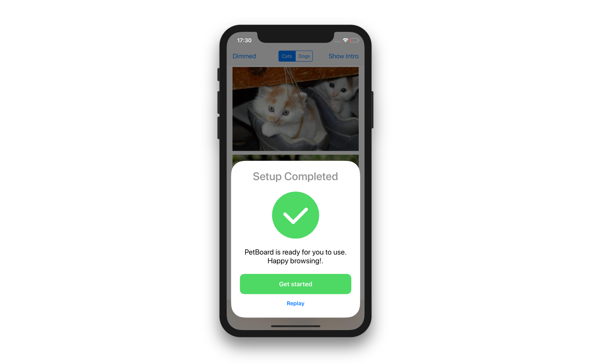
Here are some screenshots showing what you can build with BulletinBoard:
Requirements
- Xcode 10 and later
- iOS 9 and later
- Swift 4.2 and later
Demo
A demo project is included in the BulletinBoard workspace. It demonstrates how to:
- integrate the library (setup, data flow)
- create standard page cards
- create custom page subclasses to add features
- create custom cards from scratch
Two demo targets are available:
BB-Swift(demo written in Swift)BB-ObjC(demo written in Objective-C)
Build and run the scheme for your favorite language to open the demo app.
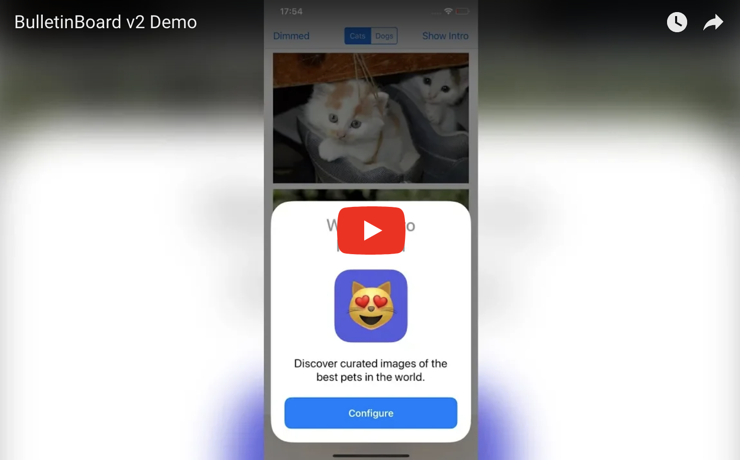
Here's a video showing it in action:
Installation
BulletinBoard is available via CocoaPods and Carthage.
CocoaPods
To install BulletinBoard using CocoaPods, add this line to your Podfile:
pod 'BulletinBoard'
Carthage
To install BulletinBoard using Carthage, add this line to your Cartfile:
github "alexaubry/BulletinBoard"
? Objective-C Integration
BulletinBoard is fully compatible with Objective-C.
To import it in your Objective-C app, just add this line at the top of your files:
@import BLTNBoard;
Usage
The Basics
The BLTNManager class generates, manages and displays bulletin cards. Cards are created using bulletin items. Bulletin items are objects that conform to the BLTNItem protocol.
The library provides a standard item type: BLTNPageItem. If you need to customize the items, you can override this class, or create new item types from scratch.
Displaying Bulletins
To display bulletins you first need to create the root item to display (explained in the next sections).
With this root item, you need to create a BLTNManager. We recommend putting it in the view controller that will display the bulletin.
class ViewController: UIViewController {

    lazy var bulletinManager: BLTNItemManager = {
        let rootItem: BLTNItem = // ... create your item here
        return BLTNItemManager(rootItem: rootItem)
    }()

}
To present your bulletin, call this method:
bulletinManager.showBulletin(above: self)
For the case of onboarding, you can call it in viewWillAppear(animated:) after checking if the user has already completed onboarding.
Creating Page Items
You can create standard page items using the BLTNPageItem class.
It takes care of generating a user interface with standard components:
- a title (required)
- an icon image (should be 128x128px or less)
- a description text (plain or attributed)
- a large action button
- a smaller alternative button
For example, this interface was created using a BLTNPageItem:
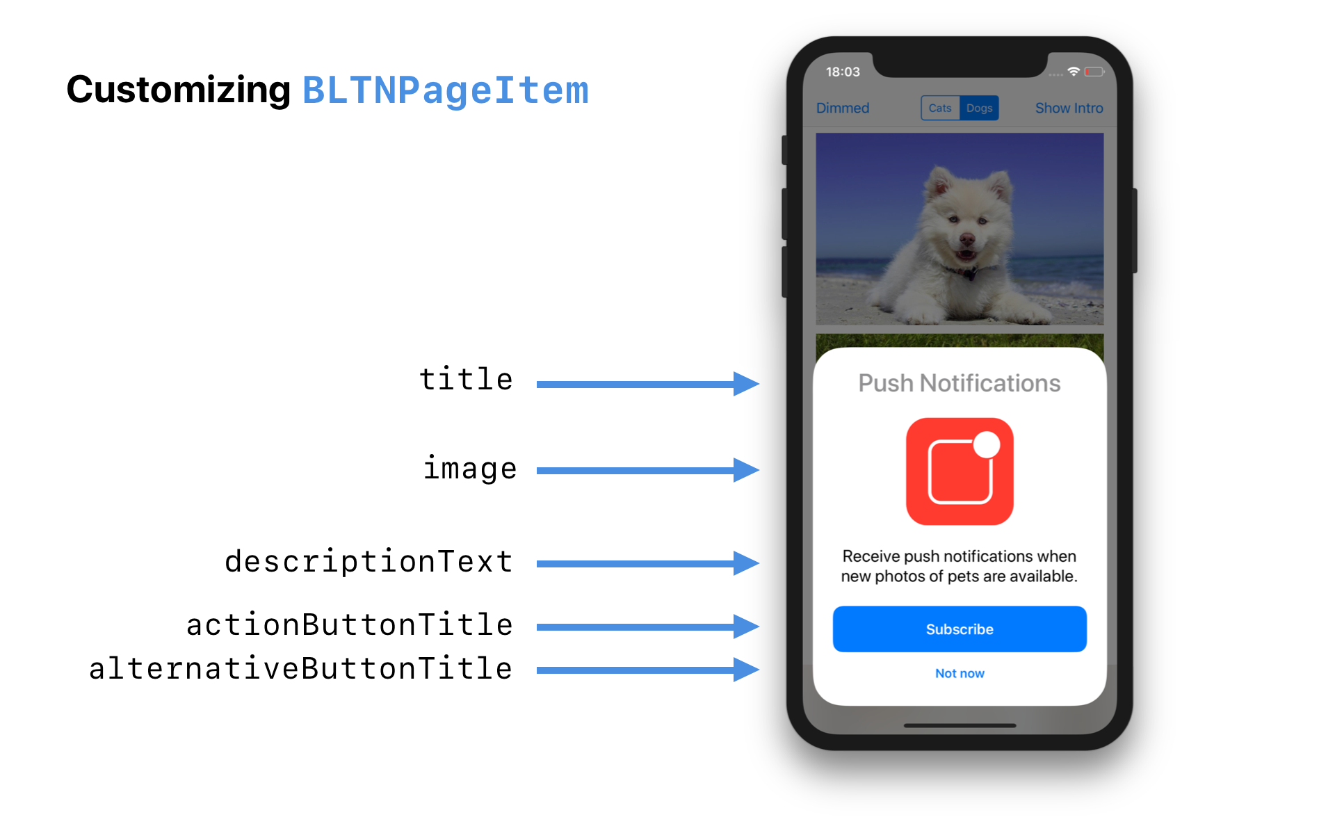
To recreate this interface, use this code:
let page = BLTNPageItem(title: "Push Notifications")
page.image = UIImage(named: "...")

page.descriptionText = "Receive push notifications when new photos of pets are available."
page.actionButtonTitle = "Subscribe"
page.alternativeButtonTitle = "Not now"
If you omit an optional property, the page won't generate a view for it. For instance, if you set alternativeButtonTitle to nil, the card won't display an alternative button.
You can also set the attributedDescriptionText if you want to use an attributed string.
Customizing the Appearance
The BLTNPageItem class exposes a appearance property that allows you to fully customize the appearance of the generated interface.
This property references a BLTNAppearance, which is used to generate the standard components (more on this later).
You can customize both color and fonts. You need to change these before you present / push the item. Changing them after presentation will have no effect.
Example
let greenColor = UIColor(red: 0.294, green: 0.85, blue: 0.392, alpha: 1)
page.appearance.actionButtonColor = greenColor
page.appearance.alternativeButtonColor = greenColor
page.appearance.actionButtonTitleColor = .white
This produces a card with the following appearance:
Handling Button Taps
To handle taps on buttons, set a closure for these properties:
actionHandler- called when the action button is tapped.alternativeHandler- called when the alternative button is tapped.
page.actionHandler = { (item: BLTNActionItem) in
    print("Action button tapped")
}
This prints "Action button tapped" when the action button is tapped.
page.alternativeHandler = { (item: BLTNActionItem) in
    print("Alternative button tapped")
}
This prints "Alternative button tapped" when the alternative button is tapped.
Use these handlers as an opportunity to change the presented item, dismiss the bulletin and/or pass data to your model.
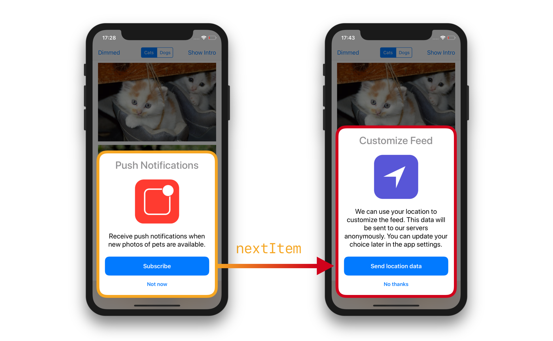
Changing the Presented Item
The BLTNItem protocol exposes a manager property that is set when the item is currently being displayed by a manager.
You can use it to interact with the presented bulletin. Call:
manager?.popItem()to go back to the previous itemmanager?.popToRootItem()to go back to the first itemmanager?.push(item:)with aBulletinItemto present a new itemmanager?.dismissBulletin(animated:)to dismiss the bulletinmanager?.displayNextItem()to display the next item (see below)
You need to call these methods from the main thread. Never force unwrap manager, as this property will be unset as soon as the item is removed from the bulletin.
It is also possible to set the nextItem property to the BLTNItem that should be displayed next and call the displayNextItem() method when you want to display it.
For instance, to present a new card when the user taps the action button:
page.nextItem = makeLocationPage() // Creates a new PageBulletinItem

page.actionHandler = { (item: PageBulletinItem) in
    item.manager?.displayNextItem()
}
This creates the following interaction:
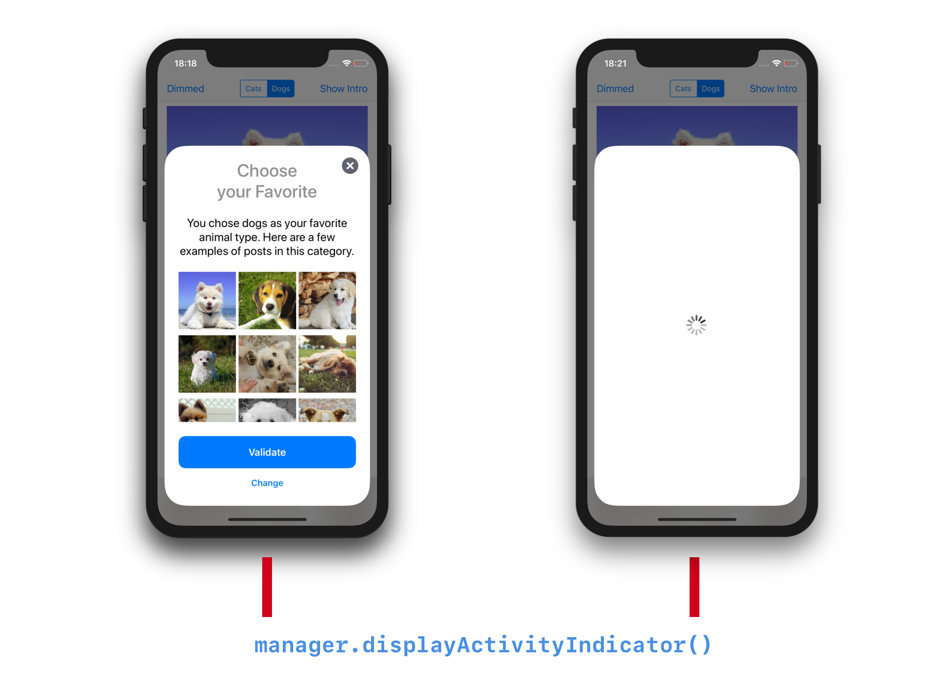
Displaying an Activity Indicator
If you need to perform a task between the moment the user taps a button and the moment you'll be able to change the presented item, you can call displayActivityIndicator() method on the item manager to hide the current card and display an activity indicator.
This is especially useful if you need to fetch data from a server (in-app purchase price, subscription status, ...) or save data (e.g. Core Data).
Once your task is finished, you call one of the methods described in Changing the Presented Item to display the new item, or call hideActivityIndicator() to hide the indicator without changing the item.
Example:
page.actionHandler = { (item: BLTNActionItem) in
    item.manager?.displayActivityIndicator()
    // do your task
    // ...
    // when your task is finished, transition to the appropriate bulletin item
    item.manager?.displayNextItem()
}
This creates the following interaction:
Customizing the Background View
By default, the content behind the card is covered with a semi-opaque view (known as the .dimming style).
You can customize the background view by changing the backgroundViewStyle property of the manager before calling prepare().
Example:
manager.backgroundViewStyle = .blurredExtraLight
manager.showBulletin(above: self)
Several styles are available in the BulletinBackgroundViewStyle enum:
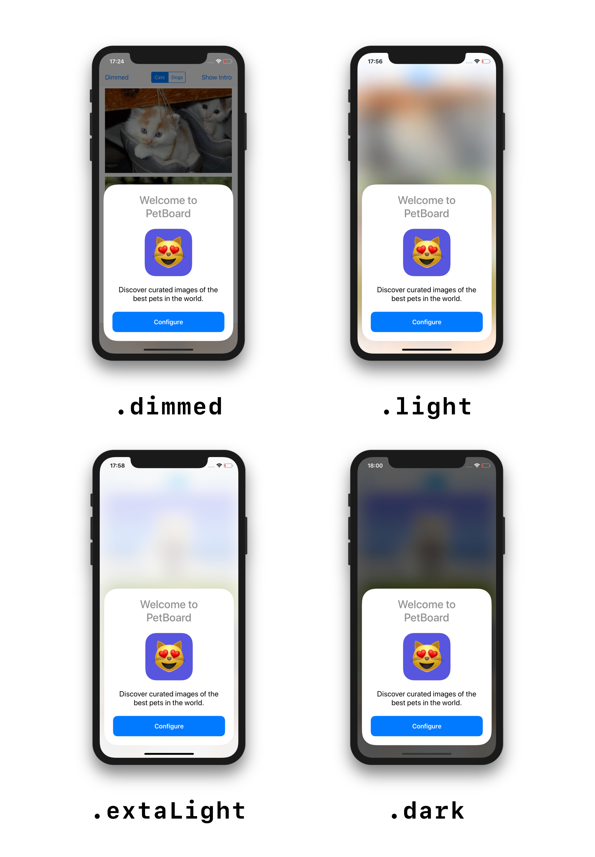
Note: blurred backgrounds are available in iOS 10.0 and later.
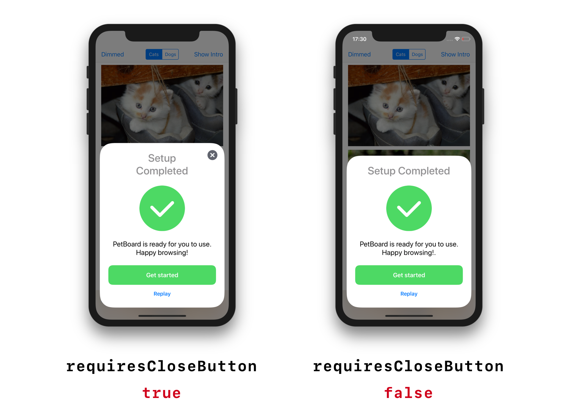
Dismissal
If you set the isDismissable property to true, the user will be able to dismiss the bulletin by tapping outside of the card or by swiping the card down. This property defaults to true. You should set this property to false if completing the task is required, and should not be avoided by the user.
By default, a close button will be displayed when the item can be dismissed. If you don't want this behavior, you can set the requiresCloseButton property to false. This is useful when the bulletin already provides an action button to close the item (such as a “Done“ button).
Creating Custom Items
To create custom bulletin items, create a class that implements the BLTNItem protocol. It is usually easier to subclass BLTNPageItem and implement one of the hook methods to provide your custom views to display with standard elements.
See the Creating a Custom Item guide to learn more.
Internals
BulletinBoard uses stack views and Auto Layout to display and manage cards. It automatically adapts to changes in width and height. iPad and iPhone X are supported out of the box.
If you are interested in learning how it works in more details, look at the implementation of BLTNManager, BulletinViewController and BLTNInterfaceBuilder.