SPIndicator
Floating indicator, mimicrate to indicator which appear when silent mode turn on / off. Support large texts.
Installation
Ready for use on iOS 12+, tvOS 12+. Works with Swift 5+. Required Xcode 12.5 and higher.
Swift Package Manager
The Swift Package Manager is a tool for managing the distribution of Swift code. It’s integrated with the Swift build system to automate the process of downloading, compiling, and linking dependencies.
To integrate SPIndicator into your Xcode project using Xcode 12, specify it in File > Swift Packages > Add Package Dependency...:
https://github.com/ivanvorobei/SPIndicator
CocoaPods:
CocoaPods is a dependency manager for Cocoa projects. For usage and installation instructions, visit their website. To integrate SPIndicator into your Xcode project using CocoaPods, specify it in your Podfile:
pod 'SPIndicator'
Manually
If you prefer not to use any of dependency managers, you can integrate SPIndicator into your project manually. Put Sources/SPIndicator folder in your Xcode project. Make sure to enable Copy items if needed and Create groups.

Quick Start
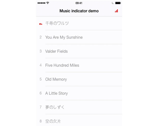
For best experience, I recommend presenting alerts by calling the class functions SPIndicator. These functions are updated regularly and show the alerts as Apple way:
SPIndicator.present(title: "Error", message: "Try Again", preset: .error)
For using a custom image:
let image = UIImage.init(systemName: "sun.min.fill")!.withTintColor(.systemYellow, renderingMode: .alwaysOriginal)
SPIndicator.present(title: "Custom Image", message: "With tint color", preset: .custom(image)))

For showing a simple text message:
SPIndicator.present(title: "Error", haptic: .error)
You can provide message optional too.
Usage
Duration
For change duration of present time, create alert view and call present method with custom duration:
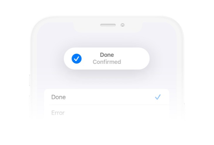
let indicatorView = SPIndicatorView(title: "Complete", preset: .done)
indicatorView.present(duration: 3)
Layout
For customise layout and margins, use layout property. You can manage margins for each side, icon size and space between image and titles:
indicatorView.layout.iconSize = .init(width: 24, height: 24)
indicatorView.layout.margins.top = 12
Dismiss by Drag
By default allow drag alert for hide. While alert is dragging, dismiss not work. This can be disabled:
indicatorView.dismissByDrag = false
Haptic
For manage haptic, you shoud pass it in present method:
alertView.present(duration: 1.5, haptic: .success, completion: nil)
You can remove duration and completion, its have default values.