NativeUIKit
Mimicrated views and controls to native Apple appearance. If you have any ideas of what elements can be added, let me know. Here provided all elements which available, tap for open docs for it.


If you like the project, don't forget to put star ★
Check out my other libraries:

Navigate
Installation
Ready for use on iOS 12+, tvOS 12+ & watchOS 6.0+. Works with Swift 5+. Required Xcode 12.0 and higher.
Swift Package Manager
The Swift Package Manager is a tool for managing the distribution of Swift code. It’s integrated with the Swift build system to automate the process of downloading, compiling, and linking dependencies.
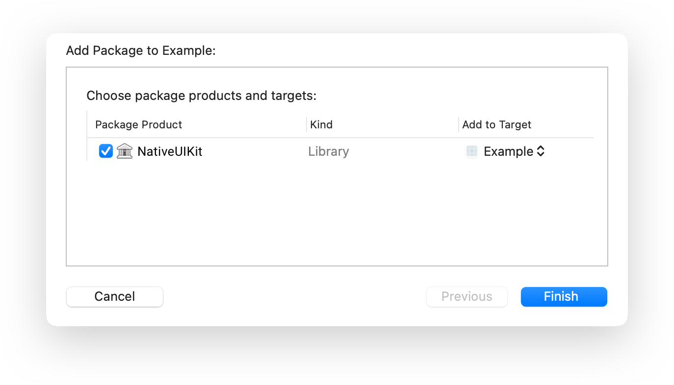
To integrate using Xcode 12, specify it in File > Swift Packages > Add Package Dependency...:
https://github.com/ivanvorobei/NativeUIKit
CocoaPods:
CocoaPods is a dependency manager for Cocoa projects. For usage and installation instructions, visit their website. To integrate using CocoaPods, specify it in your Podfile:
pod 'NativeUIKit'
Manually
If you prefer not to use any of dependency managers, you can integrate manually. Put Sources/NativeUIKit folder in your Xcode project. Make sure to enable Copy items if needed and Create groups.
Classes
NativeLargeActionButton
Usually used at the bottom of the screen. You can set an icon. You can set how to change the style when you click. Supports states disabled and dimmed.
Next code for usage:
// Set Appearance and Content
let button = NativeLargeActionButton()
button.setImage(UIImage.init(systemName: "plus.circle.fill")!)
button.higlightStyle = .background
button.applyDefaultAppearance(with: .init(content: .custom(.white), background: .tint))

// or use Wrapper
button.set(
    title: "Large Action",
    icon: UIImage.init(systemName: "plus.circle.fill")!,
    colorise: .init(content: .custom(.white), background: .tint)
)
Button support system layouts by sizeToFit(). Next code allow you to layout button with cutom width:
button.sizeToFit()
button.frame = .init(x: 0, y: 0, width: 300, height: button.frame.height)
NativeSmallActionButton
You definitely saw this button in the AppStore. You can use it without the icon.
Supports states disabled and dimmed.
Next code for usage:
// Set Appearance and Content
let button = NativeSmallActionButton()
button.higlightStyle = .background
button.applyDefaultAppearance(with: .init(content: .custom(.white), background: .tint))

// or use Wrapper
button.set(
    title: "Edit",
    icon: nil,
    colorise: .init(content: .custom(.white), background: .tint)
)
Button support system layouts by sizeToFit(). Next code allow you to layout button:
button.sizeToFit()
NativeAvatarView
Avatar view is container with 3 buttons - placeholder, avatar and indicator. For change avatar set avatarAppearance. For show or hide edit button set isEditable.
Layout availbe by size to fit for content. In this case change placeholder size to valid SFSymbol for have correct fit. By default font side is 80 point. Or you can set fixed frame and ignore fitting size.
let avatarView = NativeAvatarView()

// You can set target, actions or even contex menu like usual button.
avatarView.placeholderButton.addTarget(self, action: #selector(didTap), for: .touchUpInside)
avatarView.avatarButton.addTarget(self, action: #selector(didTap), for: .touchUpInside)
avatarView.indicatorButton.addTarget(self, action: #selector(didTap), for: .touchUpInside)

// For show edit button.
avatarView.isEditable = true

// Layout.
// For fit by images:
avatarView.sizeToFit()
// By custom frame:
avatarView.frame = .init(x: 0, y: 0, width: 60, height: 60)
Other Projects
I love being helpful. Here I have provided a list of libraries that I keep up to date. For see video previews of libraries without install open opensource.ivanvorobei.by website.
Russian Community
Подписывайся в телеграмм-канал, если хочешь получать уведомления о новых туториалах.
Со сложными и непонятными задачами помогут в чате.


Видео-туториалы выклыдываю на YouTube: