Koyomi
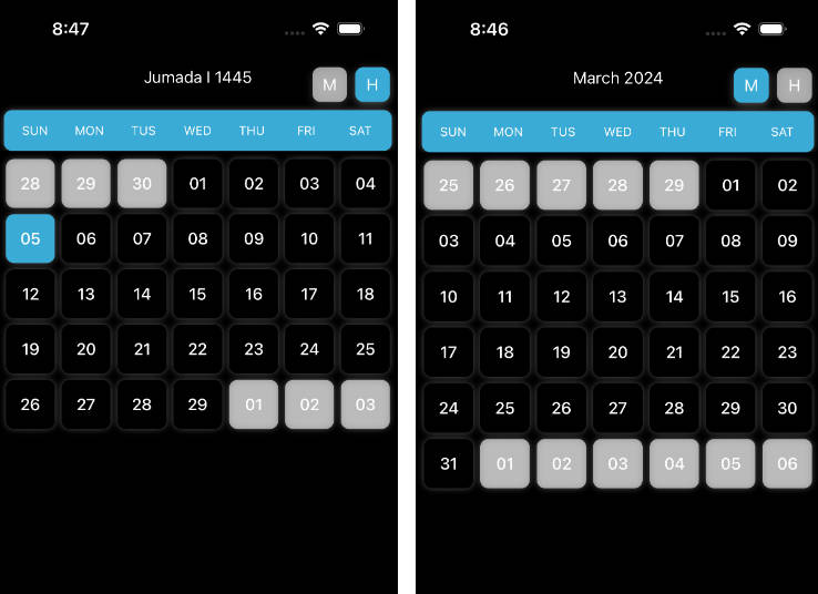
Koyomi is a simple calendar view framework for iOS, written in Swift.
Features
- Simple Calendar View :calendar:
- Easily usable :sunglasses:
- Customizable in any properties for appearance
- Selectable calender
- Complete
README - [x] Support
@IBDesignableand@IBInspectable - [x] Compatible with Carthage
- [x] Support Swift 2.3.
- [x] Support Swift 3.0
Demo App
Open Example/Koyomi.xcworkspace and run Koyomi-Example to see a simple demonstration.
Usage
Koyomi is designed to be easy to use :sunglasses:
    let frame = CGRect(x: 10, y : 20, width: 250, height: 300)
    let koyomi = Koyomi(frame: frame, sectionSpace: 1.5, cellSpace: 0.5, inset: .zero, weekCellHeight: 25)
    view.addSubview(koyomi)
Koyomi is available in Interface Builder.
Set custom class of UICollectionView to Koyomi
@IBOutlet weak var koyomi: Koyomi!
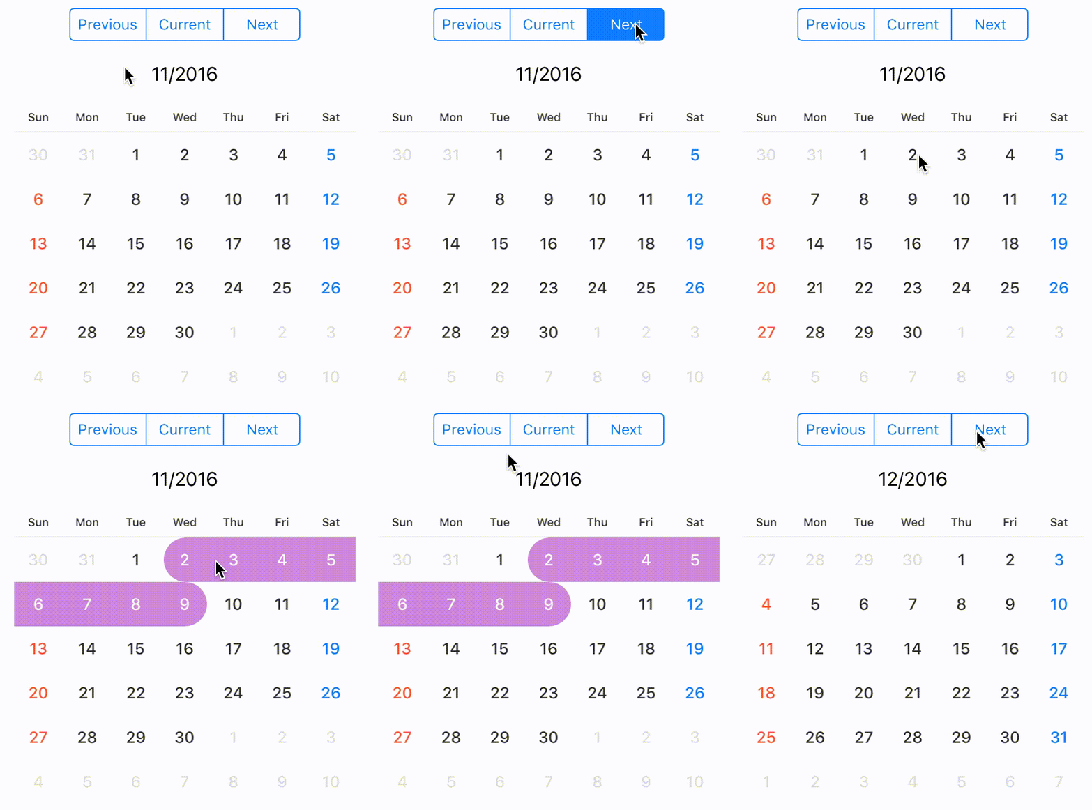
:calendar: Change displayed month
If you want to change displayed month, call display(in: MonthType). MonthType is defined by three types.
    public enum MonthType { case previous, current, next }

    // change month
    koyomi.display(in: .next)
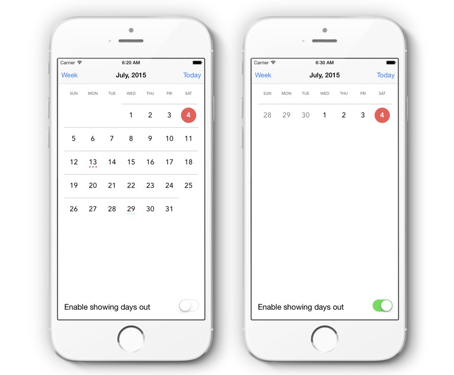
Hide days of other months
If you want to hide days of other months, set isHiddenOtherMonth to true.
Days of other months aren't displayed and user can't select.
koyomi.isHiddenOtherMonth = true
Get current month string
let currentDateString = koyomi.currentDateString()
NOTE
If you want to change
dateFormatofcurrentDateString, set argument to format.currentDateString(withFormat: "MM/yyyy")
default
dateFormatofcurrentDateStringisM/yyyy
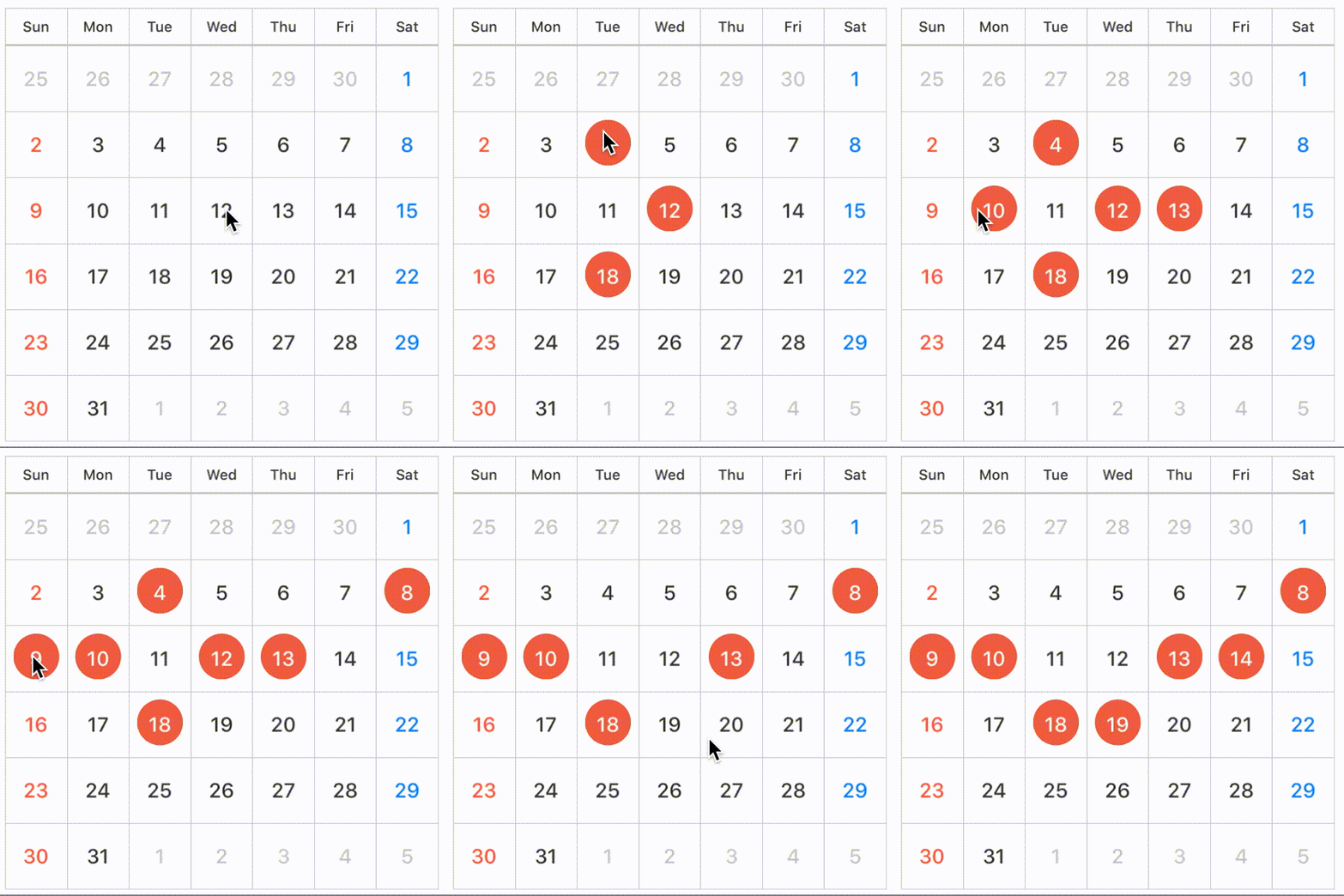
The selection state of date
You can configure SelectionMode with style.
SelectionMode has nested enumerations type: SequenceStyle, Style.
    public enum SelectionMode {
        case single(style: Style), multiple(style: Style), sequence(style: SequenceStyle), none


        public enum SequenceStyle { case background, circle, semicircleEdge, line }
        public enum Style { case background, circle, line }
   }

    // default selectionMode is single, circle style
    public var selectionMode: SelectionMode = .single(style: .circle)

    // call selectionStyle
    koyomi.selectionMode = .single(style: .circle)
| single | 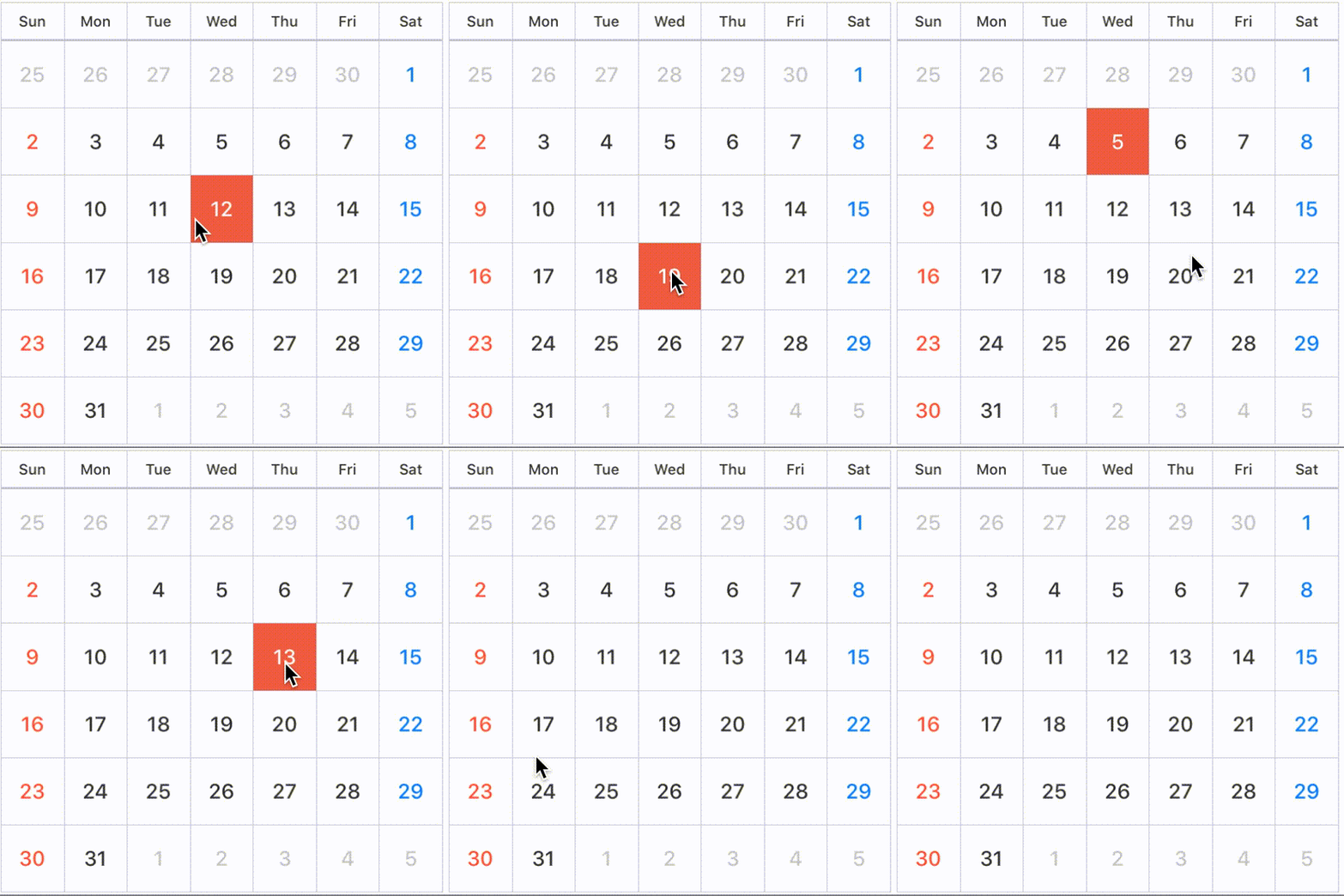 |
 |
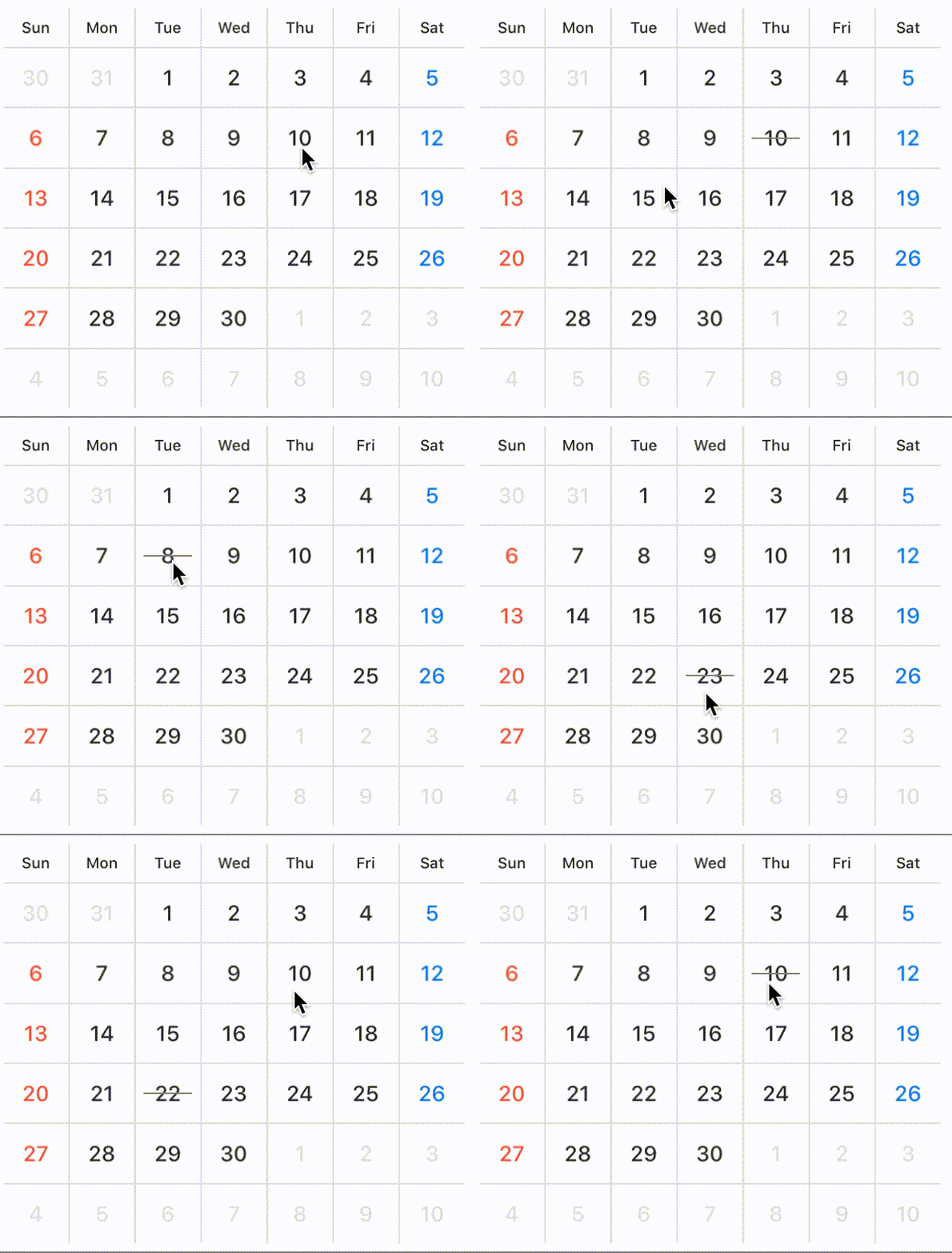 |
|---|---|---|---|
| SelectionMode | .single(style: .background) |
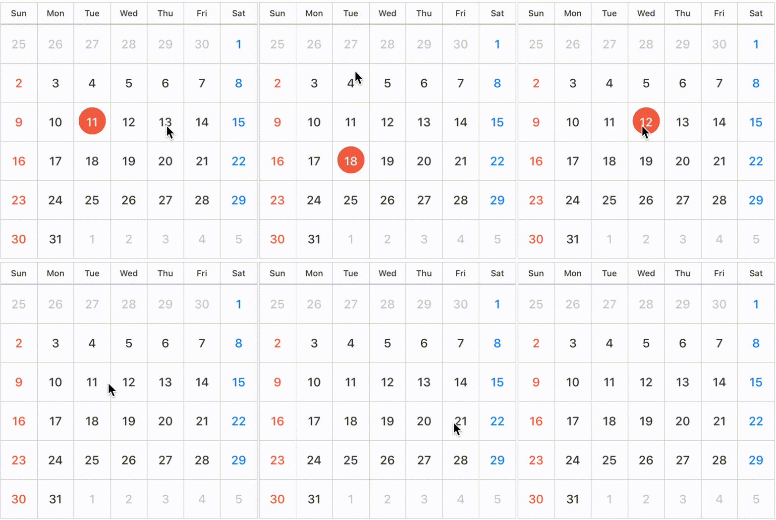
.single(style: .circle) |
.single(style: .line) |
| multiple | 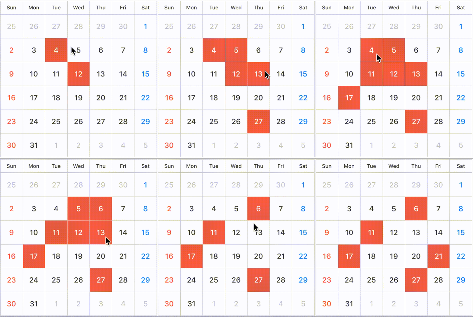 |
 |
 |
|---|---|---|---|
| SelectionMode | .multiple(style: .background) |
.multiple(style: .circle) |
.multiple(style: .line) |
| sequence | 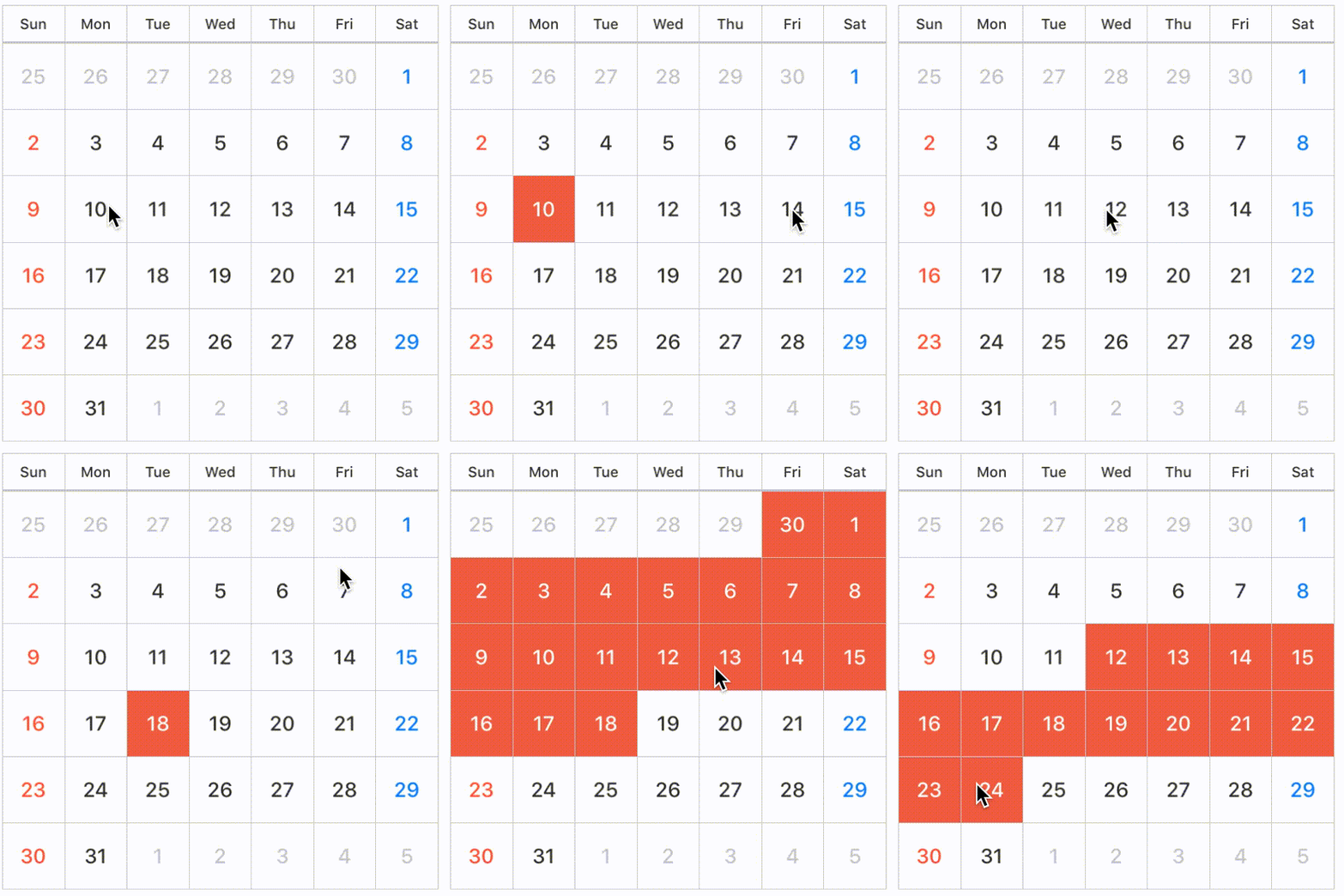 |
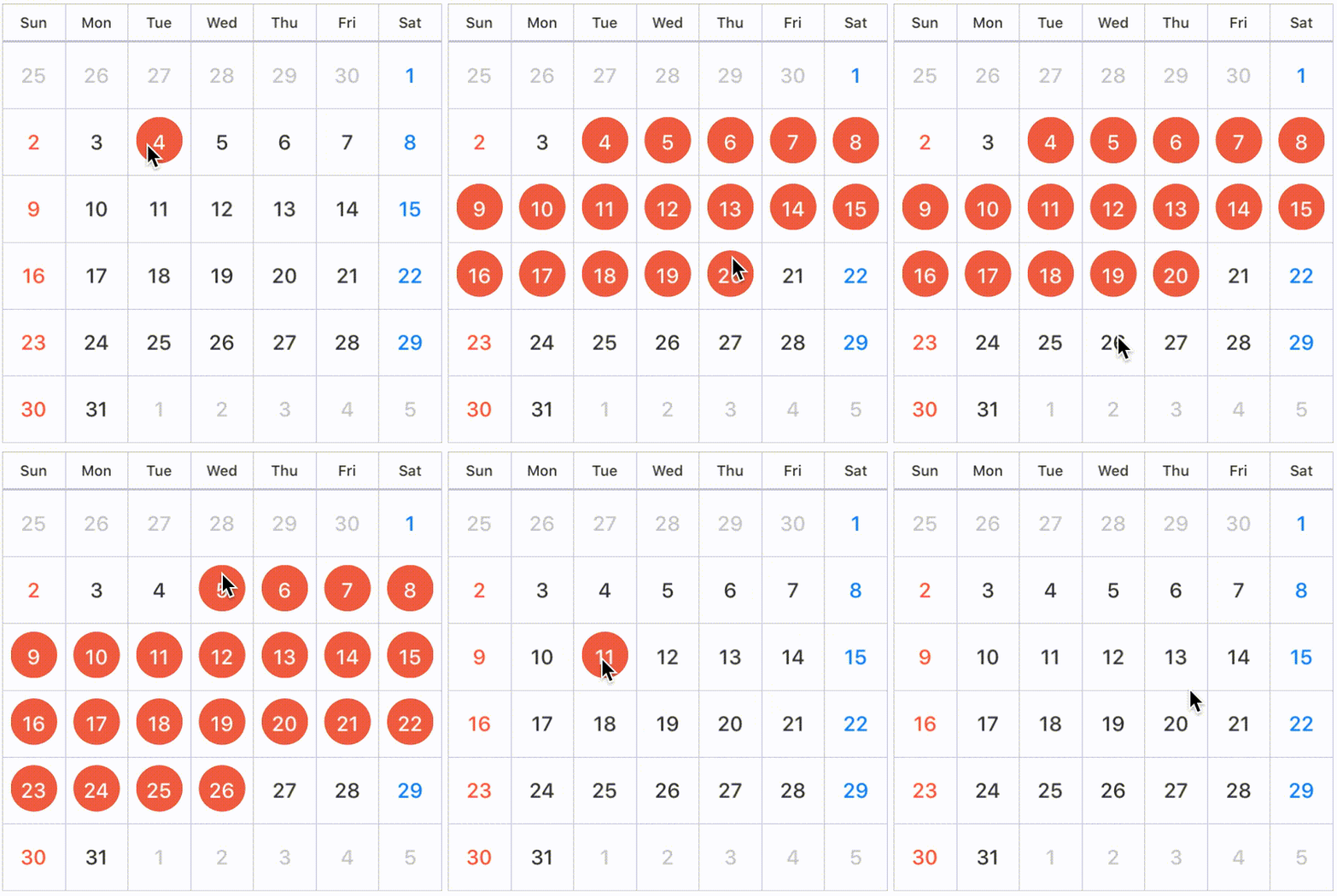 |
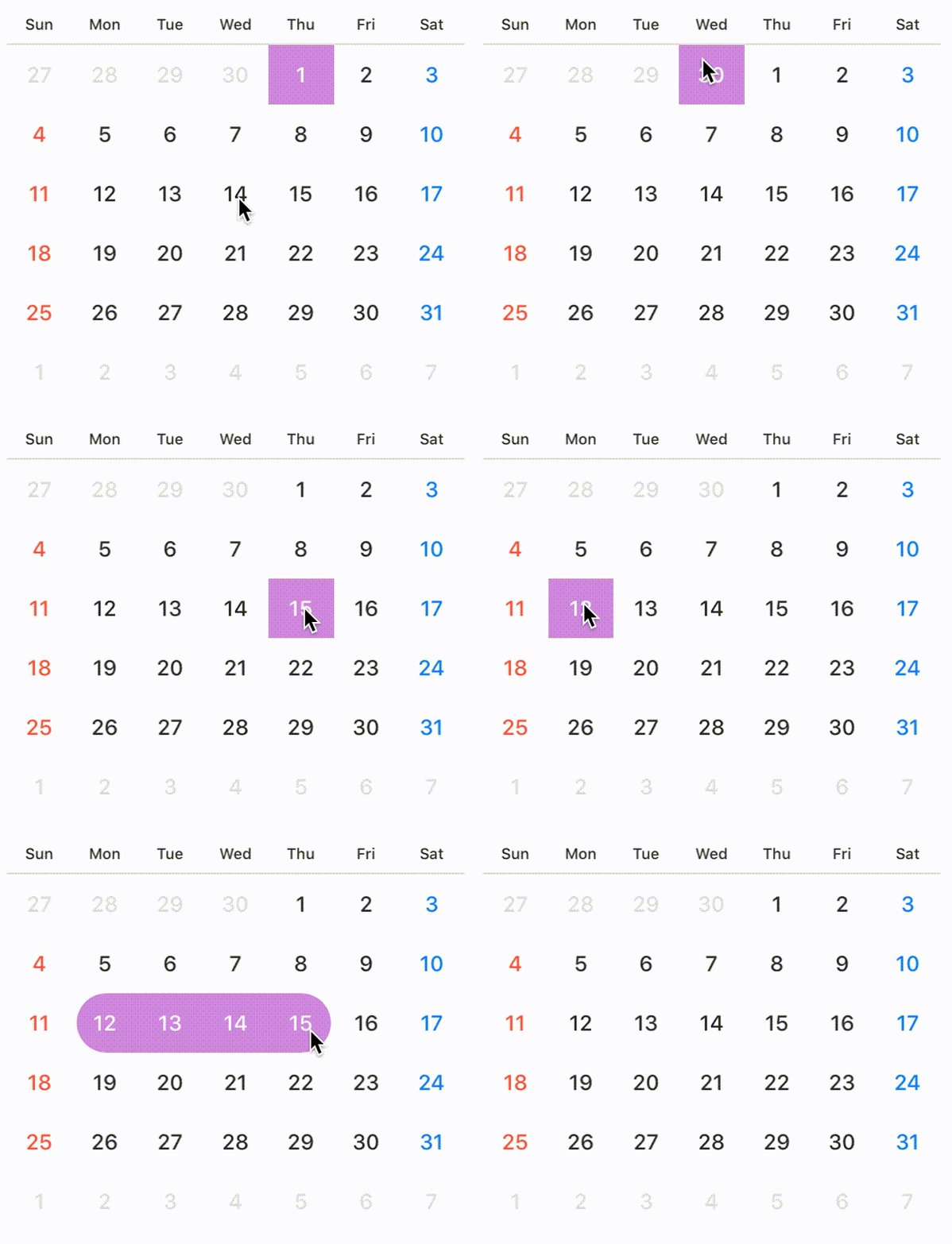 |
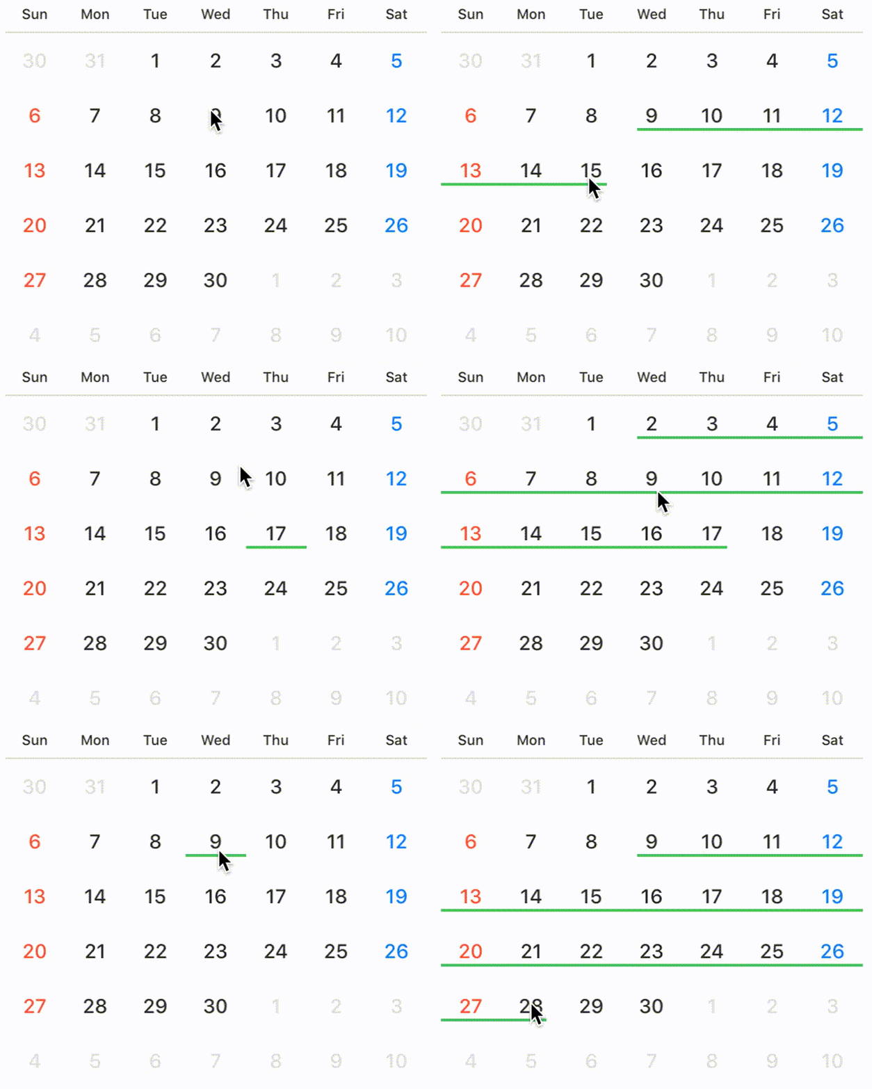 |
|---|---|---|---|---|
| SelectionMode | .sequence(style: .background) |
.sequence(style: .circle) |
.sequence(style: .semicircleEdge) |
.sequence(style: .line) |
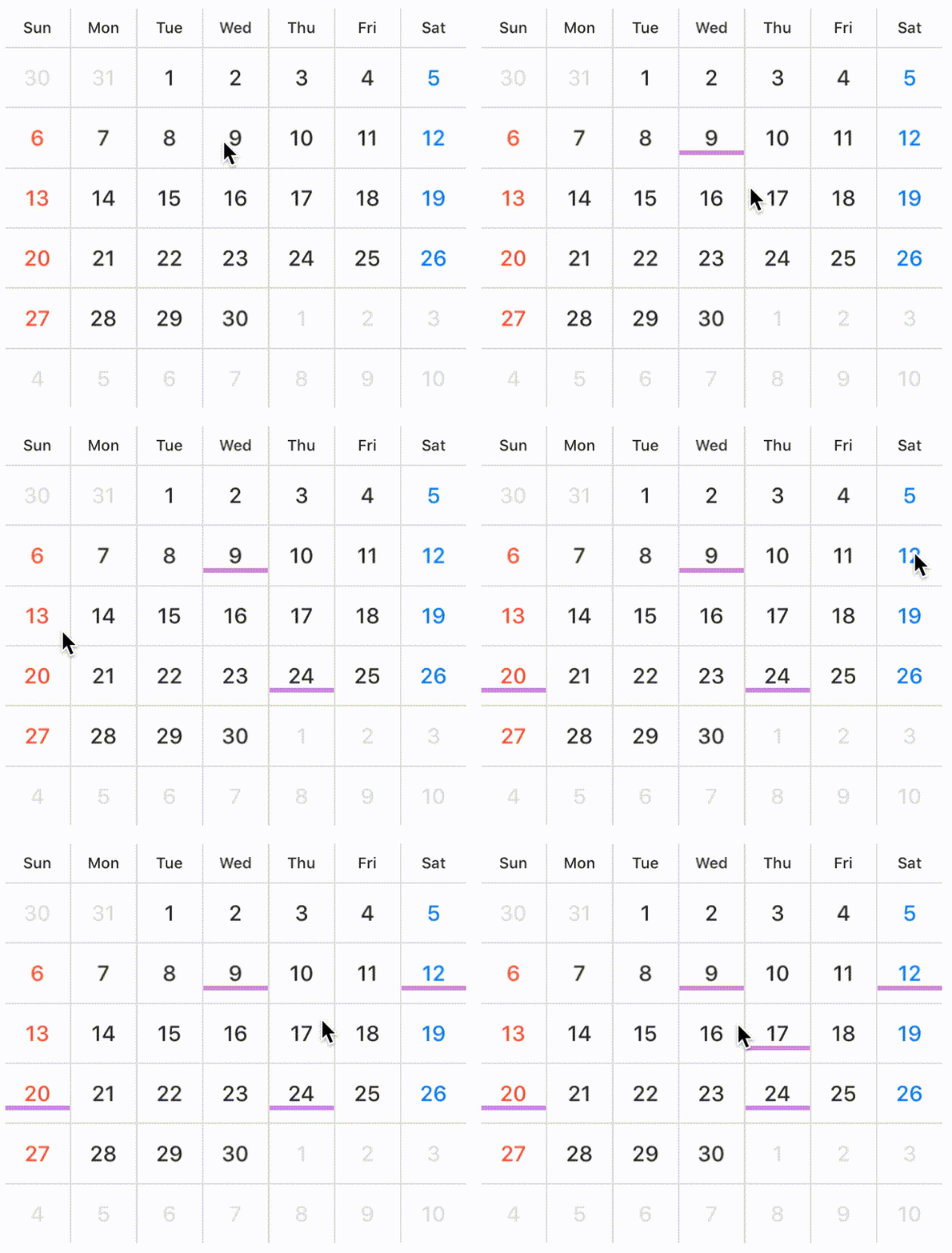
You can configure lineView in the case of line style.
public struct LineView {
    public enum Position { case top, center, bottom }
    public var height: CGFloat = 1
    public var widthRate: CGFloat = 1 // default is 1.0 (0.0 ~ 1.0)
    public var position: Position = .center
}

koyomi.selectionMode = .single(style: .line)
koyomi.lineView.height = 3
koyomi.lineView.position = .bottom
koyomi.lineView.widthRate = 0.7
NOTE
If you don't want to allow user to select date by user interaction, set
selectionModeto.none.
Select date in programmatically
You can select specific date .
    let today = Date()
    var components = DateComponents()
    components.day = 7
    let weekLaterDay = Calendar.current.date(byAdding: components, toDate: today)
    koyomi.select(date: today, to: weekLaterDay)

    // If want to select only one day.
    koyomi.select(date: today)

    // If want to select multiple day.
    let dates: [Date] = [date1, date2, date3]
    koyomi.select(dates: dates)
You can also unselect available.
    koyomi.unselect(today, to: weekLaterDay)
    // If want to unselect only one day.
    koyomi.unselect(today)
    // If want to unselect multiple day.
    let dates: [Date] = [date1, date2, date3]
    koyomi.unselect(dates: dates)

    // unselect all date
    koyomi.unselectAll()
You can configure style color and text state in selected state.
    @IBInspectable public var selectedStyleColor: UIColor

    public enum SelectedTextState { case change(UIColor), keeping }
    public var selectedDayTextState: SelectedTextState
selectedDayTextState
If you want to change day textColor when the user selects day in the Koyomi, set selectedDayTextState to SelectedTextState.change(UIColor).
Also, if you don't want to change day textColor when the user selects day, set selectedDayTextState to SelectedTextState.keeping.
// day text color change white when selected.
koyomi.selectedDayTextState = .change(.white)

// day text color doesn't change when selected.
koyomi.selectedDayTextState = .keeping
Highlight specific days
You can change dayColor and dayBackgroundColor in specific days.
    koyomi
        .setDayColor(.white, of: today, to: weekLaterDay)
        .setDayBackgrondColor(.black, of: today, to: weekLaterDay)

        // set day color only one day.
        // .setDayColor(.white, of: today)
        // .setDayBackgrondColor(.black, of: today)
KoyomiDelegate
If you want to use KoyomiDelegate, set calendarDelegate to target
koyomi.calendarDelegate = self
Declaration
koyomi(_: didSelect: forItemAt)
optional func koyomi(_ koyomi: Koyomi, didSelect date: Date, forItemAt indexPath: IndexPath)
Tells the delegate that the date at the specified index path was selected.
date: the date user selected, when tapped cell
koyomi(_: currentDateString:)
   optional func koyomi(_ koyomi: Koyomi, currentDateString dateString: String)

    // if you want to change string format, use `currentDateFormat`
    koyomi.currentDateFormat = "M/yyyy"
Tells the delegate that the displayed month is changed.
currentDateString: the current month string, when changed month.
koyomi(_: shouldSelectDates: to: withPeriodLength)
    optional func koyomi(_ koyomi: Koyomi, shouldSelectDates date: Date?, to toDate: Date?, withPeriodLength length: Int) -> Bool

    // control date user selected.
    func koyomi(_ koyomi: Koyomi, shouldSelectDates date: Date?, to toDate: Date?, withPeriodLength length: Int) -> Bool {

        if invalidStartDate <= date && invalidEndDate >= toDate {
            print("Your select day is invalid.")
            return false
        }

        if length > 90 {
            print("More than 90 days are invalid period.")
            return false
        }

        return true
    }
koyomi calls this method before select days.
return value: true if the item should be selected or false if it should not. to is always nil if selectionMode isn't sequence.
koyomi(_: selectionColorForItemAt: date:)
    optional func koyomi(_ koyomi: Koyomi, selectionColorForItemAt indexPath: IndexPath, date: Date) -> UIColor?

    func koyomi(_ koyomi: Koyomi, selectionColorForItemAt indexPath: IndexPath, date: Date) -> UIColor? {
        return today == date ? UIColor.black : nil
    }
koyomi calls this method before setting selectionColor for specific date.
return value: UIColor instance for a different color then the default one or return nil to use the default color.
koyomi(_: fontForItemAt: date:)
    func koyomi(_ koyomi: Koyomi, fontForItemAt indexPath: IndexPath, date: Date) -> UIFont?

    func koyomi(_ koyomi: Koyomi, fontForItemAt indexPath: IndexPath, date: Date) -> UIFont? {
        return today == date ? UIFont(name:"FuturaStd-Bold", size:16) : nil
    }
koyomi calls this method before setting font for specific date.
return value: UIFont instance for a different font then the default one or return nil to use the default font.
:wrench: Customize Koyomi
Customize layout properties
    // Support @IBInspectable properties
    @IBInspectable var sectionSpace: CGFloa
    @IBInspectable var cellSpace: CGFloat
    @IBInspectable var weekCellHeight: CGFloat
    // Public property
    public var inset: UIEdgeInsets
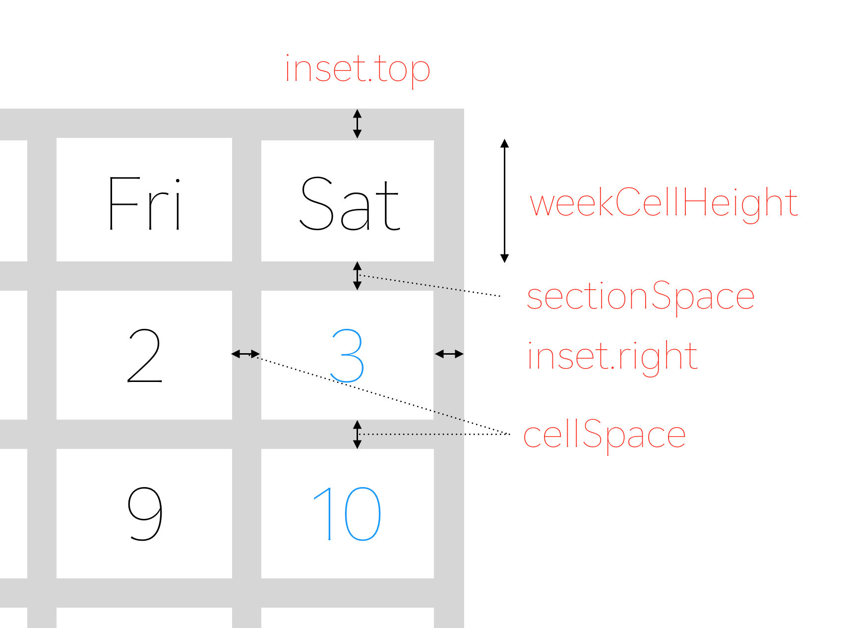
koyomi.inset = UIEdgeInsets(top: 0.5, left: 0.5, bottom: 0.5, right: 0.5)
Set sectionSpace, cellSpace, weekCellHeight in initialization or Interface Builder.
Customize text postion
    public enum ContentPosition {
        case topLeft, topCenter, topRight
        case left, center, right
        case bottomLeft, bottomCenter, bottomRight
        case custom(x: CGFloat, y: CGFloat)
    }
You can configure text postion.
    // default is .center
    koyomi.dayPosition = .topRight
    koyomi.weekPosition = .center

    // custom case
    koyomi.dayPosition = .custom(x: 1.2, y: 2.3)
Customize text font
    // set Day and Week Label Font
    koyomi
        .setDayFont(size: 12)
        .setWeekFont(size: 8)

    // if want to change font name,
    setDayFont(fontName: ".SFUIText-Medium", size: 12)
Customize weeks text
   koyomi.weeks = ("Sun", "Mon", "Tue", "Wed", "Thu", "Fri", "Sat")

   // configure with index
   koyomi.weeks.0 = "Sun"
   koyomi.weeks.1 = "Mon"
   koyomi.weeks.2 = "Tue"
   ...
Customize color properties
    // Support @IBInspectable properties
    @IBInspectable public var sectionSeparatorColor: UIColor
    @IBInspectable public var separatorColor: UIColor
    @IBInspectable public var weekColor: UIColor
    @IBInspectable public var weekdayColor: UIColor
    @IBInspectable public var holidayColor: UIColor
    @IBInspectable public var otherMonthColor: UIColor
    @IBInspectable public var dayBackgrondColor: UIColor
    @IBInspectable public var weekBackgrondColor: UIColor
    @IBInspectable public var selectedStyleColor: UIColor
You can configure the lots of color properties for appearance :weary:
Don't worry :stuck_out_tongue_closed_eyes:, you can easily configure appearance by using KoyomiStyle.
koyomi.style = .tealBlue
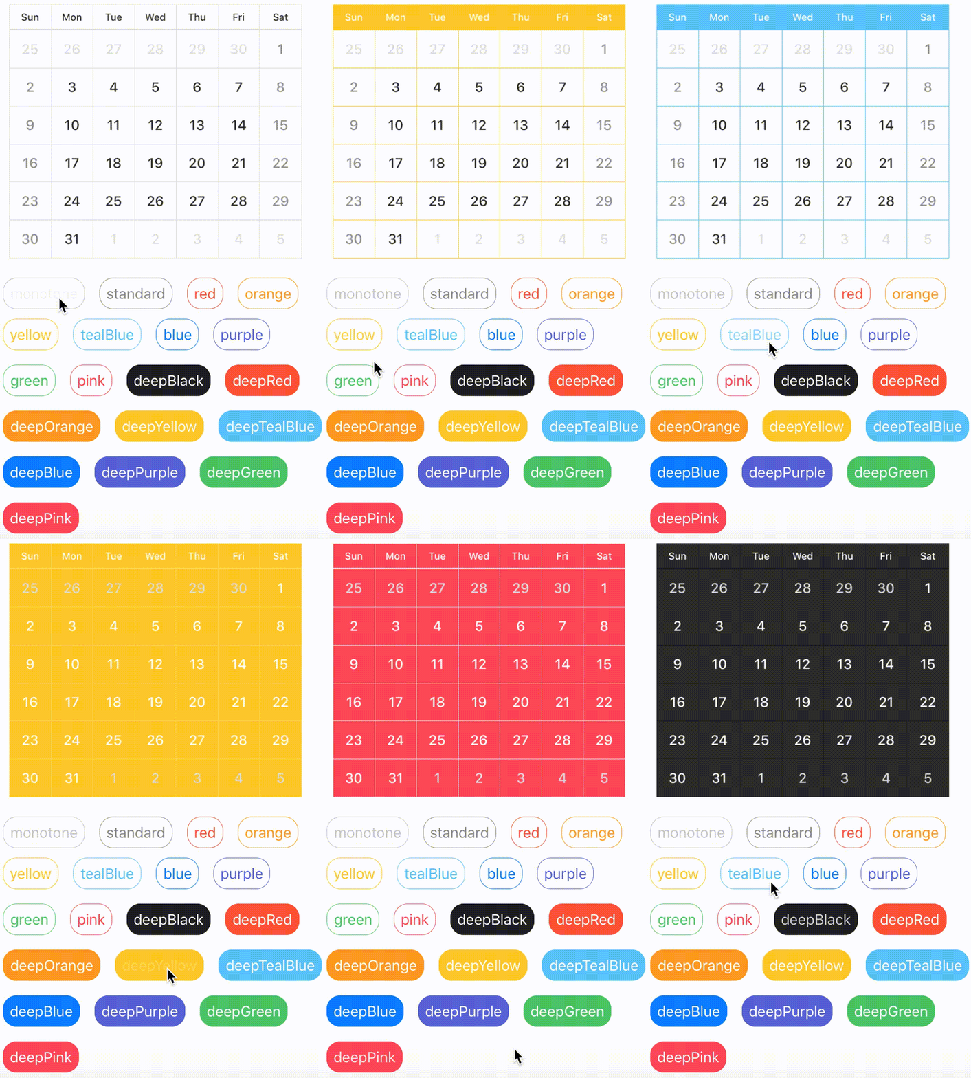
KoyomiStyle is defined by 19 types + 1 custom.
used iOS Human Interface Guidelines as reference
    enum KoyomiStyle {
        // basic color style
        case monotone, standard, red, orange, yellow, tealBlue, blue, purple, green, pink
        // deep color style
        case deepBlack, deepRed, deepOrange, deepYellow, deepTealBlue, deepBlue, deepPurple, deepGreen, deepPink

        case custom(customColor: CustomColorScheme)
    }
To use a custom color scheme, you need to define tuple with the necessarry values
    // This is a replica of the `.deepRed` style, you can unleash your creativity here:
    let customColorScheme = (dayBackgrond: UIColor.KoyomiColor.red,
                           weekBackgrond: UIColor.KoyomiColor.red,
                           week: .white,
                           weekday: .white,
                           holiday: (saturday: UIColor.white, sunday: UIColor.white),
                           otherMonth: UIColor.KoyomiColor.lightGray,
                           separator: UIColor.KoyomiColor.orange)

    koyomi.style = KoyomiStyle.custom(customColor: customColorScheme)
Requirements
- iOS 8.0+
- Xcode 8.0+
- Swift 3.0+
Installation
Installation of Swift 2.3
Please install version 0.1.6 or earlier.
pod 'Koyomi', '~> 0.1.6'
CocoaPods
Koyomi is available through CocoaPods.
To install it, simply add the following line to your Podfile:
pod "Koyomi"
Carthage
Add the following line to your Cartfile:
github "shoheiyokoyama/Koyomi"
App using Koyomi
If you're using Koyomi in your app, please open a PR to add it to this list! :blush:
Author
shoheiyokoyama, [email protected]

