StepperView
SwiftUI iOS component for Step Indications.
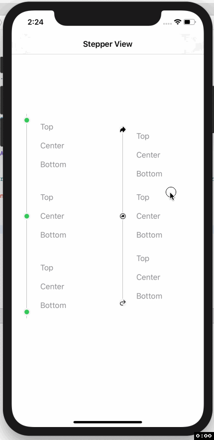
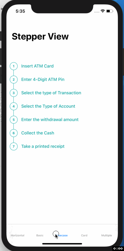
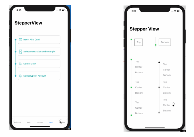
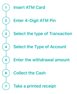
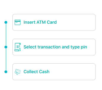
Usecase
 |
 |
 |
Example
To run the example project, clone the repo, and run pod install from the Example directory first.
Requirements
- iOS 13.0+
- Xcode 11.2+
- Swift 5.0+
- CocoaPods 1.6.1+
Installation
StepperView is available through CocoaPods. To install
it, simply add the following line to your Podfile.
pod 'StepperView','~> 1.2.0'
Swift Package Manager
StepperView is available through Swift Package Manager. To install it, simply add the following dependency to your Package.swift
.package(url: "https://github.com/badrinathvm/StepperView.git", from: "1.2.0")
Usage
import StepperView
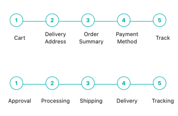
let steps = [ Text("Cart").font(.caption),
Text("Delivery Address").font(.caption),
Text("Order Summary").font(.caption),
Text("Payment Method").font(.caption),
Text("Track").font(.caption)]
let alignments = [StepperAlignment.center,.center,.center, .center, .center]
let indicationTypes = [StepperIndicationType.custom(NumberedCircleView(text: "1")),
.custom(NumberedCircleView(text: "2")),
.custom(NumberedCircleView(text: "3")),
.custom(NumberedCircleView(text: "4")),
.custom(NumberedCircleView(text: "5"))]
var body: some View {
var body: some View {
StepperView()
.addSteps(self.set1)
.indicators(self.indicationTypes)
.stepIndicatorMode(StepperMode.horizontal)
.spacing(50)
.lineOptions(StepperLineOptions.custom(1, Colors.blue(.teal).rawValue))
}
}
Methods ( View Modifiers )
- .addSteps(_ steps: [View]) : array of views to be rendered next to step Indicator
- .alignments(_ alignments: [StepperAlignment]) : optional defaults to .center, for custom options it can be either .top, .center, or .bottom sections
- .indicatorTypes(_ indicators:[StepperIndicationType]): enum provides the options to use .circle(color, width) , .image(Image, width) or .custom(AnyView)
- .lineOptions(_ options: StepperLineOptions): to customize the line for thickness and color options.
- .spacing(_ value: CGFloat): spacing between each of the step views.
- .stepIndicatorMode(_ mode: StepperMode): enum provides the option of vertical or horizontal node for display step indications.
Refer Example for more details on usage of StepperView
Author
Badarinath Venkatnarayansetty