Patterns
SwiftUI tiling black and white patterns.
This project contains PatternView, which is built out of Tiles with a given
TileDesign.
It also includes a TilePicker that can be used to control the selected
design.
Available Tile Designs
The TileDesign enum contains the following patterns (shown in the image from
top left to bottom right)

.grid.dottedGrid.stitch.curvedTile.brick.tile.shadowGrid.circles.trees.shingles.wicker.rhombus.balls
Usage
The PatternView view will tile the selected design in its frame. It has the
following properties:
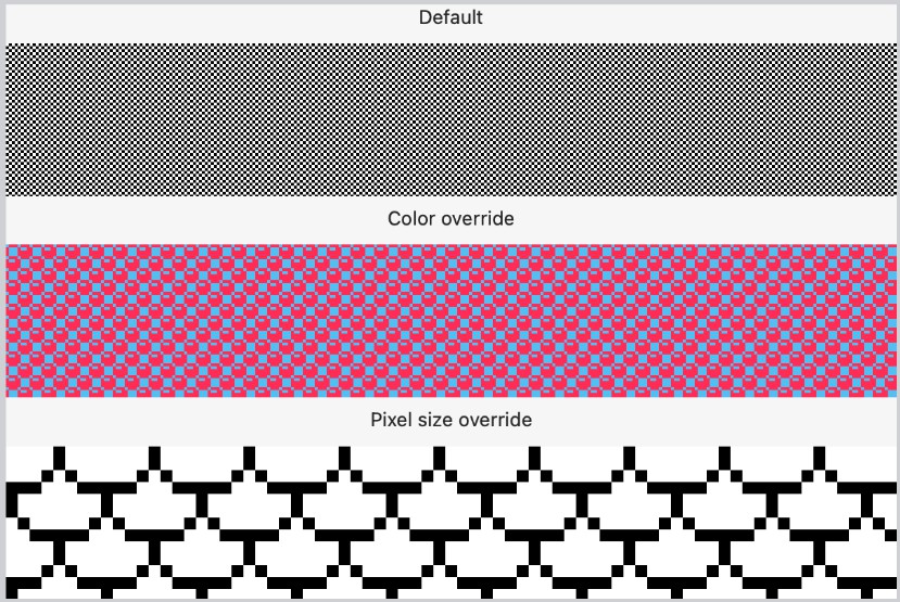
design: Binding<TileDesign>: required, which design to use to tile the frame.pixelSize: CGFloat: defaults to 2.0, the size of a pixel in the tile.foregroundColor: Color: defaults toColor.black, the foreground color.backgroundColor: Color: defaults toColor.white, the background color.
// PatternView using default settings
PatternView(design: .constant(TileDesign.shadowGrid))

// PatternView using overrides
PatternView(design: $tileDesign, pixelSize: 4.0, foregroundColor: .pink, backgroundColor: .cyan)
Screenshots of the Patterns

Using the PatternPicker
The pattern picker view is intended to be used when you want to allow users to change the design of the pattern.
selectedDesign: Binding<TileDesign>: required, the current selected tile design.selectedColor: Color: defaults toColor.accentColor, the color of the border around the selected tile design.
It also has pixelSize, foregroundColor, and backgroundColor with the
same effect as Pattern mentioned above
@State var design: TileDesign = .brick
@State var shouldShowPatternPicker = false

...

PatternView(design: $design)
  .frame(width: 32.0).border(.black)
  .onTapGesture {
    shouldShowPatternPicker = !shouldShowPatternPicker;
  }
  .popover(isPresented: $shouldShowPatternPicker) {
    PatternPicker(selectedDesign: $design)
  }
  .onChange(of: design) { _ in
    shouldShowPatternPicker = false;
  }
Screenshots of the Pattern Picker

Supported Platforms
- macOS 12+
- iOS 15+
- tvOS ?+
- watchOS 8+
- catalyst 15+
The TileImage struct
If you’d like to do other things with the individual tiles, we also provide the TileImage struct, which generates a CGImage.
The tiles support similar properties as PatternView with the exception that
design: TileDesign: required, which design to use to tile the frame.pixelSize: CGFloat: defaults to 2.0, the size of a pixel in the tile.foregroundColor: CGColor: defaults to black, the foreground color.backgroundColor: CGColor: defaults to white, the background color.