DSFStepperView
A custom stepper text field.
Features
IBDesignablesupport so you can see and configure your stepper views in Interface Builder- Increment decrement buttons with repeat (click and hold to continuously increment/decrement)
- Editable via keyboard
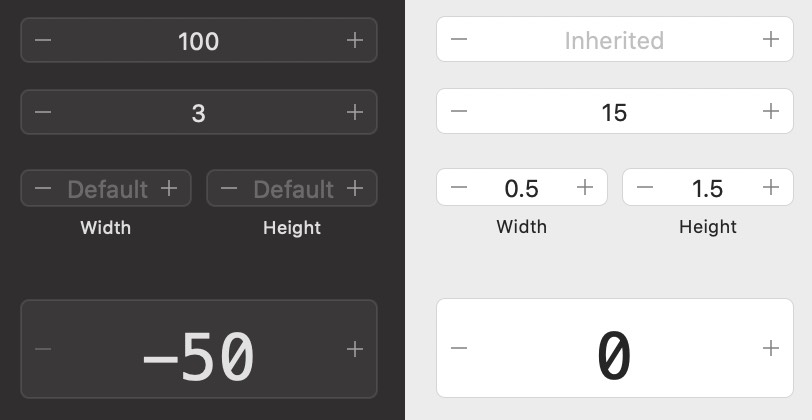
- Supports empty fields (useful for items that are 'default' or 'inherited' values)
- Set minimum/maximum and increment values. Support for float values (eg. increment by 0.01)
- Font name/size/color
- Optionally specify a NumberFormatter to display the value in the format you wish (for example, always showing 2 decimal places)
- Specify a delegate to receive value change updates, or bind to the field's value.
- Fully auto-layout managed
Usage
Add DSFStepperView to your project via Swift Package Manager, or copy the sources in the Sources/DSFStepperView directly to your project
Via Interface Builder
Add a new NSView instance using Interface Builder, then change the class type to DSFStepperView
Programatically
let stepperView = DSFStepperView(frame: .zero)
stepperView.minimum = -1.0
stepperView.maximum = 1.0
stepperView.allowsEmpty = true
...
// Set the control's value to 0.5
stepperView.floatValue = 0.5

// Clear the control's value
stepperView.floatValue = nil
Number Formatting
If you want to allow non-integer values (such as 0.5), you will need to provide a NumberFormatter instance to format and/or validate the value in the field. DSFStepperView provides a default NumberFormatter which provides integer only values in the range (-∞ ... ∞) which you can override.
let format = NumberFormatter()
format.numberStyle = .decimal

// Always display a single digit fractional value.
format.allowsFloats = true
format.minimumFractionDigits = 1
format.maximumFractionDigits = 1

stepperView.numberFormatter = format
Using a number formatter also allows you to have a stepper that supports (for example) 1st, 2nd, 3rd, 4th when displaying.
Customizations
Properties
These properties can all be configured via Interface Builder or programatically.
allowsEmpty: Allow the field to be empty. Useful if you want to display (for example) an 'inherited' or 'default' label (Bool)placeholder: The placeholder string to use when the field is empty (String)minimum: The minimum value to be allowed in the view (CGFloat)maximum: The maximum value to be allowed in the view (CGFloat)increment: The amount to increment or decrement the count when using the buttons (CGFloat)initialValue: The initial value to be displayed in the field (useful only for @IBDesignable support)fontName: The name of the font displaying the value (eg. Menlo). Defaults to the system font if the fontName cannot be resolved on the system. (String)fontSize: The size (in pts) of the font displaying the value (CGFloat)foregroundColor: The color of the font displaying the value (NSColor)numberFormatter: An optional number formatter for formatting/validating values in the viewisEnabled: Enable or disable the control