drawer-view
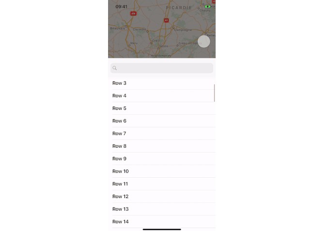
? Drawer View is a custom UI component replication of Apple's Apple Music player and Shortcuts components view (also can be seen in Maps app).
Installation
CocoaPods
drawer-view is availabe via CocoaPods
pod 'drawer-view', '~> 1.0.1'
Manual
You can always use copy-paste the sources method ?. Or you can compile the framework and include it with your project.
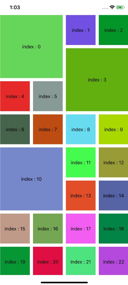
? Demo
Please wait while the .gif files are loading... (they are about 25Mb)


? Features
- Easy to use
- You only need to instantiate a class called
DrawerViewand add your UI components.
- You only need to instantiate a class called
- Flexible
API- Includes a number of customization points that allows to decorate the
DrawerViewas you'd like.
- Includes a number of customization points that allows to decorate the
- Callbacks
- You can use built-in callbacks in order to integrate animations or get the state changes.
- Behavior
- You may tell the component to close the drawer when the device is rotated or user interacts with the child components.
- Autolayout
- You don't need to do anything related to autolayout - the component properly handles all the changes. The only thing you need to do is to add your
UIcomponents and make sure that aulayout constraints are properly setup for them.
- You don't need to do anything related to autolayout - the component properly handles all the changes. The only thing you need to do is to add your
? Code Samples
Instantiation
The most simple instantiation: you only need to provide the superview:
let _ = DrawerView(superView: view)
You can specify how much space will be between top anchor of the DrawerView and the superview by setting topLayoutGuidePadding property and how tall the DrawerView will be when it is closed by setting closedHeight property:
let _ = DrawerView(topLayoutGuidePadding: 100, closedHeight: 82, superView: view)
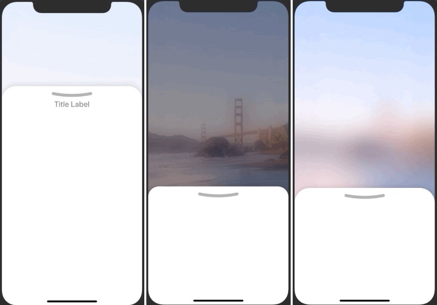
You can specify blur effect and its type. It will be animated alongside with the drawer view. There are several styles for blur:
let _ = DrawerView(blurStyle: .light, superView: view)
By default the DrawerView will include a visual indicator called LineArrow. LineArrow is an indicator that decorates the view and helps a user with interaction. You can change the properties of the indicator by setting its height, width and color:
let _ = DrawerView(lineArrow: (height: 8, width: 82, color: .black), superView: view)
// Or you can set `nil` in order to turn the indicator off
You can change the behavior of the component when a device is rotated. By default the DrawerView will not be closed when a device is rotated. However, you can change this behavior:
drawerView.closeOnRotation = true
You can programmatically change the state of the component:
drawerView.change(state: .open, shouldAnimate: true)
By default, interactions with the child views don't affect the DrawerView anyhow. However, you can change this behavior and allow the DrawerView to be dismissed when one of the child views are interacted:
drawerView.closeOnChildViewTaps = true
There is an animation closure that is used to animate the external components alongside with the DrawerView:
drawerView.animationClosure = { state in
    switch state {
    case .open:
      someOtherView.alpha = 1.0
    case .closed:
      someOtherView.alpha = 0.0
  }
}
You can optionally specify a completion closure that gets called when animation is completed:
drawerView.completionClosure = { state in
  switch state {
    case .open:
      service.launch()
    case .closed:
      service.dismiss()
    }
}
The third and final callback closure can be used to get DrawerViewstate changes:
drawerView.onStateChangeClosure = { state in
  state == .closed ? showDialog() : doNothing()
}
Also there are many other properties that be customized:
drawerView.cornerRadius = 60
drawerView.animationDuration = 2.5
drawerView.animationDampingRatio = 0.9
drawerView.shadowRadius = 0.25
drawerView.shadowOpacity = 0.132