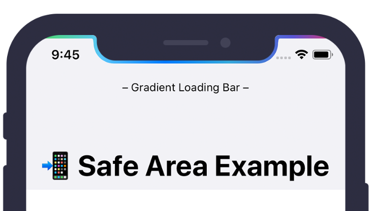
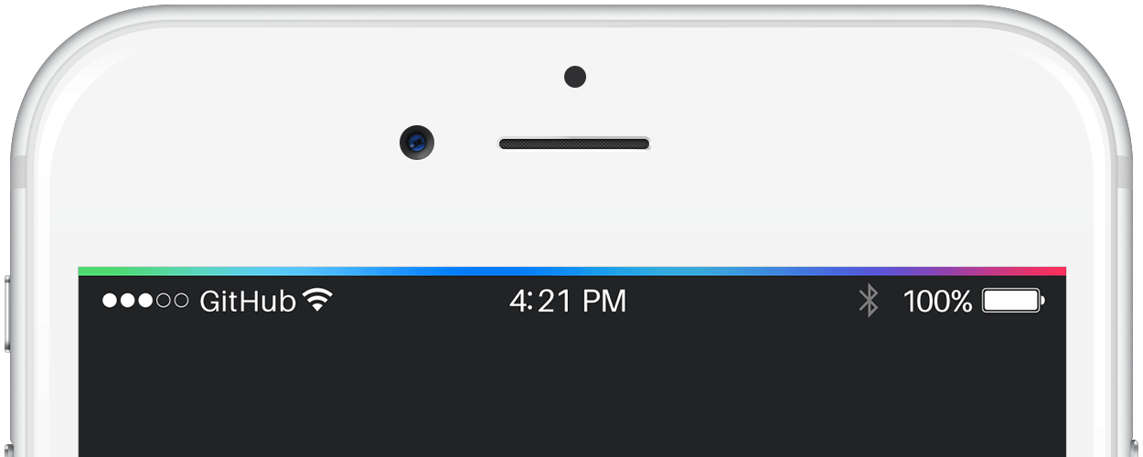
GradientLoadingBar
A customizable animated gradient loading bar. Inspired by iOS 7 Progress Bar from Codepen.
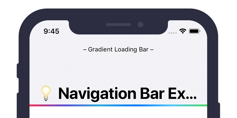
Example
To run the example project, clone the repo, and open the workspace from the Example directory.
Requirements
- Swift 5.0
- Xcode 10.2+
- iOS 9.0+
Integration
CocoaPods
CocoaPods is a dependency manager for Cocoa projects. For usage and installation instructions, visit their website. To integrate GradientLoadingBar into your Xcode project using CocoaPods, specify it in your Podfile:
pod 'GradientLoadingBar', '~> 2.0'
Carthage
Carthage is a decentralized dependency manager that builds your dependencies and provides you with binary frameworks. To integrate GradientLoadingBar into your Xcode project using Carthage, specify it in your Cartfile:
github "fxm90/GradientLoadingBar" ~> 2.0
Run carthage update to build the framework and drag the built GradientLoadingBar.framework, as well as the dependency LightweightObservable.framework, into your Xcode project.
Swift Package Manager
The Swift Package Manager is a tool for automating the distribution of Swift code and is integrated into the swift compiler. It is in early development, but Gradient Loading Bar does support its use on supported platforms.
Once you have your Swift package set up, adding Gradient Loading Bar as a dependency is as easy as adding it to the dependencies value of your Package.swift.
dependencies: [
    .package(url: "https://github.com/fxm90/GradientLoadingBar", from: "2.0.3")
]
How to use
This framework provides three classes:
- GradientLoadingBar: A controller, managing the visibility of the
GradientActivityIndicatorViewon the current key window. - NotchGradientLoadingBar: A subclass of
GradientLoadingBar, wrapping theGradientActivityIndicatorViewaround the notch of the iPhone. - GradientActivityIndicatorView: A
UIViewcontaining the gradient with the animation. It can be added as a subview to another view either inside the interface builder or programmatically. Both ways are shown inside the example application.
GradientLoadingBar
To get started, import the module GradientLoadingBar into your file and save an instance of GradientLoadingBar() on a property of your view-controller. To show the loading bar, simply call the fadeIn(duration:completion) method and after your async operations have finished call the fadeOut(duration:completion) method.
class UserViewController: UIViewController {

    private let gradientLoadingBar = GradientLoadingBar()

    // ...

    override func viewDidLoad() {
        super.viewDidLoad()

        gradientLoadingBar.fadeIn()

        userService.loadUserData { [weak self] _ in
            // ...
            // Be sure to call this on the main thread!
            self?.gradientLoadingBar.fadeOut()
        }
    }
}
Configuration
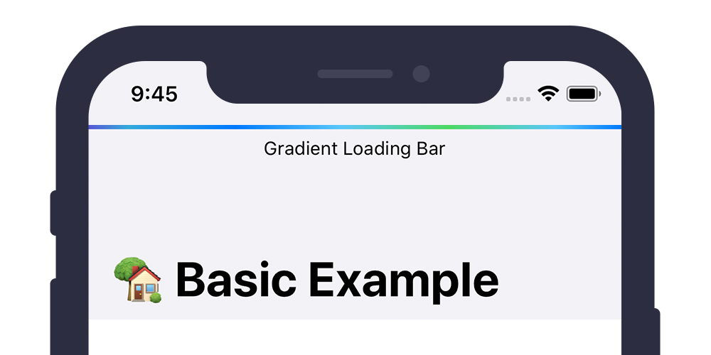
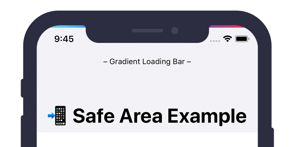
You can overwrite the default configuration by calling the initializers with the optional parameters height and isRelativeToSafeArea:
let gradientLoadingBar = GradientLoadingBar(
    height: 4.0,
    isRelativeToSafeArea: true
)
– Parameter height: CGFloat
By setting this parameter you can set the height for the loading bar (defaults to 3.0)
– Parameter isRelativeToSafeArea: Bool
With this parameter you can configure, whether the loading bar should be positioned relative to the safe area (defaults to true).
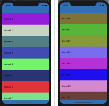
Example with isRelativeToSafeArea set to true.
Example with isRelativeToSafeArea set to false.
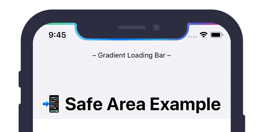
Note
There is a third option which will wrap the loading bar around the iPhone notch. See documentation of the class NotchGradientLoadingBar for further details.
Properties
– gradientColors: [UIColor]
This property adjusts the gradient colors shown on the loading bar.
– progressAnimationDuration: TimeInterval
This property adjusts the duration of the animation moving the gradient from left to right.
Methods
– fadeIn(duration:completion)
This method fades-in the loading bar. You can adjust the duration with corresponding parameter. Furthermore you can pass in a completion handler that gets called once the animation is finished.
– fadeOut(duration:completion)
This methods fades-out the loading bar. You can adjust the duration with corresponding parameter. Furthermore you can pass in a completion handler that gets called once the animation is finished.
Custom shared instance (Singleton)
If you need the loading bar on multiple / different parts of your app, you can use the given static shared variable:
GradientLoadingBar.shared.fadeIn()

// Do e.g. server calls etc.

GradientLoadingBar.shared.fadeOut()
If you wish to customize the shared instance, you can add the following code e.g. to your app delegate didFinishLaunchingWithOptions method and overwrite the shared variable:
GradientLoadingBar.shared = GradientLoadingBar(height: 5.0)
NotchGradientLoadingBar
This subclass of the GradientLoadingBar will wrap the loading bar around the notch of the iPhone.
For iPhones without a safe area, the behaviour stays the same as mentioned in the above documentation of the GradientLoadingBar.
let notchGradientLoadingBar = NotchGradientLoadingBar(
    height: 3.0
)
GradientActivityIndicatorView
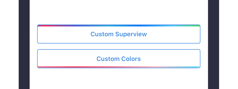
In case you don't want to add the loading bar onto the key-window, this framework provides the GradientActivityIndicatorView, which is a direct subclass of UIView. You can add the view to another view either inside the interface builder or programmatically.
E.g. View added as a subview to a UINavigationBar.
E.g. View added as a subview to a UIButton.
Note
The progress-animation starts and stops according to the isHidden flag. Setting this flag to false will start the animation, setting this to true will stop the animation. Often you don't want to directly show / hide the view and instead smoothly fade it in or out. Therefore the view provides the methods fadeIn(duration:completion) and fadeOut(duration:completion). Based on my gist, these methods adjust the alpha value of the view and update the isHidden flag accordingly.
Properties
– gradientColors: [UIColor]
This property adjusts the gradient colors shown on the loading bar.
– progressAnimationDuration: TimeInterval
This property adjusts the duration of the animation moving the gradient from left to right.
To see all these screenshots in a real app, please have a look at the example application. For further customization you can also subclass GradientLoadingBar and overwrite the method setupConstraints().
Troubleshooting
Interface Builder Support
Unfortunatly the Interface Builder support is currently broken for Cocoapods frameworks. If you need Interface Builder support, add the following code to your Podfile and run pod install again. Afterwards you should be able to use the GradientLoadingBar inside the Interface Builder :)
  post_install do |installer|
    installer.pods_project.build_configurations.each do |config|
      next unless config.name == 'Debug'

      config.build_settings['LD_RUNPATH_SEARCH_PATHS'] = [
        '$(FRAMEWORK_SEARCH_PATHS)'
      ]
    end
  end
Source: Cocoapods – Issue 7606
Author
Felix Mau (me(@)felix.hamburg)