EasyCustomTabBar


Example
To run the example project, clone the repo, and run pod install from the Example directory first.
Requirements
- iOS 14.0 or above
- SwiftUI
Installation
EasyCustomTabBar is available through CocoaPods. To install it, simply add the following line to your Podfile:
pod 'EasyCustomTabBar'
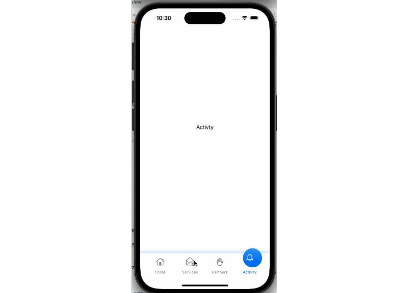
Usage
You can find Demo App from the git repository in Example directory.
To create custom tabbar with simple code follow the mentioned steps; Make sure to add EasyPin in Podfile & install it
Step 1
import EasyCustomTabBar in your code file
import EasyCustomTabBar
Step 2
Initialize array which will represent you tabbar items
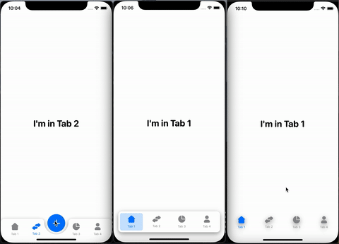
let items: [TabItem] = [
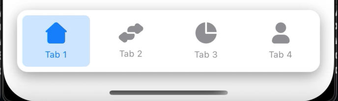
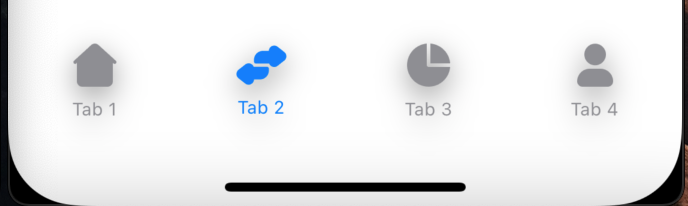
TabItem(title: "Tab 1", image: Image("tab1")),
TabItem(title: "Tab 2", image: Image("tab2")),
TabItem(title: "Tab 3", image: Image("tab3")),
TabItem(title: "Tab 4", image: Image("tab4"))]
Step 3
Initialize a State variable to keep track of active tabbar item’s index
@State var selectedTabIndex = 0
Step 4
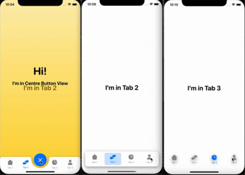
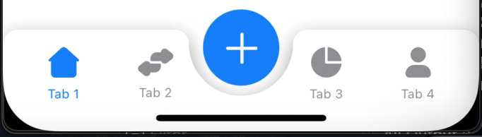
Choose the tabBarStyle according to your requirement. This will set the actual view of the tabbar. Available options are: simple, separate, centeredButton
- Centred Button
- Separate
- Simple
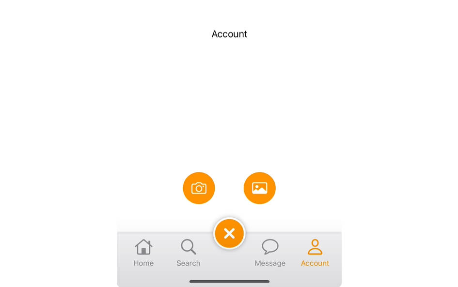
Step 5 (In case of Centred Button Tabbar Style)
If you want centred button tabbar style then initialize boolean State variable otherwise you can skip this step
@State var centreBtnPressed: Bool? = false
Step 6
In your body add a ZStack with following properties:
ZStack {
    // Here next code will be implemented
}.frame(alignment: .bottom)
Step 7
Now you can simply create your tabbar with following code.
- tabs: Array of tabbar items
- selection: Index of active tabbar item
- tabBarStyle: You can choose between simple, separate, centeredButton
- Please make sure that your index don’t exceed your array of tabbar items
ZStack {
        EasyCustomTabBar(tabs: items, selection: $selectedTabIndex, tabBarStyle: .centeredButton) {
        Tab1()
            .frame(maxWidth: .infinity, maxHeight: .infinity)
            .tabBarItem(tab: items[0], tabIndex: 0, selection: $selectedTabIndex)

        Tab2()
            .frame(maxWidth: .infinity, maxHeight: .infinity)
            .tabBarItem(tab: items[1], tabIndex: 1, selection: $selectedTabIndex)

        Tab3()
            .frame(maxWidth: .infinity, maxHeight: .infinity)
            .tabBarItem(tab: items[2], tabIndex: 2, selection: $selectedTabIndex)

        Tab4()
            .frame(maxWidth: .infinity, maxHeight: .infinity)
            .tabBarItem(tab: items[3], tabIndex: 3, selection: $selectedTabIndex)

        // [Optional] In case of centred button tabbar style write the below code
        if centreBtnPressed == true {
            CentreButtonView()
        }
    }
    // [Optional] In case of centred button tabbar style write this
    .centreBtnPressed($centreBtnPressed)
    .centreBtn(TabItem(title: "", image: Image("ImageName")))

}.frame(alignment: .bottom)
Here Tab1(), Tab2(), Tab3(), Tab4() are the views which you want to open on tab selection. You can create them separately. In case of centre button action add the optional code provided in above code
Step 8 (Customization)
You can highly customize the tabbars with some properties. Here are some properties which you can add on your EasyCustomTabBar block
For Tabbar Customization:
- tabBarShadow
- tabBarCornerRadius
- tabBarColor
- tabBarHeight
For Tabbar Item Customization:
- tabItemFont
- tabItemActiveColor
- tabItemInActiveColor
- tabItemBgColor
For Centre Button Customization:
- centreBtn
- centreBtnRadius
- centreBtnPadding
- centreBtnOffsetY
- centreBtnHeightWidth
- centreBtnBgColor
- centreBtnTextColor
Author
Fahad Shafiq, [email protected]
License
EasyCustomTabBar is available under the MIT license. See the LICENSE file for more info.