MGSwipeCards
A flexible, multi-directional card swiping framework inspired by Tinder and built with Facebook's Pop animation library.

Features
- [x] Maximum customizability - create your own card template and card stack layout
- [x] Accurate swipe recognition based on velocity and card position
- [x] Programmatic swiping
- [x] Animated undo and card stack reordering
- [x] Smooth overlay view transitions
- [x] Dynamic card loading using data source/delegate pattern
Example
To run the example project, clone the repo and run the MGSwipeCards-Example target.
The example project uses the Tinder-inspired framework PopBounceButton, make sure to check it out!
Requirements
- iOS 9.0+
- Xcode 9.0+
- Swift 4.2
Installation
CocoaPods
MGSwipeCards is available through CocoaPods. To install it, simply add the following line to your Podfile:
pod 'MGSwipeCards'
Manual
- Download and drop the
MGSwipeCardsdirectory into your project. - Install Facebook's Pop library.
Contributing
- If you found a bug, open an issue and tag as bug.
- If you have a feature request, open an issue and tag as feature.
- If you want to contribute, submit a pull request.
- In order to submit a pull request, please fork this repo and submit a pull request from your forked repo.
- Have a detailed message as to what your pull request fixes/enhances/adds.
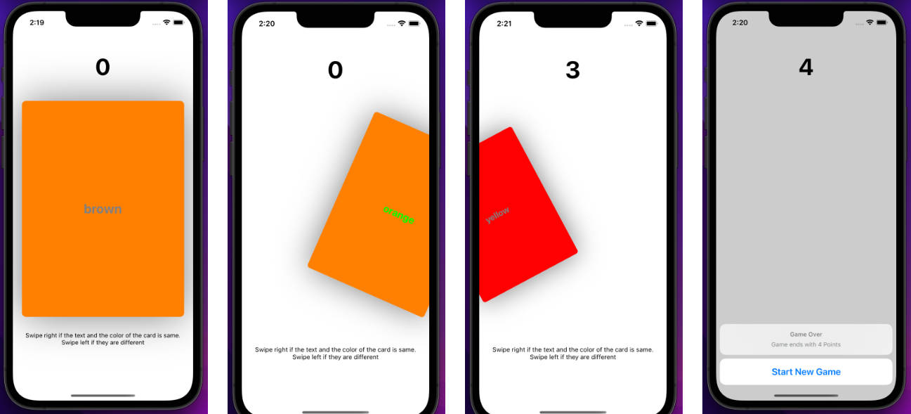
Quick Start
-
Create your own card by subclassing
MGSwipeCard. Our card simply displays an image.class SampleCard: MGSwipeCard { init(model: SampleCardModel) { self.content = UIImageView(image: model.image) } } struct SampleCardModel { var image: UIImage } -
Add a
MGCardStackViewto your view and implement to the protocolMGCardStackViewDataSource(make sure to set your card stack'sdataSourceproperty).class ViewController: UIViewController { let cardStack = MGCardStackView() var cardModels: [SampleCardModel] = [ SampleCardModel(image: UIImage(named: "cardImage1")), SampleCardModel(image: UIImage(named: "cardImage2")), SampleCardModel(image: UIImage(named: "cardImage3")) ] override func viewDidLoad() { super.viewDidLoad() view.addSubview(cardStack) cardStack.frame = view.safeAreaLayoutGuide.bounds.insetBy(dx: 10, dy: 50) cardStack.dataSource = self } } //MARK: - Data Source Methods extension ViewController: MGCardStackViewDataSource { func numberOfCards() -> Int { return cards.count } func card(forItemAtIndex index: Int) -> MGSwipeCard { return SampleCard(model: cardModels[index]) } } -
Happy swiping!
Architecture
There are two major components in the MGSwipeCards framework. The first is the MGCardStackView which displays the cards. It is responsible for managing the lifetime of the cards. The second component is the cards themselves. Each draggable MGSwipeCard contains the swipe logic and is responsible for notifying the card stack of a registered swipe.
MGCardStackView
To use a MGCardStackView, add it to your view and implement the MGCardStackViewDataSource protocol. Once the card stack's data source is set, the cards you provided will automatically be loaded. MGCardStackView exposes the following variables:
var delegate: MGCardStackViewDelegate?
var dataSource: MGCardStackViewDataSource?

var numberOfVisibleCards: Int = 2
var topCardIndex: Int

var cardStackInsets: UIEdgeInsets = UIEdgeInsets(top: 10, left: 10, bottom: 10, right: 10)
var animationOptions: CardStackAnimationOptions = .defaultOptions
Useful Methods
The following methods can be accessed from within MGCardStackView.
Swipe
Performs a swipe programmatically in the given direction. Any delegate methods are called as usual.
func swipe(_ direction: SwipeDirection)

Undo
Restores the card stack to its state before the last swipe.
func undoLastSwipe()

Shift
Shifts the card stack's cards by the given distance. Any previously swiped cards are skipped over.
func shift(withDistance distance: Int = 1, animated: Bool)

Custom Layouts
While the default card stack layout works great for a quick implementation, you can achieve your own layout by overriding the following method:
func transformForCard(at index: Int) -> CGAffineTransform
For all card stack layouts, the background cards will animate to their next position in response to any of the actions listed above.
Data Source & Delegates
To populate your card stack, you must conform your view controller to the MGCardStackViewDataSource protocol and implement the following required functions:
func numberOfCards(in cardStack: MGCardStackView) -> Int
func cardStack(_ cardStack: MGCardStackView, cardForIndexAt index: Int) -> MGSwipeCard
Once your card stack's dataSource property is set, your card stack will automatically be populated.
To react to swipes and other related events, you must conform your view controller to the MGCardStackViewDelegate protocol. The protocol contains the following (optional) methods:
func didSwipeAllCards(_ cardStack: MGCardStackView)
func cardStack(_ cardStack: MGCardStackView, didSwipeCardAt index: Int, with direction: SwipeDirection)
func cardStack(_ cardStack: MGCardStackView, didUndoCardAt index: Int, from direction: SwipeDirection)
func cardStack(_ cardStack: MGCardStackView, didSelectCardAt index: Int)
func cardStack(_ cardStack: MGCardStackView, didSelectCardAt index: Int, tapCorner: UIRectCorner)
NOTE: The didSwipeCardAt and didSwipeAllCards methods are called regardless if a card was swiped programmatically or by the user.
MGSwipeCard
The MGSwipeCard is a UIView with added gesture recognizers to handle swipe recognition and achieve the visual drag effect. It is also responsible for informing its parent card stack of a registered (or cancelled) swipe. To use a MGSwipeCard, we recommend you create a subclass of it and initialize your card's appearance following the instructions in the section below.
Each MGSwipeCard exposes the following properties:
var swipeDirections = SwipeDirection.allDirections

var content: UIView?
var footer: UIView?

var leftOverlay: UIView?
var upOverlay: UIView?
var rightOverlay: UIView?
var downOverlay: UIView?

var isFooterTransparent: Bool = false
var footerHeight: CGFloat = 100

var animationOptions: CardAnimationOptions = .defaultOptions
Card Appearance
Each MGSwipeCard consists of three UI components: its content view, footer view, and overlay view(s).
Content
The content view is the card's primary view. You can include your own card template here. The content view is set assigning the content variable.
Footer
The card's footer view is set just below the card's content view. To have the card's content continue past the footer view, set isFooterTransparent is to true. The footer's height is modified with footerHeight. The card's footer is set by assigning the footer variable.
Overlays
An overlay view is a view whose alpha value reacts to the user's dragging. The overlays are laid out above the card's footer, regardless if the footer is transparent or not. The card's overlays are set by assigning the leftOverlay, upOverlay, rightOverlay, and downOverlay variables.
MGDraggableSwipeView
Each MGSwipeCard is a subclass of MGDraggableSwipeView. It is here that the swipe recognition settings can be modified. The following properties of MGDraggableSwipeView are available:
var minimumSwipeSpeed: CGFloat = 1100
var minimumSwipeMargin: CGFloat = 0.5
var maximumRotationAngle: CGFloat = CGFloat.pi / 10
The default values have been optimized to feel natural to the user.
Sources
- Pop: Facebook's iOS animation framework.
- "Building a Tinder-esque Card Interface" by Phill Farrugia (on Medium)
Author
Mac Gallagher, [email protected]