TabBar
TabBar is a highly customizable tab bar view made in SwiftUI that functions similarly to TabView.
Installation
Requirement: iOS 15.0+
This package can be installed using the Swift Package Manager.
Usage
Similar to TabView, TabBar accepts a Binding value that conforms to Hashable.
import SwiftUI
import TabBar

struct ContentView: View {
    @State private var item: Int = 0

    var body: some View {
        TabBar(selection: $item) {
            HomeView()
                .tabItem(0) {
                    Image(systemName: item == 0 ? "house.fill" : "house")
                        .font(.title3)
                    Text("Home")
                        .font(.system(.footnote, design: .rounded).weight(item == 0 ? .bold : .medium))
                }
            MarksView()
                .tabItem(1) {
                    Image(systemName: item == 1 ? "star.fill" : "star")
                        .font(.title3)
                    Text("Marks")
                        .font(.system(.footnote, design: .rounded).weight(item == 1 ? .bold : .medium))
                }
            UserView()
                .tabItem(2) {
                    Image(systemName: item == 2 ? "person.fill" : "person")
                        .font(.title3)
                    Text("User")
                        .font(.system(.footnote, design: .rounded).weight(item == 2 ? .bold : .medium))
                }
        }
    }
}
TabBar provides a default style when no other modifiers are set.

With modifiers, it is easy to set the TabBar‘s styles.
TabBar(selection: $item) {
    // ...
}
.tabBarFill(.regularMaterial)
.tabBarMargins(top: 8, bottom: 8)
.tabBarPadding(top: 8, leading: 16, bottom: 8, trailing: 16)
.tabBarShape(RoundedRectangle(cornerRadius: 16, style: .continuous))
.tabBarShadow(radius: 1, y: 1)

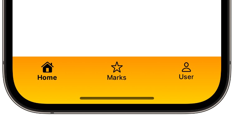
TabBar accepts any fill that conforms to the ShapeStyle protocol.
TabBar(selection: $item) {
    // ...
}
.tabBarFill(.linearGradient(colors: [.orange, .yellow],
                            startPoint: .top, endPoint: .bottom))
.tabBarMargins(top: 8, bottom: 8)

TabBar also accepts any background shape that conforms to the Shape protocol (e.g., Capsule).
TabBar(selection: $item) {
    // ...
}
.tabBarMargins(top: 8, bottom: 8)
.tabBarPadding(top: 8, leading: 16, bottom: 8, trailing: 16)
.tabBarShape(Capsule(style: .continuous))
.tabBarFill(.linearGradient(colors: [.yellow, .yellow.opacity(0.4)],
                            startPoint: .top, endPoint: .bottom))