ComposableFullscreenPopup
A library optimized for Composable Architecture, enabling easy presentation of customizable popups above the NavigationBar.
Motivation
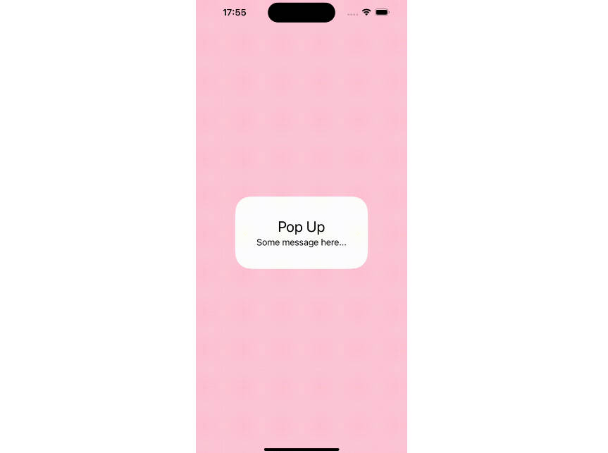
ComposableFullscreenPopup is an extension of the FullscreenPopup library, specifically designed for SwiftUI and optimized for use with Composable Architecture. This library addresses the challenges of displaying custom alerts in SwiftUI, particularly in scenarios involving modal views. Standard methods like using ZStack or overlay modifiers are limited, as they are constrained within the bounds of active modal views, preventing full-screen extensions crucial for capturing the user’s full attention.
Our solution leverages the fullscreenCover modifier, allowing custom alerts to be presented over the entire screen, irrespective of any active modal views. This ensures that custom alerts are not limited by modal boundaries, enabling them to completely cover the background content and prevent unintended interactions.
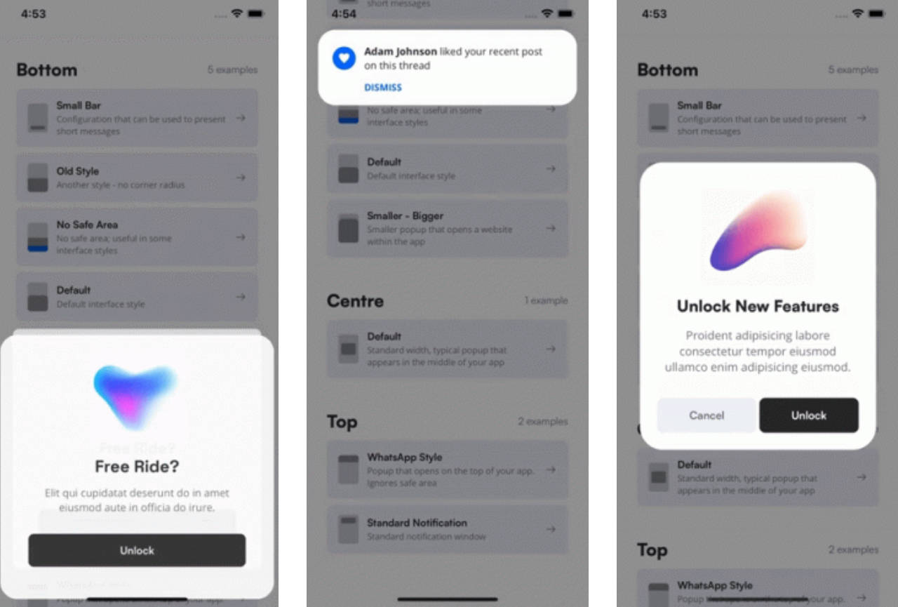
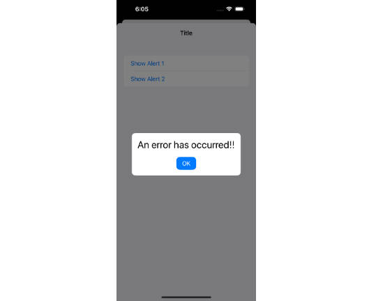
| ZStack or overlay | This Library |
|---|---|
 |
 |
Usage
Here’s how you can use it:
import SwiftUI
import ComposableArchitecture
import ComposableFullscreenPopup

@Reducer
public struct MyReducer: Reducer {
    public struct State: Equatable {
        @PresentationState var popup: PopupReducer.State?
        public init() {}
    }

    public enum Action {
        case popup(PresentationAction<PopupReducer.Action>)
    }

    public var body: some ReducerOf<Self> {
        Reduce { state, action in
            ...
        }
        .ifLet(\.$popup, action: \.popup) {
            PopupReducer()
        }
    }
}

public struct MyView: View {
    let store: StoreOf<MyReducer>
    ...
    public var body: some View {
        ...
        .popup(store.scope(state: \.$popup, action: { .popup($0) })) { store in
            PopupView(store: store)
        }
    }
}
Customizing Animation
You can also customize the animation by providing an animation parameter to the .popup modifier. Here’s an example:
.popup(store.scope(state: \.$popup, action: { .popup($0) }), duration: .seconds(0.5), animation: .easeIn(duration: 0.5)) {
    // Your custom popup content
}
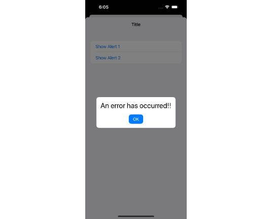
Warning The
durationparameter must be greater than thedurationof theanimation.
Customizing Background
You can also customize the background view that appears behind the popup. By default, a semi-transparent black view is used. To use a different view, provide a background parameter to the .popup modifier:
.popup(store.scope(state: \.$popup, action: { .popup($0) })) { isPresented in
    LinearGradient(gradient: Gradient(colors: [.blue, .purple]), startPoint: .top, endPoint: .bottom)
        .opacity(isPresented ? 0.5 : 0)
} content: {
    // Your custom popup content
}
Installation
let package = Package(
    name: "YourProject",
    ...
    dependencies: [
        .package(url: "https://github.com/Ryu0118/swift-composable-fullscreen-popup", exact: "0.1.0")
    ],
    targets: [
        .target(
            name: "YourTarget",
            dependencies: [
                .product(name: "ComposableFullscreenPopup", package: "swift-composable-fullscreen-popup"),
            ]
        )
    ]
)