FullscreenPopup
Library that can display popup above NavigationBar in SwiftUI
Motivation
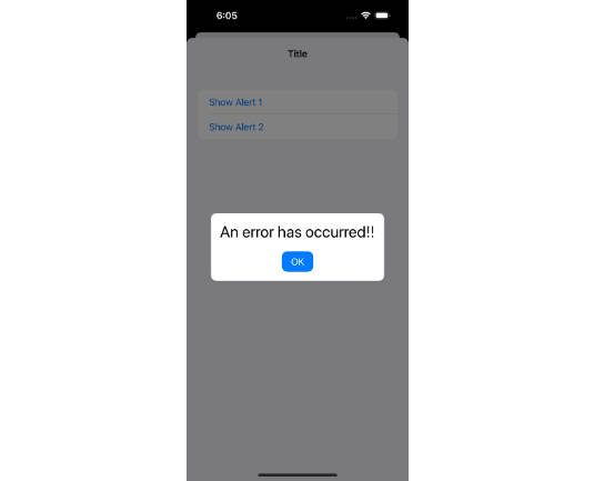
This library is crafted to tackle the specific challenges associated with displaying custom alerts in SwiftUI, especially when modal views are involved. In standard practice, developers might employ ZStack or the overlay modifier to layer additional views on top of existing ones. However, this method reveals its limitations when it comes to modal presentations.
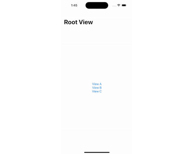
When a modal view is active, any additional views layered with ZStack or overlay are constrained within the bounds of the modal view. This restriction means they cannot extend over the entire screen, which is often a crucial requirement for custom alerts that need to capture the user’s full attention and prevent any interaction with the underlying content.
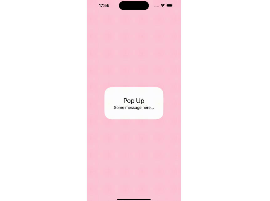
This library provides a solution by leveraging the fullscreenCover modifier, ensuring that the custom alert can be presented over the entire screen, regardless of any active modal views. This approach ensures that the custom alert is not limited by the boundaries of a modal view, allowing it to fully cover the background content and prevent unintended interactions.
| ZStack or overlay | This Library |
|---|---|
 |
 |
Usage
Here’s how you can use it:
import SwiftUI
import FullscreenPopup

public struct ContentView: View {
    @State var isPopupPresented = false
    public var body: some View {
        Button("show popup") {
            isPopupPresented = true
        }
        .popup(isPresented: $isPopupPresented) {
            // Your custom popup content
        }
    }
}
Customizing Animation
You can also customize the animation by providing an animation parameter to the .popup modifier. Here’s an example:
.popup(isPresented: $isPopupPresented, duration: .seconds(0.5), animation: .easeIn(duration: 0.5)) {
    // Your custom popup content
}
Warning
The duration parameter must be greater than the duration of the animation.
Customizing Background
You can also customize the background view that appears behind the popup. By default, a semi-transparent black view is used. To use a different view, provide a background parameter to the .popup modifier:
.popup(isPresented: $isExample1Presented) { isPresented in
    LinearGradient(gradient: Gradient(colors: [.blue, .purple]), startPoint: .top, endPoint: .bottom)
        .opacity(isPresented ? 0.5 : 0)
} content: {
    // Your custom popup content
}
Installation
let package = Package(
    name: "YourProject",
    ...
    dependencies: [
        .package(url: "https://github.com/Ryu0118/swift-fullscreen-popup", exact: "0.1.0")
    ],
    targets: [
        .target(
            name: "YourTarget",
            dependencies: [
                .product(name: "FullscreenPopup", package: "swift-fullscreen-popup"),
            ]
        )
    ]
)