CustomToggle – SwiftUI
Install
Swift Package Manager
Open Xcode, go to File -> Swift Packages -> Add Package Dependency and enter https://github.com/akardas16/CustomToggle.git as Branch main
You need to add import CustomToggle
Usage
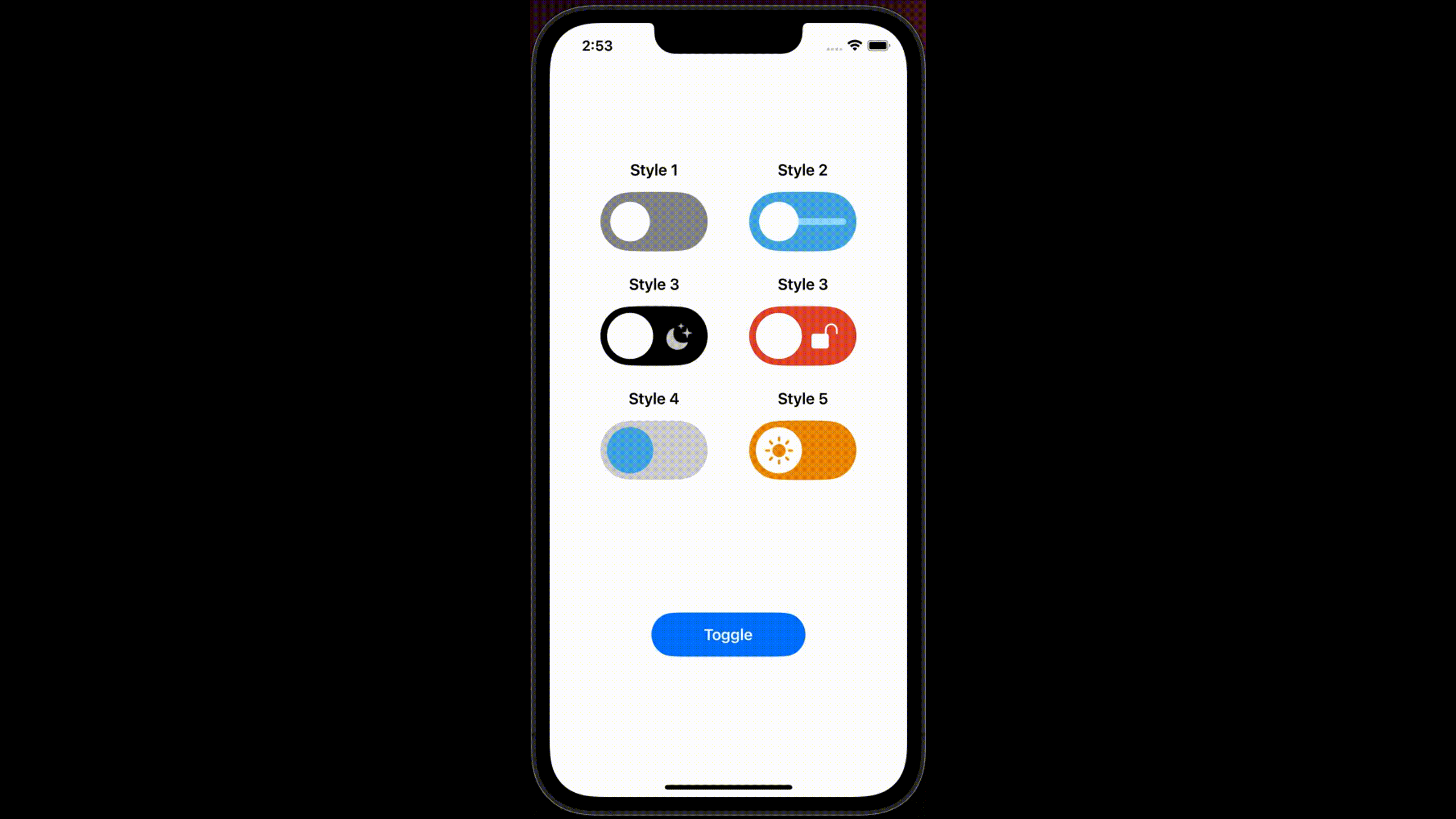
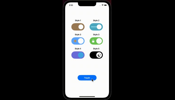
- See avaliable styles and their usages
Style 1
BounceToggle(status: $isOpen, colorClose: .gray, colorOpen: .brown, thumbColor: .white)
    //.scaleEffect(1.8).padding() // use scaleEffect to resize toggle
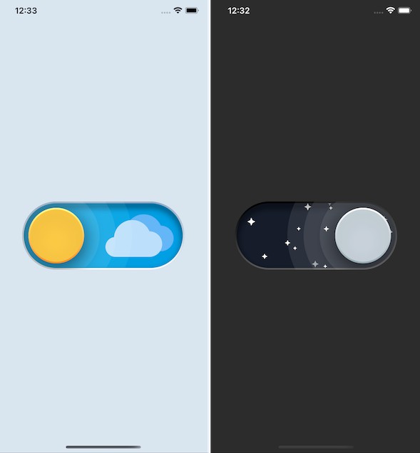
Style 2
BounceToggle(status: $isOpen, colorClose: .cyan, colorOpen: .teal, thumbColor: .white,enableLine: true)
Style 3
IconToggle(status: $isOpen) // see other parameters to customize fully
IconToggle(status: $isOpen, iconClose: "lock.fill", iconClsClr: .white, backClose: .red, iconOpen: "lock.open.fill", iconOpnClr: .white, backOpen: .green, thumbColor: .white)
Style 4
IconToggle(status: $isOpen, backClose: .gray.opacity(0.4), backOpen: .indigo.opacity(0.8), thumbColor: .cyan,disableIcon: true)
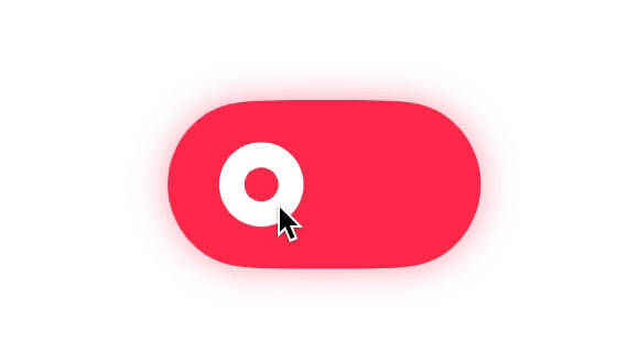
Style 5
ThumbToggle(status: $isOpen, backClose: .orange, backOpen: .black, thumbColor: .white)
Parameters
| Parameters | Meanings |
|---|---|
| status | shows status of toggle |
| iconClose | shows systemName of icon while toggle closed |
| iconClsClr | shows color of icon while toggle closed |
| iconOpen | shows systemName of icon while toggle opened |
| iconOpnClr | shows color of icon while toggle opened |
| backOpen | shows background color of toggle while opened |
| thumbColor | shows thumb color of toggle |
| enableLine | shows line on center of toggle (see style 2) |
-
Check out
ContentView.swiftto see all styles and usages -
This library is inspired by Lottie animations. Check out toggle animations on Lottie https://lottiefiles.com/search?q=toggle&category=animations