PagingView
A paging scroll view for SwiftUI, using internal SwiftUI components.
This is basically the same as TabView in the paging mode with the index style set to never.
The major difference is having control over the spacing / margins for items in the scroll view,
allowing you to create card-like where the next and previous cards can “peek”.

Documentation
Configuration
direction: Horizontal or Vertical. The direction the paging view scrolls in.margin: The margin at each end of the list of paging items in the paging direction.spacing: The spacing between each paging item in the paging direction.size: The size of each item in the paging direction.constrainedDeceleration: If true deceleration animations caused by drags may not scroll further than the size of the scroll view in the paging direction.
Example
Using TabView:
import SwiftUI

struct ContentView: View {
  var body: some View {
    TabView {
      Color.red
      Color.blue
      Color.green
    }
    .tabViewStyle(.page(indexDisplayMode: .never))
  }
}
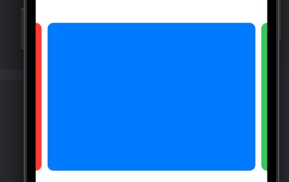
Using PagingView:
import SwiftUI
import PagingView

struct ContentView: View {
  var body: some View {
    PagingView {
      Color.red
      Color.blue
      Color.green
    }
  }
}
Card like interface:
import SwiftUI
import PagingView

struct ContentView: View {
  var body: some View {
    PagingView(config: .init(margin: 20, spacing: 10)) {
      Group {
        Color.red
        Color.green
        Color.blue
      }
      .mask(RoundedRectangle(cornerRadius: 10))
      .aspectRatio(1.4, contentMode: .fit)
    }
  }
}