TVOSPicker
This package provides a component that is missing from UIKit on tvOS – a picker view. The API and behaviour of the TVOSPickerView is heavily inspired by iOS UIPickerView.
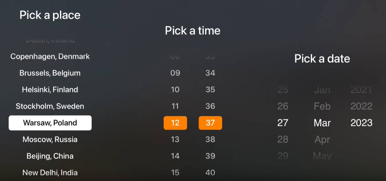
This package also provides a simple date picker built on top of the base TVOSPickerView component. Currently, it only supports Gregorian calendar.
demo.mp4
Requirements
- Swift 5.7
- tvOS 13+
Installation
Swift Package Manager
Add to your Package.swift:
dependencies: [
    .package(url: "https://github.com/ViacomInc/TVOSPicker.git", .upToNextMajor(from: "0.1.0"))
]
Usage
You can find a few usage examples in TVOSPickerViewExamples project in Examples directory.
TVOSPickerView
To use TVOSPickerView, add it to the view hierarchy and set the delegate property to an object conforming to TVOSPickerViewDelegate protocol. Delegate controls how many components are displayed (columns), how many rows are there in each component and what string to display in each row. Custom row views are not supported currently. Optionally, delegate can customize width of each column (by default, columns are of equal width) as well as accessibility labels for rows.
import TVOSPicker

...

// ViewController viewDidLoad
let picker = TVOSPickerView(
    style: .default, // pass custom style here if needed
    delegate: self
)
view.addSubview(picker)
... // setup frames/constraints

// to reload all components
picker.reloadData()
// to reload specific components
picker.reloadComponents([0, 2, 4])
// OR
picker.reloadComponent(1)

// ViewController TVOSPickerViewDelegate conformance
extension ViewController: TVOSPickerViewDelegate {
    func numberOfComponents(in pickerView: TVOSPickerView) -> Int {
        // number of components (columns)
    }

    func pickerView(_ pickerView: TVOSPickerView, numberOfRowsInComponent component: Int) -> Int {
        // number of rows in each component
    }

    func pickerView(_ pickerView: TVOSPickerView, titleForRow row: Int, inComponent component: Int) -> String? {
        // string to display in each row
    }

    func pickerView(_ pickerView: TVOSPickerView, didSelectRow row: Int, inComponent component: Int) {
        // update state with the newly selected row
    }

    func indexOfSelectedRow(inComponent component: Int, ofPickerView pickerView: TVOSPickerView) -> Int? {
        // provide an index of selected row - used as initially focused index as well as after each reloadData
    }
}
TVOSDatePickerView
TVOSDatePickerView is a view built on top of TVOSPickerView. It stores the picker delegate object and requires it to be a GregorianCalendarDatePickerDelegate. This delegate provides a default implementation for a picker with 3 components: day, month and year. Initializer parameters allow to configure order of components, locale, supported date ranges, initial date as well as custom formatters for days, months and years.
import TVOSPicker

...

// ViewController viewDidLoad
let picker = TVOSDatePickerView(
    delegate: GregorianCalendarDatePickerDelegate( // delegate supporting Gregorian calendar is provided with the package
        order: .dayMonthYear, // customize order of components
        locale: Locale.autoupdatingCurrent,
        minYear: 1950,
        initialDate: Date()
    )
)
picker.style = ... // by default TVOSDatePickerView uses .datePicker style, this can be overriden here
view.addSubview(picker)
... // setup frames/constraints

// to retrieve selected date
print(picker.date)
Contributing
Please read CONTRIBUTING.md for details on our code of conduct, and the process for submitting pull requests to us.
License
TVOSPicker is released under the Apache 2.0 license. See LICENSE for details.