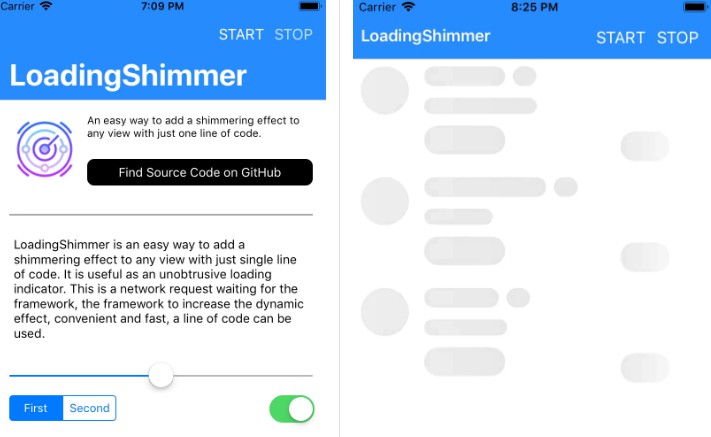
TABAnimated
The origin version of TABAnimated is the dynamic effect of the skeleton screen of the jianshu web page. I have explored the template mode in v1.9, but the repetitive workload is not conducive to rapid construction. Moreover, the existence of the two modes is unreasonable, so this setting is deleted in v2.1, but the appearance of the template mode to delete is not unproductive, but instead brings a more reasonable implementation scheme and a more convenient construction method.

Implementation Principle
TABAnimated requires a control view to make the switch animation. All subViews under this control view will be added to the animation queue.
TABAnimated creates TABCompentLayer by controlling the position of the subViews of the view and related information.
Normal control view with a TABLayer
Table view, each cell has a TABLayer
TABLayer is responsible for managing and displaying all TABCompentLayer.
When using constraints for layout, if the constraints are insufficient and there is no data, the location information of subViews will not be reflected, and TABAnimated will pre-populate the data.
Benefits
- Rapid integration
- Zero coupling, easy to wrap its animation logic into the base library
- High performance with minimal memory loss
- Chained syntax, fast and easy to read
- Fully customizable to fit 99.99% view
Evolution Process
Can't see clearly, you can zoom in
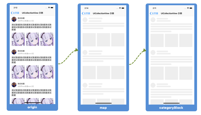
Briefly explain:
The first picture: the original table component, the display situation when there is data
The second picture: is the animation group mapped after the table component starts the animation. I believe you can see that the effect is not very beautiful.
The third picture: for this unsightly animation group, through the callback, pre-processing, the following description
Effects
| Dynamic | Card View | Bin Animation |
|---|---|---|
 |
 |
 |
| Shimmer Animation | Segment View | Drop Animation |
|---|---|---|
 |
 |
 |
Installation
Using CocoaPods
Pod 'TABAnimated'
Manual Import
Drag the TABAnimated folder into the project.
Usage
You only need four steps
- Initialize
TABAimatedindidFinishLaunchingWithOptions
There are other global properties, which are presented below in a table.
// init `TABAnimated`, and set the properties you need.
[[TABAnimated sharedAnimated] initWithOnlySkeleton];
// open log
[TABAnimated sharedAnimated].openLog = YES;
- Control view initialization tabAnimated
Ordinary view:
self.mainView.tabAnimated = TABViewAnimated.new;
self.mainView.tabAnimated.categoryBlock = ^(UIView * _Nonnull view) {
        View.animation(1).width(200);
        View.animation(2).width(220);
        View.animation(3).width(180);
 };
Table component:
_collectionView.tabAnimated =
[TABCollectionAnimated animatedWithCellClass:[NewsCollectionViewCell class]
                                    cellSize:[NewsCollectionViewCell cellSize]];
_collectionView.tabAnimated.categoryBlock = ^(UIView * _Nonnull view) {
        View.animation(1).reducedWidth(20).down(2);
        View.animation(2).reducedWidth(-10).up(1);
        View.animation(3).down(5).line(4);
        View.animations(4,3).radius(3).down(5);
};
- Turn on the animation
[self.collectionView tab_startAnimation];
- Turn off the animation
[self.collectionView tab_endAnimation];
UIView corresponds to TABViewAnimated
UITableView corresponds to TABTableAnimated
UICollectionView corresponds to TABCollectionAnimated
There are also other initialization methods that support multiple sections.
In general, the registered cell can be mapped with the original cell.
Special application scenarios:
For example, there are many types of Sina Weibo post pages.
Such a complicated page, rising to the animation level is definitely to design a unified animation.
At this time, you can rewrite a cell, then register to the form, and map out the visual effects you want through this framework. This is also the evolution of the template function.
For additional details, continue to add additional documentation or view it on the github demo.
Extended Callback
The extension callback gives the animation group to the developer, which the developer can adjust.
Because it is an adjustment, the chain syntax is added to allow developers to adjust quickly and easily.
_collectionView.tabAnimated.categoryBlock = ^(UIView * _Nonnull view) {
        View.animation(1).reducedWidth(20).down(2);
        View.animation(2).reducedWidth(-10).up(1);
        View.animation(3).down(5).line(4);
        View.animations(4,3).radius(3).down(5);
};
Parameter description (also detailed in the framework)
| Chained Function Name | Meaning |
|---|---|
| view.animation(x) | The animation of the specified subscript of the view TABCompentLayer |
| view.animations(x,x) | The view specifies a range of animated individual arrays for uniform adjustments |
| up(x) | How much to move up |
| down(x) | How much to move down |
| left(x) | How much to move to the left |
| right(x) | How much to move to the right |
| height(x) | Modify Height |
| width(x) | Modify Width |
| reducedWidth(x) | How much is the width compared to before |
| reducedHeight(x) | How much is the height compared to before? |
| radius(x) | Fillet |
| remove() | Move out animation group |
| toLongAnimation() | Give Dynamic Variable Length Animation |
| toShortAnimation() | Give Dynamic Short Animation |
Functions that require special instructions:
line(x): number of lines
space(x): spacing
lastScale(x): the scale factor of the last line and the original width. The default value is 0.5.
If it is multi-line text, it will be assigned according to the number of numberOfLines of the text.
Note that ordinary animation elements can also achieve the special effects of multiple lines by setting these three properties.
special reminder:
- In the
TABAnimated.hfile, there are global animation parameters- In
TABViewAnimated.h, there are parameters for all animations in the control view- The above chained grammar, modified by specific animated individuals
priority:
Animated Individual Parameter Configuration > Control View Animation Parameter Configuration > Global Animation Parameter Configuration
Drop Animation
- dropIndex(xxx): means the subscript setting for discoloration,
In general, if you don't set it up, the framework will be set up in the order in which the views are added to the view, which of course is far from satisfactory.
for example:

The first three animation elements in this effect are discolored together, and are the first color change, that is, the color change subscript is 0.
If you follow the default settings of the framework, then their color-changing subscripts are 0, 1, 2, respectively.
Obviously not meeting the demand.
At this time, you have to set it by dropIndex(xxx).
The framework is available in 2 ways:
view.animations(0,3).dropIndex(0);
view.animation(0).dropIndex(0);
view.animation(1).dropIndex(0);
view.animation(2).dropIndex(0);
- Falling multiple lines of label in an animation
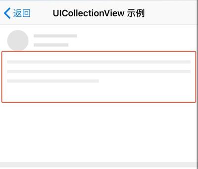
All skeletons of the framework are mapped based on your original view.
If your view is UILabel and numberOfLines is not 1, then the frame will be considered as multiple lines of text.
At this point, it involves two chained grammars.
lines(xxx), meaning to modify the number of lines in the red box
space(xxx), meaning to modify the spacing in the red box
Of course, if an ordinary element can also be set to achieve the same effect, do you understand? ? ?
At this point, it is only the old content, in case some children have not used it, do not understand.
Based on this particularity,
dropFromIndex(xxx) came into being, meaning that the three elements in the red box start to change color from the subscript xxx
**Specific point: view.animation(xxx).lines(3).dropFromIndex(3);
Means: Three elements in the red frame, the first color change subscript is 3, the second color change subscript is 4, and the third color change subscript is 5. **
-
removeOnDrop(): means that the animated element does not wish to participate in discoloration
-
dropStayTime(xxx): color retention time ratio, default 0.2
Tips
- Q: Which animation component corresponds to which component?
answer:
If you build with pure code, then you add the subscripts of the animation array corresponding to the component order,
For example, if the first one is added to the cell, then its corresponding animation component is: view.animation(0)
And so on, just open your cell file and look at the hierarchy to make adjustments.
However, if you create with xib, it's a pity to tell you that the order is the order in which the xib files are associated.
The xib in the demo did a wrong demonstration, and there was a pit of caution.
There are no other good ways to find it, and I hope to collect your suggestions.
UILabelwith Multi-line
As mentioned above, here again,
You can use .line(x) to set the number of lines. space(x) to set the spacing.
Each animation component can set these two properties to achieve the same effect.
- Specify the initialization method of section loading animation
For example, animatedSectionArray = @[@(3), @(4)];
This means the first element in the cellHeightArray, animatedCountArray, cellClassArray, is the animation data when section == 3.
// Some sections have animations

_tableView.tabAnimated =
[TABTableAnimated animated WithCellClassArray:@[[TestTableViewCell class]]
                              cellHeightArray:@[@(100)]
                           animatedCountArray:@[@(1)]
                         animatedSectionArray:@[@(1)];

_tableView.tabAnimated.categoryBlock = ^(UIView * _Nonnull view){
    view.animation(1).down(3).height (12).toShortAnimation();
    view.animation(2).height(12).width(110).toLongAnimation();
    view.animation(3).down(-5).height(12);
}
- Expand the callback when using multiple sections
_collectionView.tabAnimated.categoryBlock = ^(UIView * _Nonnull view) {

      If ([view isKindOfClass:[CourseCollectionViewCell class]]) {

      }

      If ([view isKindOfClass:[DailyCollectionViewCell class]]) {
            View.animations(1,3).height(14);
            View.animation(2).down(6);
            View.animation(1).up(1);
            View.animation(3).up(6);
      }
  };
- For nested table components, the
isNestattribute of the table component to be nested needs to be set toYES. See demo for details.
_collectionView.tabAnimated = [[TABAnimatedObject alloc] init];
_collectionView.tabAnimated.isNest = YES;
_collectionView.tabAnimated.animatedCount = 3;
- Specify section end animation
/**
  Ending animation for a specific partition, there is no animation in all partitions, it will automatically be set to end animation state

  @param section Specify section
  */
- (void)tab_endAnimationWithSection:(NSInteger)section;
Attribute Related
| Initialization Method | Name |
|---|---|
| initWithOnlySkeleton | Skeleton Screen |
| initWithBinAnimation | Breathing Light Animation |
| initWithShimmerAnimated | Shimmer Animation |
| initWithDropAnimated | Drop Animation |
If the control view's superAnimationType is set, it will be loaded with the animation type declared by superAnimationType
**Global animation properties: **
Instructions
[TABAnimated shareAnimated].xxx = xxx;
| Property Name | Applicable Animation | Meaning | Default |
|---|---|---|---|
| animatedColor | General | Animated Color | 0xEEEEEE |
| animatedBackgroundColor | General | Animated Background Color | UIColor.white |
| animatedDuration | Dynamic Animation | Move back and forth | 1.0 |
| longToValue | Dynamic Animation | Scale | 1.9 |
| shortToValue | Dynamic Animation | Scale | 0.6 |
| animatedDurationShimmer | Shimmer Animation | Movement Duration | 1.5 |
| animatedHeightCoefficient | General | Height Coefficient | 0.75 |
| useGlobalCornerRadius | General | Open Global Fillet | NO |
| animatedCornerRadius | General | Global Fillet | 0. |
| openLog | Universal | Open Log | NO |
| useGlobalAnimatedHeight | without UIImageView | use Global Animated Height | NO |
| animatedHeight | without UIImageView | Global Animated Height | 12. |
| dropAnimationDuration | drop Animation | drop duration | 0.4 |
| dropAnimationDeepColor | drop Animation | changed color | 0xE1E1E1 |
All animation property configurations under control view:
Instructions
_tableView.tabAnimated.xxx = xxx;
| Property Name | Scope | Meaning | Default |
|---|---|---|---|
| superAnimationType | General | This control view animation type | Default global properties |
| animatedCount | Table Components | Number of Animations | Filling the Table Visible Area |
| animatedColor | General | Animated Content Color | UIColor.white |
| animatedBackgroundColor | General | Animated Background Color | 0xEEEEEE |
| cancelGlobalCornerRadius | General | Unused Global Fillet | NO |
| animatedCornerRadius | General | Animated fillets in this control view | 0. |
| animatedHeight | General | Animation height under this control view | 0. |
| isAnimating | General | Is it in animation | \ |
| isNest | General | Is it a nested table | NO |
| canLoadAgain | General | Is it can load again | NO |
| dropAnimationDuration | drop Animation | drop duration | 0.4 |
| dropAnimationDeepColor | drop Animation | changed color | 0xE1E1E1 |