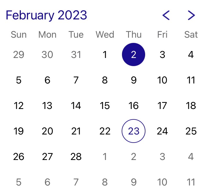
 An easy-to-use and highly customizable month calendar.
This frameworks provides a month calendar picker with both UIKit and SwiftUI variants.

Licensing
Y—CalendarPicker is licensed under the Apache 2.0 license.
Documentation
Documentation is automatically generated from source code comments and rendered as a static website hosted via GitHub Pages at: https://yml-org.github.io/ycalendarpicker-ios/
Usage
YCalendarPicker (UIKit)
YCalendarPicker is a subclass of UIControl with an api similar to UIDatePicker.
YCalendarView (SwiftUI)
YCalendarView is a struct that conforms to the SwiftUI View protocol.
Initializers
Both YCalendarPicker and YCalendarView can be initialized with the same five parameters (YCalendarPicker uses YCalendarView internally):
init(
    firstWeekday: Int? = nil,
    appearance: Appearance = .default,
    minimumDate: Date? = nil,
    maximumDate: Date? = nil,
    locale: Locale? = nil
)
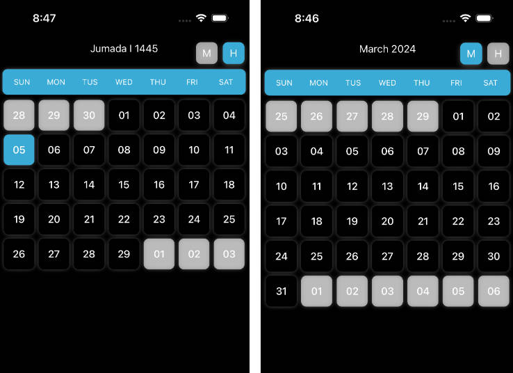
The standard initializer lets you specify the first day of the week, appearance, optional minimum and maximum dates, and the locale, although it provides sensible defaults for all of these.
YCalendarPicker has an additional initializer:
init?(coder: NSCoder)
For use in Interface Builder or Storyboards (although we recommend that you build your UI in code).
A calendar picker created this way begins with the default appearance, but you can customize it at runtime by updating its appearance property.
Customization
YCalendarPicker and YCalendarView both have an appearance property of type Appearance.
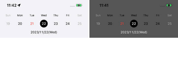
Appearance lets you customize the picker’s appearance. You have full control over the colors, typographies, and images used. The default appearance is dark mode compatible and WCAG 2.0 AA compliant for color contrast.
/// Appearance for YCalendarPicker that contains typography and color properties
public struct Appearance {
    /// Appearance for days within current month
    public var normalDayAppearance: Day
    /// Appearance for days outside current month
    public var grayedDayAppearance: Day
    /// Appearance for today
    public var todayAppearance: Day
    /// Appearance for selected day
    public var selectedDayAppearance: Day
    /// Appearance for disabled day
    public var disabledDayAppearance: Day
    /// Appearance for booked day
    public var bookedDayAppearance: Day
    /// Foreground color and typography for weekdays
    public var weekdayStyle: (textColor: UIColor, typography: Typography)
    /// Image for previous month button
    ///
    /// Images with template rendering mode will be tinted to `monthForegroundColor`.
    public var previousImage: UIImage?
    /// Image for next month button
    ///
    /// Images with template rendering mode will be tinted to `monthForegroundColor`.
    public var nextImage: UIImage?
    /// Foreground color and typography for month (and year)
    public var monthStyle: (textColor: UIColor, typography: Typography)
    /// Background color for calendar view
    public var backgroundColor: UIColor
}
The calendar has six different appearances for drawing individual days:
- normal: for unselected dates within the current month
- grayed: for unselected dates that fall before or after the current month (because we always show 6 rows or 42 days)
- today: for today’s date when unselected
- selected: for the currently selected date (if any)
- booked: for any dates that are already booked. These days are not selectable.
- disabled: for any dates before
minimumDateor aftermaximumDate. These days are not selectable.
The appearance of each of these types of days can be customized using the Day structure.
/// Appearance for Date
public struct Day {
    /// Typography for day view
    public var typography: Typography
    /// Foreground color for day view
    public var foregroundColor: UIColor
    /// Background color for day view
    public var backgroundColor: UIColor
    /// Border color for day view
    public var borderColor: UIColor
    /// Border width for day view
    public var borderWidth: CGFloat
}
Usage (UIKit)
-
How to import?
import YCalendarPicker
-
Create a calendar picker
// Create calendar picker with default values
let calendarPicker = YCalendarPicker()

// add calendar picker to any view
view.addSubview(calendarPicker)
-
Customize and then update appearance
// Create a calendar picker with the weekday text color set to green
var calendarPicker = YCalendarPicker(
    appearance: YCalendarPicker.Appearance(weekdayStyle: (textColor: .green, typography: .weekday)
)

// Change the weekday text color to red
calendarPicker.appearance.weekdayStyle.textColor = .red
-
Update Calendar properties
// set minimum date to yesterday and maximum date to tomorrow
calendarPicker.minimumDate = Date().previousDate()
calendarPicker.maximumDate = Date().nextDate()

// select today's date
calendarPicker.date = Date()
-
Receive change notifications
To be notified when the date changes, simply use the target-action mechanism exactly as you would for
UIDatePicker.// Add target with action calendarPicker.addTarget(self, action: #selector(onDateChange), for: .valueChanged)
If you wish to know when the user has switched months (via the previous and next buttons), you can use the picker’s
delegateproperty and conform to theYCalendarPickerDelegateprotocol.// Create calendar picker let calendarPicker = YCalendarPicker() // set the delegate to be notified when the month changes calendarPicker.delegate = self
// This will notify when the user presses the next/previous buttons
extension DemoViewController: YCalendarPickerDelegate {
    func calendarPicker(_ calendarPicker: YCalendarPicker, didChangeMonthTo date: Date) {
        print("New month: \(date)")
    }
}
Usage (SwiftUI)
Our calendar picker also supports Swift UI!
-
How to import?
import YCalendarPicker
-
Create a calendar view
YCalendarViewconforms to SwiftUI’sViewprotocol so we can directly integrateYCalendarViewwith any SwiftUI view.var body: some View { YCalendarView() }
-
Customize and then update appearance
struct CustomCalendar {
    @State var calendar: YCalendarView = {
        // Create a calendar picker with the weekday text color set to green
        var calendar = YCalendarView()
        calendar.appearance.weekdayStyle.textColor = .green
        return calendar
    }()
}

extension CustomCalendar: View {
    public var body: some View {
        VStack {
            calendar
            Button("Go Red") {
                // Change the weekday text color to red
                calendar.appearance.weekdayStyle.textColor = .red
            }
        }
    }
}
-
Update Calendar properties
struct CustomCalendar {
    @State var calendar = YCalendarView()
}

extension CustomCalendar: View {
    var body: some View {
        VStack {
            calendar
            Button("Set Min/Max") {
                // set minimum date to yesterday and maximum date to tomorrow
                calendar.minimumDate = Date().previousDate()
                calendar.maximumDate = Date().nextDate()
            }
            Button("Select Today") {
                // select today's date
                calendar.date = Date()
            }
        }
    }
}
-
Receive change notifications To be notified when the user selects a date or changes the month, you can use the
delegateproperty and conform to theYCalendarViewDelegateprotocol.extension DemoView: YCalendarViewDelegate { // Date was selected func calendarViewDidSelectDate(_ date: Date?) { if let date { print("Selected: \(date)") } else { print("Selection cleared") } } // Month was changed func calendarViewDidChangeMonth(to date: Date) { print("New month: \(date)") } }
Installation
You can add Y—CalendarPicker to an Xcode project by adding it as a package dependency.
- From the File menu, select Add Packages…
- Enter “https://github.com/yml-org/ycalendarpicker-ios” into the package repository URL text field
- Click Add Package
Contributing to Y—CalendarPicker
Requirements
SwiftLint (linter)
brew install swiftlint
Jazzy (documentation)
sudo gem install jazzy
Setup
Clone the repo and open Package.swift in Xcode.
Versioning strategy
We utilize semantic versioning.
{major}.{minor}.{patch}
e.g.
1.0.5
Branching strategy
We utilize a simplified branching strategy for our frameworks.
- main (and development) branch is
main - both feature (and bugfix) branches branch off of
main - feature (and bugfix) branches are merged back into
mainas they are completed and approved. maingets tagged with an updated version # for each release
Branch naming conventions:
feature/{ticket-number}-{short-description}
bugfix/{ticket-number}-{short-description}
e.g.
feature/CM-44-button
bugfix/CM-236-textview-color
Pull Requests
Prior to submitting a pull request you should:
- Compile and ensure there are no warnings and no errors.
- Run all unit tests and confirm that everything passes.
- Check unit test coverage and confirm that all new / modified code is fully covered.
- Run
swiftlintfrom the command line and confirm that there are no violations. - Run
jazzyfrom the command line and confirm that you have 100% documentation coverage. - Consider using
git rebase -i HEAD~{commit-count}to squash your last {commit-count} commits together into functional chunks. - If HEAD of the parent branch (typically
main) has been updated since you created your branch, usegit rebase mainto rebase your branch.- Never merge the parent branch into your branch.
- Always rebase your branch off of the parent branch.
When submitting a pull request:
- Use the provided pull request template and populate the Introduction, Purpose, and Scope fields at a minimum.
- If you’re submitting before and after screenshots, movies, or GIF’s, enter them in a two-column table so that they can be viewed side-by-side.
When merging a pull request:
- Make sure the branch is rebased (not merged) off of the latest HEAD from the parent branch. This keeps our git history easy to read and understand.
- Make sure the branch is deleted upon merge (should be automatic).
Releasing new versions
- Tag the corresponding commit with the new version (e.g.
1.0.5) - Push the local tag to remote
Generating Documentation (via Jazzy)
You can generate your own local set of documentation directly from the source code using the following command from Terminal:
jazzy
This generates a set of documentation under /docs. The default configuration is set in the default config file .jazzy.yaml file.
To view additional documentation options type:
jazzy --help
A GitHub Action automatically runs each time a commit is pushed to main that runs Jazzy to generate the documentation for our GitHub page at: https://yml-org.github.io/ycalendarpicker-ios/