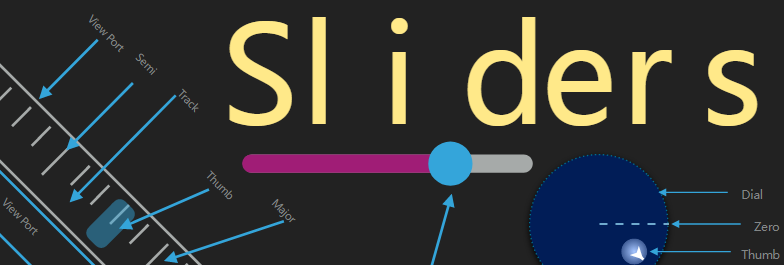
Sliders
Sliders is a compilation of all my stylable drag based SwiftUI components. It provides a variety of unique controls as well as an enhanced version of the normal Slider called an LSlider. You can try them all out quickly by clone the example project
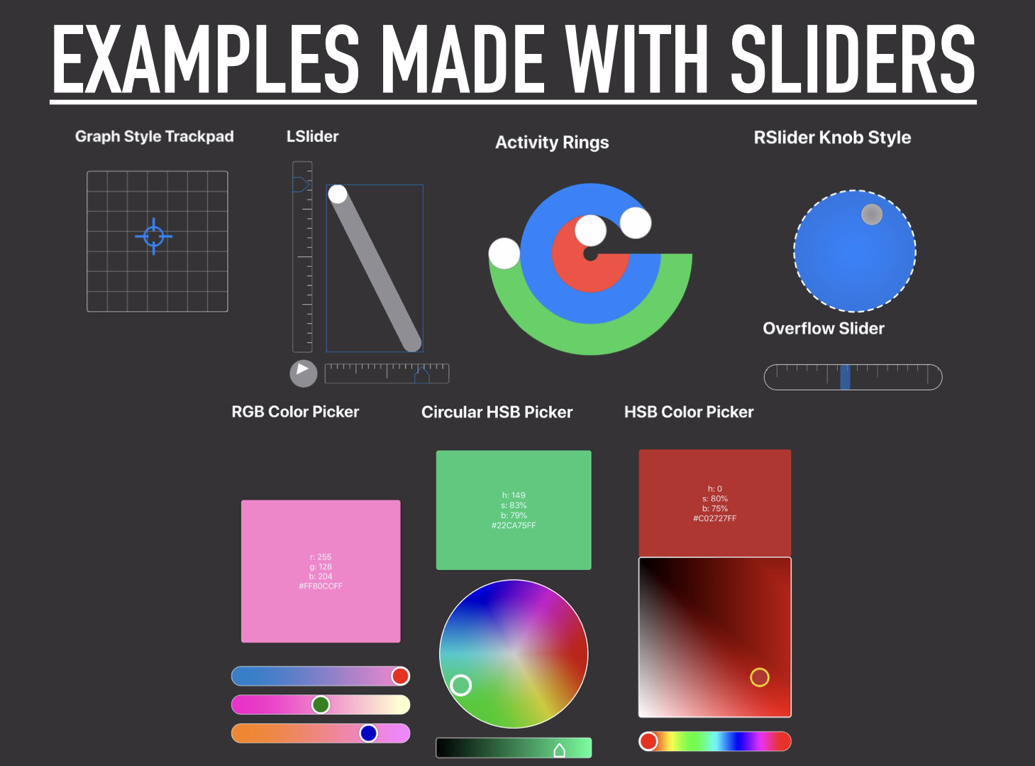
The various components are:
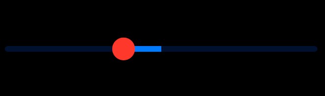
LSlider- a spatially adaptive slider that fits to its container at any angle you decide.RSlider- A circularly shaped slider which restricts movement of the thumb to the radius of the circlePSlider- Turn anyShapeinto its very own slider!OverflowSlider- A meter like slider which has two moving components, the track and the thumb. Also has velocity based gestures implementedTrackPad- A 2D version of a normal slider, which restricts displacement of the thumb to the bounds of the trackRadialPad- A joystick like component that does not reset the position of the thumb upon gesture end.Joystick- an onscreen joystick that can appear anywhere the user drags within the defined hitbox, if the drag ends inside the lockbox, the joystick remains onscreen locked in the forward position. if the drag ends not inside the lockbox the joystick fades away until the hitbox is dragged again.
Requirements
Sliders as a default requires the SwiftUI Framework to be operational and since the DragGesture is required only these platforms can make use of the library:
- macOS 10.15 or Greater
- iOS 13 or Greater
- watchOS 6 or Greater
How To Add To Your Project
- Snag that URL from the github repo
- In Xcode -> File -> Swift Packages -> Add Package Dependencies
- Paste the URL Into the box
- Specify the minimum version number (This is new so 1.0.3 and greater will work).
Dependencies
- CGExtender
- Shapes - Currently looking for contributors
- bez
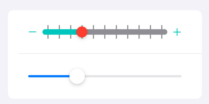
LSlider
Spatially Adaptive Linear Slider
While at on the surface this slider my seem like a copy of the already available Slider. I implore you to try and make a neat layout with a Slider in the vertical position.
After trying everything with SwiftUI's built in slider I realized making layouts with it just was not going to work. So I created the LSlider. It works just like a normal Slider except
You can provide a value for the angle parameter which rotates the slider and adaptively fits it to its containing view. Also Its fully customizable with cascading styles thanks to Environment variables.
- parameters:
value:Binding<Double>The value the slider should controlrange:ClosedRange<Double>The minimum and maximum numbers thatvaluecan beangle:AngleThe angle you would like the slider to be atisDisabled:BoolWhether or not the slider should be disabled
Styling The Slider
To create a custom style for the slider you need to create a LSliderStyle conforming struct. Conformance requires implementation of 2 methods
makeThumb: which creates the draggable portion of the slidermakeTrack: which creates the track which fills or empties as the thumb is dragging within it
Both methods provide access to the sliders current state thru the LSliderConfiguration of the LSliderto be styled
        struct LSliderConfiguration {
            let isDisabled: Bool // whether or not the slider is current disables
            let isActive: Bool // whether or not the thumb is dragging or not
            let pctFill: Double // The percentage of the sliders track that is filled
            let value: Double // The current value of the slider
            let angle: Angle // The angle of the slider
            let min: Double // The minimum value of the sliders range
            let max: Double // The maximum value of the sliders range
        }
To make this easier just copy and paste the following style based on the DefaultLSliderStyle. After creating your custom style
apply it by calling the linearSliderStyle method on the LSlider or a view containing it.
       struct <#My Slider Style#>: LSliderStyle {
           func makeThumb(configuration:  LSliderConfiguration) -> some View {
               Circle()
                   .fill(configuration.isActive ? Color.yellow : Color.white)
                   .frame(width: 40, height: 40)
           }
           func makeTrack(configuration:  LSliderConfiguration) -> some View {
               let style: StrokeStyle = .init(lineWidth: 10, lineCap: .round, lineJoin: .round, miterLimit: 0, dash: [], dashPhase: 0)
               return AdaptiveLine(angle: configuration.angle)
                   .stroke(Color.gray, style: style)
                   .overlay(AdaptiveLine(angle: configuration.angle).trim(from: 0, to: CGFloat(configuration.pctFill)).stroke(Color.blue, style: style))
           }
       }
Radial Slider
A Circular slider whose thumb is dragged causing it to follow the path of the circle
- parameters:
value: aBinding<Double>value to be controlled.range: aClosedRange<Double>denoting the minimum and maximum values of the slider (default is0...1)isDisabled: aBoolvalue describing if the sliders state is disabled (default isfalse)
Styling The Slider
To create a custom style for the slider you need to create a RSliderStyle conforming struct. Conformance requires implementation of 2 methods
makeThumb: which creates the draggable portion of the slidermakeTrack: which creates the track which fills or emptys as the thumb is dragging within it
Both methods provide access to state values of the radial slider thru the RSliderConfiguration struct
     struct RSliderConfiguration {
         let isDisabled: Bool // whether or not the slider is current disables
         let isActive: Bool // whether or not the thumb is dragging or not
         let pctFill: Double // The percentage of the sliders track that is filled
         let value: Double // The current value of the slider
         let angle: Angle //  The direction from the thumb to the slider center
         let min: Double // The minimum value of the sliders range
         let max: Double // The maximum value of the sliders range
     }
To make this easier just copy and paste the following style based on the DefaultRSliderStyle. After creating your custom style
apply it by calling the radialSliderStyle method on the RSlider or a view containing it.
struct <#My Slider Style #>: RSliderStyle {
    func makeThumb(configuration:  RSliderConfiguration) -> some View {
        Circle()
        .frame(width: 30, height:30)
        .foregroundColor(configuration.isActive ? Color.yellow : Color.white)
    }

    func makeTrack(configuration:  RSliderConfiguration) -> some View {
        Circle()
        .stroke(Color.gray, style: StrokeStyle(lineWidth: 10, lineCap: .round))
        .overlay(Circle()
        .trim(from: 0, to: CGFloat(configuration.pctFill))
        .stroke(Color.purple, style: StrokeStyle(lineWidth: 12, lineCap: .round)))

    }
}
Path Slider
A View that turns any Shape into a slider. Its great for creating unique user experiences
- parameters:
value: aBinding<Double>value which represents the percent fill of the slider between (0,1).shape: TheShapeto be used as the sliders trackrange:ClosedRange<Double>The minimum and maximum numbers thatvaluecan beisDisabled:BoolWhether or not the slider should be disabled
Styling The Slider
To create a custom style for the slider you need to create a PSliderStyle conforming struct. Conformance requires implementation of 2 methods
makeThumb: which creates the draggable portion of the slidermakeTrack: which creates the track which fills or empties as the thumb is dragging within it
Both methods provide access to state values through the PSliderConfiguration struct
 struct PSliderConfiguration {
     let isDisabled: Bool // whether or not  the slider is disabled
     let isActive: Bool // whether or not the thumb is currently dragging
     let pctFill: Double  // The percentage of the sliders track that is filled
     let value: Double // The current value of the slider
     let angle: Angle // Angle of the thumb
     let min: Double  // The minimum value of the sliders range
     let max: Double // The maximum value of the sliders range
 }
To make this easier just copy and paste the following style based on the DefaultPSliderStyle. After creating your custom style
apply it by calling the pathSliderStyle method on the PSlider or a view containing it.
struct <#My PSlider Style#>: PSliderStyle {
    func makeThumb(configuration:  PSliderConfiguration) -> some View {
        Circle()
        .frame(width: 30, height:30)
        .foregroundColor(configuration.isActive ? Color.yellow : Color.white)
    }

    func makeTrack(configuration:  PSliderConfiguration) -> some View {
        configuration.shape
            .stroke(Color.gray, lineWidth: 8)
            .overlay(
                configuration.shape
                .trim(from: 0, to: CGFloat(configuration.pctFill))
            .stroke(Color.purple, lineWidth: 10))
    }
}
Overflow Slider
A Slider which has a fixed frame but a movable track in the background. Used for values that have a discrete nature to them but would not necessarily fit on screen.
Both the thumb and track can be dragged, if the track is dragged and thrown the velocity of the throw is added to the tracks velocity and it slows gradually to a stop.
If the thumb is currently being dragged and reaches the minimum or maximum value of its bounds, velocity is added to the track in the opposite direction of the drag.
- parameters:
value:Binding<Double>The value the slider should controlrange:ClosedRange<Double>The minimum and maximum numbers thatvaluecan beisDisabled:BoolWhether or not the slider should be disabled
Styling The Slider
To create a custom style for the slider you need to create a OverflowSliderStyle conforming struct. Conformance requires implementation of 2 methods
makeThumb: which creates the draggable portion of the slidermakeTrack: which creates the draggable background track
Both methods provide access to the sliders current state thru the OverflowSliderConfiguration of the OverflowSliderto be styled.
 struct OverflowSliderConfiguration {
     let isDisabled: Bool // Whether the control is disabled or not
     let thumbIsActive: Bool // Whether the thumb is currently dragging or not
     let thumbIsAtLimit: Bool // Whether the thumb has reached its min/max displacement
     let trackIsActive: Bool // Whether of not the track is dragging
     let trackIsAtLimit: Bool // Whether the track has reached its min/max position
     let value: Double // The current value of the slider
     let min: Double // The minimum value of the sliders range
     let max: Double // The maximum value of the sliders range
     let tickSpacing: Double // The spacing of the sliders tick marks
 }
To make this easier just copy and paste the following style based on the DefaultOverflowSliderStyle. After creating your custom style apply it by calling the overflowSliderStyle method on the OverflowSlider or a view containing it.
struct <#My OverflowSlider Style#>: OverflowSliderStyle {
   func makeThumb(configuration: OverflowSliderConfiguration) -> some View {
       RoundedRectangle(cornerRadius: 5)
           .fill(configuration.thumbIsActive ?  Color.orange : Color.blue)
           .opacity(0.5)
           .frame(width: 20, height: 50)
   }
   func makeTrack(configuration: OverflowSliderConfiguration) -> some View {
       let totalLength = configuration.max-configuration.min
       let spacing = configuration.tickSpacing

       return TickMarks(spacing: CGFloat(spacing), ticks: Int(totalLength/Double(spacing)))
           .stroke(Color.gray)
           .frame(width: CGFloat(totalLength))
   }
}
Track Pad
Essentially the 2D equaivalent of a normal Slider, This creates a draggable thumb and a rectangular area that the thumbs translation is restricted within
- parameters:
value: ACGPointrepresenting the two values being controlled by the trackpad in the x, and y directionsrangeX: AClosedRange<CGFloat>defining the minimum and maximum of thevalueparameters x componentrangeY: AClosedRange<CGFloat>defining the minimum and maximum of thevalueparameters y componentisDisabled: ABoolvalue describing whether the track pad responds to user input or not
Styling
To create a custom style for the TrackPad you need to create a TrackPadStyle conforming struct. Conformance requires implementation of 2 methods
makeThumb: which creates the draggable portion of the trackpadmakeTrack: which creates view containing the thumb
Both methods provide access to state values of the track pad thru the TrackPadConfiguration struct
  struct TrackPadConfiguration {
      let isDisabled: Bool // Whether or not the trackpad is disabled
      let isActive: Bool // whether or not the thumb is dragging
      let pctX: Double // (valueX-minX)/(maxX-minX)
      let pctY: Double // (valueY-minY)/(maxY-minY)
      let valueX: Double // The current value in the x direction
      let valueY: Double // The current value in the y direction
      let minX: Double // The minimum value from rangeX
      let maxX: Double // The maximum value from rangeX
      let minY: Double // The minimum value from rangeY
      let maxY: Double // The maximum value from rangeY
  }
To make this easier just copy and paste the following style based on the DefaultTrackPadStyle. After creating your custom style
apply it by calling the trackPadStyle method on the TrackPad or a view containing it.
struct <#My TrackPad Style #>: TrackPadStyle {
    func makeThumb(configuration:  TrackPadConfiguration) -> some View {
        Circle()
            .fill(configuration.isActive ? Color.yellow : Color.black)
            .frame(width: 40, height: 40)
    }

    func makeTrack(configuration:  TrackPadConfiguration) -> some View {
        RoundedRectangle(cornerRadius: 5)
            .fill(Color.gray)
            .overlay(RoundedRectangle(cornerRadius: 5).stroke(Color.blue))
    }
}
Radial Track Pad
A control that constrains the drag gesture of the thumb to be contained within the radius of the track.
Similar to a joystick, with the difference being that the thumb stays fixed at the gestures end location when the drag is finished.
- parameters:
offset:Binding<Double>The distance measured from the tracks center to the thumbs locationangle:Binding<Angle>The angle of the line between the pads center and the thumbs location, measured from the vector pointing in the trailing directionisDisabled:Boolvalue describing if the sliders state is disabled (default isfalse)
note: There is no need to define the radius of the track because the RadialPad automatically adjusts to the geometry of its container.
Styling
To create a custom style for the RadialPad you need to create a RadialPadStyle conforming struct.
Conformance requires implementation of 2 methods
makeThumb: which creates the draggable portion of theRadialPadmakeTrack: which creates the background that the thumb will be contained in.
Both methods provide read access to the state values of the RadialPad thru the RadialPadConfiguration struct
struct RadialPadConfiguration {
     let isDisabled: Bool // whether or not the slider is current disables
     let isActive: Bool // whether or not the thumb is dragging or not
     let isAtLimit: Bool // Is true if the radial offset is equal to the pads radius
     let angle: Angle // The angle of the line between the pads center and the thumbs location, measured from the vector pointing in the trailing direction
     let radialOffset: Double // The Thumb's distance from the Track's center
 }
To make this easier just copy and paste the following style based on the DefaultRadialPadStyle. After creating your custom style
apply it by calling the radialPadStyle method on the RadialPad or a view containing it.
struct <#My RadialPad Style#>: RadialPadStyle {
    func makeTrack(configuration: RadialPadConfiguration) -> some View {
        Circle()
            .fill(Color.gray.opacity(0.4))
    }
    func makeThumb(configuration: RadialPadConfiguration) -> some View {
        Circle()
            .fill(Color.blue)
            .frame(width: 45, height: 45)
    }
}
Joystick
Joystick view used to control various activities such as moving a character on the screen. The View creates a Rectangular region to act as a hitbox for drag gestures. Once a drag is initiated the joystick appears on screen centered at the start location of the gesture. While dragging, the thumb of the joystick is limited be within the radius of the sticks background circle.
- parameters:
state:Binding<JoyState>you provide a binding to a Joystate value which allows you to maintain access to all of the Joysticks state valuesradius:DoubleThe radius of the trackcanLock: A boolean value describing whether the joystick has locking behavior (default: true)isDisabled:Boolwhether the joystick allows hit testing or not (default: false)
Style
The Joystick can be themed and styled by making a custom struct conforming to the JoystickStyle
protocol. Conformance requires that you implement 4 methods
makeHitBox- Creates the rectangular region that responds the the users touchmakeLockBox- Creates a view such that if the drag gestures location is contained within the lockbox, the joystick goes into the locked statemakeTrack- Creates the circular track that contains the joystick thumbmakeThumb- Creates the part of the joystick the moves when dragging
These 4 methods all provide access to the JoystickConfiguration .
Make use of the various state values to customize the Joystick to your liking.
   struct JoystickConfiguration {
       let isDisabled: Bool // whether or not the slider is current disables
       let isActive: Bool // True if the joystick thumb is dragging or if the joystick is locked
       let isAtLimit: Bool // whether the offset of the thumb reached the radius of the circle
       let isLocked: Bool // Whether the joystick is locked or not
       let angle: Angle // The angle of the line between the pads center and the thumbs location, measured from the vector pointing in the trailing direction
       let radialOffset: Double // The current displacement of the thumb from the track's center
    }
Once your custom style has been created, implement it by calling the joystickStyle(_ :) method on the Joystick or
a view containing the Joystick to be styled. To make it easier try using the follow example based upon the DefaultJoystickStyle
  struct <#My Joystick Style#>: JoystickStyle {
      func makeHitBox(configuration: JoystickConfiguration) -> some View {
          Rectangle()
              .fill(Color.white.opacity(0.05))
      }
      func makeLockBox(configuration: JoystickConfiguration) -> some View {
          Circle()
              .fill(Color.black)
              .overlay(Circle().fill(Color.yellow).scaleEffect(0.7))
              .frame(width: 25, height: 25)
      }
      func makeTrack(configuration: JoystickConfiguration) -> some View {
          Circle()
              .fill(Color.gray.opacity(0.4))
      }
      func makeThumb(configuration: JoystickConfiguration) -> some View {
          Circle()
              .fill(Color.blue)
              .frame(width: 45, height: 45)
      }
  }