

CompactSlider is a SwiftUI control for selecting a value from a bounded linear range of values.
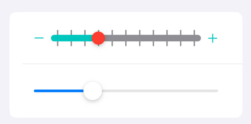
The slider is a replacement for the build-in slider and is designed specifically for SwiftUI. For me, the main motivation for writing a component that already exists is the very slow performance under macOS (e.g. when you need to resize the screen with multiple sliders or when animating) and the severely outdated design. At the same time, I was inspired by the slider design that Apple’s Photos app developed, which makes heavy use of sliders.
 |
 |
Requirements
- iOS 14, macOS 11, watchOS 7
- Swift 5.6+
- Xcode 13.0+
Installation
Swift Package Manager
- Open your
.xcodeproj, select the option Add Package… in the File menu. - Paste the URL:
https://github.com/buh/CompactSlider.gitand click Add Package.
Usage
Single value
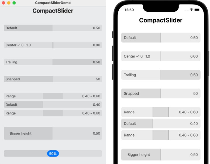
- Simple slider with different directions in which it will indicate the selected value.
macOS

iOS

watchOS

Parameter direction
By default the direction has .leading value.
@State private var value = 0.5

var body: some View {
    CompactSlider(value: $value) {
        Text("Default")
        Spacer()
        Text(String(format: "%.2f", value))
    }
}
The trailing or centred direction can be set with the direction: parameter.
@State private var value = 0.5

var body: some View {
    CompactSlider(value: $value, direction: .center) {
        Text("Center")
        Spacer()
        Text(String(format: "%.2f", value))
    }
}
Parameter in bounds
Parameter step
Parameter handleVisibility
Parameter state
Parameter valueLabel
Range values
Styling
License
CompactSlider is licensed under the MIT License.