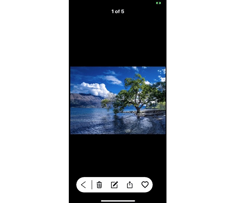
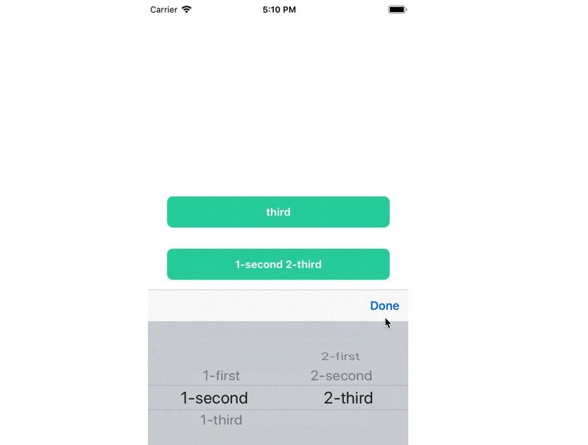
ExpandableButton
Customizable and easy to use expandable button in Swift.
Requirements
- iOS 9.0+
Installation
CocoaPods:
- Add the following line to your
Podfile:
pod 'ExpandableButton'

#for swift less than 4.2 use:
pod 'ExpandableButton', '~> 1.0.0'
- Add
use_frameworks!to yourPodfile. - Run
pod install. - Add to files:
import ExpandableButton
Usage
You can init ExpandableButton with frame (default is .zero), direction (default is .right) and items (each item will be button). direction is opening direction. items is [ExpandableButtonItem] whiches contain information about future buttons.
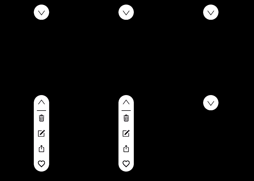
Diretions example:
let rightButton = ExpandableButtonView(frame: frame, direction: .right, items: items)
let leftButton = ExpandableButtonView(frame: frame, direction: .left, items: items)
let upButton = ExpandableButtonView(frame: frame, direction: .up, items: items)
let downButton = ExpandableButtonView(frame: frame, direction: .down, items: items)



Items with image and action:
// create items with images and actions
let items = [
    ExpandableButtonItem(
        image: UIImage(named: "delete"),
        action: {_ in
            print("delete")
        }
    ),
    ExpandableButtonItem(
        image: UIImage(named: "edit"),
        action: {_ in
            print("edit")
        }
    ),
    ExpandableButtonItem(
        image: UIImage(named: "share"),
        action: { _ in
           print("share")
        }
    )
]

// create ExpandableButton
let buttonView = ExpandableButtonView(items: items)
buttonView.frame = CGRect(x: 0, y: 0, width: 60, height: 60)
buttonView.backgroundColor = .white
view.addSubview(buttonView)

With image, highlightedImage, imageEdgeInsets:
let insets = UIEdgeInsets(top: 16, left: 16, bottom: 16, right: 16)

// create items with image, highlighted image, image insets.
let items = [
    ExpandableButtonItem(
        image: UIImage(named: "delete"),
        highlightedImage: UIImage(named: "highlightedDelete"),
        imageEdgeInsets: insets,
        action: {_ in
            print("delete")
        }
    )
    ...
]

arrowWidth, separatorWidth and cornerRadius:
buttonView.arrowWidth = 2
buttonView.separatorWidth = 2
buttonView.layer.cornerRadius = 30

Custom icons for open and close actions, closeOpenImagesInsets:
// custom open and close images
buttonView.openImage = UIImage(named: "open")
buttonView.closeImage = UIImage(named: "close")
buttonView.closeOpenImagesInsets = insets

With attributedTitle, highlightedAttributedTitle and custom item size:
// with attributed string, highlighted attributed string, custom size.
let items = [
    ExpandableButtonItem(
        attributedTitle: NSAttributedString(
            string: "Attributed Text",
            attributes: [.foregroundColor: UIColor.red]
        ),
        highlightedAttributedTitle: NSAttributedString(
            string: "Attributed Text",
            attributes: [.foregroundColor: UIColor.green]
        ),
        size: CGSize(width: 160, height: 60)
    )
]

With attributedTitle under image (using contentEdgeInsets, titleEdgeInsets, imageEdgeInsets, titleAlignment, imageContentMode, size):
let attributedTitle =  NSAttributedString(
    string: "Share",
    attributes: [.foregroundColor: UIColor.black,
                 .font: UIFont.systemFont(ofSize: 12)]
)

let highlightedAttributedTitle =  NSAttributedString(
    string: "Share",
    attributes: [.foregroundColor: UIColor.lightGray,
                 .font: UIFont.systemFont(ofSize: 12)]
)

let items = [
    ExpandableButtonItem(
        image: UIImage(named: "share"),
        highlightedImage: UIImage(named: "haglightedShare"),
        attributedTitle: attributedTitle,
        highlightedAttributedTitle: highlightedAttributedTitle,
        contentEdgeInsets: UIEdgeInsets(top: 6, left: 6, bottom: 6, right: 6),
        titleEdgeInsets: UIEdgeInsets(top: 24, left: -200, bottom: 0, right: 0),
        imageEdgeInsets: UIEdgeInsets(top: 6, left: 0, bottom: 24, right: 0),
        size: CGSize(width: 80, height: 60),
        titleAlignment: .center,
        imageContentMode: .scaleAspectFit
    )
]

You can also open() and close():
let buttonView = ExpandableButtonView(items: items)

buttonView.open()
buttonView.close()
All options
ExpandableButtonView
| Name | Type | Default value | Description |
|---|---|---|---|
direction |
Direction |
.right |
Opening direction. Could be .left, .right, .up, .down. Set only on init(frame:direction:items:). |
state |
State |
.closed |
Current state. Could be .opened, .closed or .animating. |
animationDuration |
TimeInterval |
0.2 |
Opening, closing and arrow animation duration. |
closeOnAction |
Bool |
false |
If true call close() after any item action. |
isHapticFeedback |
Bool |
true |
Turn on haptic feedback (Taptic engine) |
arrowInsets |
UIEdgeInsets |
top: 12 left: 12 bottom: 12 right: 12 |
Arrow insets. |
arrowWidth |
CGFloat |
1 |
Arrow line width. |
arrowColor |
UIColor |
UIColor.black |
Arrow color. |
closeOpenImagesInsets |
UIEdgeInsets |
.zero |
Insets for custom close and open images. |
closeImage |
UIImage? |
nil |
Custom close image. |
openImage |
UIImage? |
nil |
Custom open image. |
isSeparatorHidden |
Bool |
false |
If true hide separator view. |
separatorColor |
UIColor |
UIColor.black |
Separator color. |
separatorInset |
CGFloat |
8 |
Separator inset from top, bottom for .left, .right directions and from left, right for up, down. |
separatorWidth |
CGFloat |
1 |
Separator view width. |
ExpandableButtonItem
| Name | Type | Default value | Description |
|---|---|---|---|
image |
UIImage? |
nil |
Image for .normal state. |
highlightedImage |
UIImage? |
nil |
Image for .highlighted state. |
attributedTitle |
NSAttributedString? |
nil |
Attributed string for .normal state. |
highlightedAttributedTitle |
NSAttributedString? |
nil |
Attributed string for .highlighted state. |
contentEdgeInsets |
UIEdgeInsets |
.zero |
contentEdgeInsets for UIButton |
titleEdgeInsets |
UIEdgeInsets |
.zero |
titleEdgeInsets for UIButton. |
imageEdgeInsets |
UIEdgeInsets |
.zero |
imageEdgeInsets for UIButton. |
size |
CGSize? |
nil |
UIButton size for current item. If nil will be equal to arrow button size. |
titleAlignment |
NSTextAlignment |
.center |
titleAlignment for titleLabel in UIButton. |
imageContentMode |
UIViewContentMode |
.scaleAspectFit |
imageContentMode for imageView in UIButton. |
action |
(ExpandableButtonItem) -> Void |
{_ in} |
Action closure. Calls on .touchUpInside |
identifier |
String |
"" |
Identifier for ExpandableButtonItem. |
