NSVAnimatedTabBar
Fully customizable animated tab bar.
Example
To run the example project, clone the repo, and run pod install from the Example directory first.
Requirements
Swift 5.0
Installation
NSVAnimatedTabBar is available through CocoaPods. To install
it, simply add the following line to your Podfile:
pod 'NSVAnimatedTabBar'
About
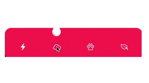
NSVAnimatedTabBar is fully customizable animated tab bar where center item can be used for more options to show.
Usage
NSVAnimatedTabBar constructed on 5 protocols, so you will need to create corresponding realization of that protocols to be able to use animated tab bar. You can customize almost everything.
Confirm to NSVAnimatedTabControllerDelegate to get each tab or center item sub option selection.
NSVAnimatedTabOptions
Main protocol to provide all all neccesary information.
tabHeight: CGFloat
Height for tab bar
tabInsets: UIEdgeInsets
Insets for tab bar
tabBackgroundColor: UIColor
Tab bar background color
selectedItemColor: UIColor
Tab bar selected item color
unselectedItemColor: UIColor
Tab bar unselected item color
cornerRadius: CGFloat
Tab bar corner radius
unselectedItemColor
Tab bar unselected item color
shadowInfo: ShadowInfo
Set this to have a shadow on top of tab bar
options: [NSVTabItemOptions]
Array of tab bar items
animationOptions: NSVTabAnimationOptions
Animation options of tab bar
centerItemOptions: NSVCenterItemOptions
Option for tab bar's center item
coverAlpha: CGFloat
Alpha value for cover view when center item is selected
mainBackgroundColor: UIColor?
Background color for main view, will be visible for curved tab bar and if tabInsets is set to none zero. Set to nil if you want to automatically have a same color as selected view controller's view
NSVTabAnimationOptions
Animation protocol to provide main animation options.
mainAnimationDuration: Double
Center item and tab bar animation duration
options: UIView.AnimationOptions
Center item and tab bar animation options
usingSpringWithDamping: CGFloat
Center item and tab bar animation spring and damping value
initialSpringVelocity: CGFloat
Center item and tab bar animation initial spring velocity
delay: Double
Center item and tab bar animation delay
tabMovePercentage: CGFloat?
Tab bar change percentage based of it's height, set to 1 if you want to fully hide it, or nil, if you don't want an animation.
centerItemMovePercentage: CGFloat?
Center item change percentage based of it's height, set nil, if you don't want an animation.
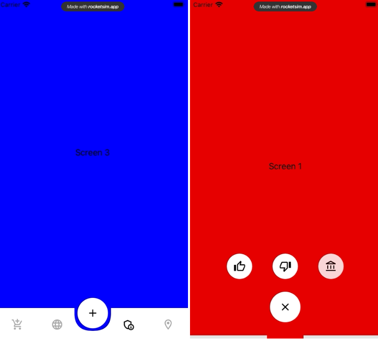
subOptionsAnimationtype: SubOptionsAnimationType
Center item sub options animation type:
.basic - first gif, just hides/shows all sub items at the same time.
.fading - second gif, hides/shows one by one with changing each item alpha.
.movingByOne - third gif, hides/shows one by one, with scaling, if needed.
tabSelectionAnimationType: TabSelectionAnimationType
Each tab selection animation, used also to animate center item selection/deselection, can be none.
shouldAnimateScreenChanges: Bool
Should animate selected view controller change.
NSVTabItemOptions
Tab bar each item options
title: String?
Tab bar item title, set nil, if you want to have only image
image: UIImage?
Tab bar item image, set nil, if you want to have only title
selectedImage: UIImage?
Tab bar selected item image, if set to nil, it will use provided selectedItemColor(use template mode images, if you want to have color changes for an image)
itemInsets: UIEdgeInsets
Tab bar item insets
spacing: CGFloat?
Spacing between image and title
font: UIFont?
Tab bar item title font
NSVCenterItemOptions
Center item options.
size: CGSize
Center item size
subOptionsSize: CGSize
Center item sub options size
insets: UIEdgeInsets
Center item insets
options: NSVTabItemOptions
Center item configuration option, similar to tab bar items.
subOptions: [NSCenterItemSubOptions]
Array of center item's sub options
backgroundColor: UIColor
Center item background color
cornerRadius: CGFloat
Center item corner radius, set to size.width/2 to have rounded button
shadowInfo: ShadowInfo?
Center item shadow
distributionType: SubOptionsDistributionType
Center item sub options layout options
For example .custom(itemsSpacing: 40, minYOffset: 50, maxYOffset: 50)
itemsSpacing - spacing between items X axis
minYOffset - minimal position for Y axis
maxYOffset - maximal position for Y axis
set minYOffset and maxYOffset to equal values, if you want to have sub options on the same line
curveType: CurveType
Set to .bottom if you want to have a curve under center item
NSVCenterItemSubOptions
Center item sub options
image: UIImage
Sub option image
backgroundColor: UIColor
Sub option background color
cornerRadius: CGFloat
Sub option corner radius
shadowInfo: ShadowInfo
Sub option shadow
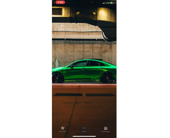
Check an example app, to see NSVAnimatedTabBar in usage.
What's next
Animations, Animations, Animations. I will try to add more animations for everything(item selection, sub option's appearance, etc...), add top curve option for center item, add option to open new screen instead of sub options, etc...
Author
Narek1994, [email protected]