ATGMediaBrowser
ATGMediaBrowser is an image slide-show viewer that supports multiple predefined transition styles, and also allows the client to define new transition styles. It supports both horizontal and vertical gestures to control transitions, and adding new transitions is fun and easy. Checkout some of the transition styles below;
Vertical Zoom In Out

Horizontal Slide In
Horizontal Slide Out

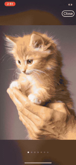
Horizontal Move In Out

It supports commonly expected features like pinch-zoom, double-tap-to-zoom, interactive dismiss transition, dismiss zoomed-out to target frame etc. You can choose between linear and carousel styles for the media browser.
Installation
Carthage
ATGMediaBrowser can be installed using Carthage. To do so, simply add the following line to your Cartfile;
github "altayer-digital/ATGMediaBrowser" ~> 1.0.0
Cocoapods
To use ATGMediaBrowser with cocoapods, add the following line to the Podfile;
pod 'ATGMediaBrowser', '~> 1.0'
Usage
The media browser can be used as shown below;
let mediaBrowser = MediaBrowserViewController(dataSource: self)
present(mediaBrowser, animated: true, completion: nil)
self needs to conform to MediaBrowserViewControllerDataSource protocol and implement following methods;
func numberOfItems(in mediaBrowser: MediaBrowserViewController) -> Int {

    // return number of images to be shown
}

func mediaBrowser(_ mediaBrowser: MediaBrowserViewController, imageAt index: Int, completion: @escaping MediaBrowserViewControllerDataSource.CompletionBlock) {

    // Fetch the required image here. Pass it to the completion
    // block along with the index, zoom scale, and error if any.
    completion(index, image, ZoomScale.default, nil)
}
Why this approach?
You might be asking, why didn't we accept images as an array of images or as an array of URLs? Well, the reason is we wanted to stick to single responsibility principle.
Holding an array of images in memory could be trivial for a small number of images, but if it becomes large enough to cause large memory footprints, we will need to start using caching inside media browser, which is not what media browser is supposed to do.
Accepting URLs will require media browser to do network requests, download and cache the images, and then display them. That's gonna break the single responsibility.
So, media browser will stay clear of all the roles it is not supposed to do, and will stick to what it does well. On the bright side, you can decide how you will download and cache the images, which library to use for the same and in fact, have total control over the contents.
Transitions
There are 8 built-in transitions available with ATGMediaBrowser. On top of this anyone can easily create new transitions using the ContentTransformer closure. More on that can be found in the custom transitions section.
In-built transitions
There are 8 built-in transitions available with ATGMediaBrowser. They are;
- horizontalMoveInOut
- verticalMoveInOut
- horizontalSlideOut
- verticalSlideOut
- horizontalSlideIn
- verticalSlideIn
- horizontalZoomInOut
- verticalZoomInOut
For transition to work the way it is expected, each transition type has to have it's related property set on the media browser. For example, horizontalZoomInOut requires horizontal gesture direction and previousToNext draw order.
mediaBrowser.contentTransformer = DefaultContentTransformers.horizontalZoomInOut
mediaBrowser.gestureDirection = .horizontal
mediaBrowser.drawOrder = .previousToNext
TADA!, With just 3 lines of code, you have changed your media browser's transition style.
Custom transitions
Creating custom transition is super easy and fun with ATGMediaBrowser. The basic concept of ATGMediaBrowser transition is that there will be 3 views always in memory, and this will not change even if the total number of images to be shown is 1 or 10,000. The transition closure will be updating these three views' transform using the position passed into it. All the crazy stuff like transition progress, view reuse, zoom-in, zoom-out etc are already handled by ATGMediaBrowser. So, in order to create a custom transition, your responsibility will be to update the appearance of each content view corresponding to it's position.
There are 3 things to be done for creating a custom transition;
1. Choosing the gesture direction
It can be either horizontal or vertical. It does not necessarily needs to be a horizontal gesture for a horizontal transition. The direction simply defines the axis in which gesture will be detected, the transition can be in the opposite axis, if need be.
2. Choosing the draw order
The draw order can be either previousToNext or nextToPrevious.
previousToNext means left/top content view is drawn first, then middle view and then the right/bottom view.
nextToPrevious means right/bottom content view is drawn first, then middle view and then the left/top view.
3. Implementing the ContentTransformer
The ContentTransformer is a closure which should update the appearance of content views based on the position. When a content view is at position0 the view should be visible to the user full screen. When the position is -1, the view should have the position and appearance of previous(top/left normally) item. When the position is 1, the view must be at next(bottom/right) item's position.
Below given is an example for the transition horizontalMoveInOut;
public static let horizontalMoveInOut: ContentTransformer = { contentView, position in

    let widthIncludingGap = contentView.bounds.size.width + MediaContentView.interItemSpacing
    contentView.transform = CGAffineTransform(translationX: widthIncludingGap * position, y: 0.0)
}
It is as simple as that.!
More Usage
Browser style
You can set the browser style to either linear or carousel. Carousel means that you can scroll the media items in circular fashion, and linear means, you can't. carousel is the default one.
mediaBrowser.browserStyle = .linear
Gap between media views
By default the gap will be 50.0 points.
mediaBrowser.gapBetweenMediaViews = 64.0
If you are implementing custom content transformer, you can access this value using MediaContentView.interItemSpacing
Show page control
Default is true. You can hide page control using the following code;
mediaBrowser.shouldShowPageControl = false
Hiding controls
By controls, we mean both page control and close button. You can set it to auto-hide using autoHideControls or show/hide them manually using hideControls.
mediaBrowser.autoHideControls = false
mediaBrowser.hideControls = false
Interactive dismissal
By default interactive dismissal is enabled. Interactive dismissal uses the gesture in direction orthogonal to the gestureDirection. You can disable the interaction as shown below;
mediaBrowser.enableInteractiveDismissal = false
Item Index
You can access the current index of the item in media browser using currentItemIndex variable.
Customizing close button
You can customize the close button using the data source call back func mediaBrowser(_ mediaBrowser: MediaBrowserViewController, updateCloseButton button: UIButton). You will be getting a UIButton instance in there, and you can customize the appearance, use auto-layout constraints to position it, even add target to get touch events on them.
If you do not add any constraints to the button, media browser will automatically add required constraints to keep it on top right of the screen.
Dismissing the media browser into target frame
If you implement the func targetFrameForDismissal(_ mediaBrowser: MediaBrowserViewController) -> CGRect? method, the media browser will transition the currently shown image to the supplied target frame on dismissal.