CrownControl
CrownControl is a tiny accessory that makes scrolling through scrollable content possible without lifting your thumb.
Features
The crown consists of background and foreground surfaces.
The foreground is an indicator which spins around the center as the attached scroll view offset changes.
- [x] Can be repositioned either using force touch or long press.
- [x] Can be spinned clockwise and counter clockwise.
- [x] Most of the user interaction actions are configurable.
- [x] The background and foreground sizes are configurable.
- [x] Can be fully stylized.
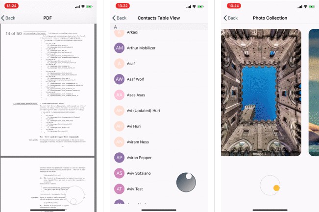
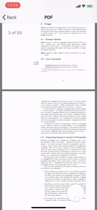
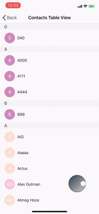
Example Project
The example project contains samples where each demonstrates the CrownControl usability in a scrollable context.
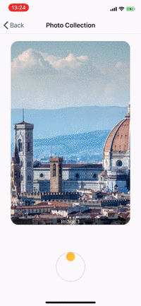
| Web View / PDF | Contacts | Photo Collection |
|---|---|---|
 |
 |
 |
Requirements
- iOS 9 or any higher version.
- Swift 4.2 or any higher version.
- CrownControl leans heavily on QuickLayout - A lightwight library written in Swift that is used to easily layout views programmatically.
Installation
CocoaPods
CocoaPods is a dependency manager for Cocoa projects. You can install it with the following command:
$ gem install cocoapods
To integrate CrownControl into your Xcode project using CocoaPods, specify it in your Podfile:
source 'https://github.com/cocoapods/specs.git'
platform :ios, '9.0'
use_frameworks!

pod 'CrownControl', '0.1.3'
Then, run the following command:
$ pod install
Usage
Quick Usage
Using CrownControl is really simple.
In your view controller:
- Define and bind
CrownAttributesto a scroll view instance, and optionally customize the attributes. - Instantiate and bind
CrownIndicatorViewControllerinstance to theCrownAttributesinstance. - Define the crown view controller constraints.
- Layout the crown view controller in its parent.
var crownViewController: CrownIndicatorViewController!
var scrollView: UIScrollView!

private func setupCrownViewController() {
    var attributes = CrownAttributes(scrollView: scrollView, scrollAxis: .vertical)
    crownViewController = CrownIndicatorViewController(with: attributes)

    // Cling the bottom of the crown to the bottom of a view with -50 offset
    let verticalConstraint = CrownAttributes.AxisConstraint(crownEdge: .bottom, anchorView: view, anchorViewEdge: .bottom, offset: -50)

    // Cling the trailing edge of the crown to the trailing edge of a view with -50 offset
    let horizontalConstraint = CrownAttributes.AxisConstraint(crownEdge: .trailing, anchorView: tableView, anchorViewEdge: .trailing, offset: -50)

    crownViewController.layout(in: self, horizontalConstaint: horizontalConstraint, verticalConstraint: verticalConstraint)
}
To make the crown respond to scrolling events that emanates from any other invoker but the crown, add to scrollViewDidScroll(_:) the following (depending on the scroll axis, replace y with x, and height with width):
func scrollViewDidScroll(_ scrollView: UIScrollView) {
    let xOffset = collectionView.contentOffset.y / (collectionView.contentSize.height - collectionView.bounds.height)
    crownViewController?.spin(to: xOffset)
}
Crown Attributes
CrownAttributes is the crown appearence descriptor.
Its nested properties describe the look and feel of the crown.
Scroll Axis
The axis of the scroll view is a .horizontal or .vertical. It must be set during CrownAttributes initialization.
Anchor Position
The anchor position of the foreground indicator. Indicates where the foreground is initially positioned.
attributes.anchorPosition = .left
The posssible values are .left, .right, .top, .bottom.
The default value is .top.
Spin Direction
The direction to which the the indicator spins.
Example for setting the spin direction to be counter-clockwise.
attributes.spinDirection = .counterClockwise
The default value is clockwise.
User Interaction
Describes the user interaction with the crown.
Currently supported user interaction gestures: tap, double tap, long-press, and force-touch events.
Tap Gestures
When a single tap event occurs, scroll forward with the specified offset value:
attributes.userInteraction.singleTap = .scrollsForwardWithOffset(value: 20)
When a single tap event occurs, perform a custom action.
attributes.userInteraction.singleTap = .custom(action: {
    /* Do something */
})
When a double tap event occurs, scroll to the leading edge of the scroll view.
attributes.userInteraction.doubleTap = .scrollsToLeadingEdge
Drag and Drop
The crown can be dragged and dropped using force-touch if the force-touch trait is supported by the device hardware. If not, there is a fallback to long-press gesture.
attributes.repositionGesture = .prefersForceTouch(attributes: .init())
Style
The background and foreground surfaces can be customized with various styles.
Example for setting the crown background to a gradient style, and its border to a specific color and width.
attributes.backgroundStyle.content = .gradient(gradient: .init(colors: [.white, .gray], startPoint: .zero, endPoint: CGPoint(x: 1, y: 1)))
attributes.backgroundStyle.border = .value(color: .gray, width: 1)
Sizes
Describes the size of the crown and relations between the foreground and the background surfaces.
In the following example, setting scrollRelation property to 10 means that 10 full spins of the foreground would make the scroll view offset reach its trailing edge.
attributes.sizes.scrollRelation = 10
Example for setting the edge size (width and height) of the crown to 60pts, and the foreground edge ratio to 25 precent of that size, which is 15pts.
attributes.sizes.backgroundSurfaceDiameter = 60
attributes.sizes.foregroundSurfaceEdgeRatio = 0.25