SSVerticalSegmentsSlider
It’s a vertical segment slider developed in SwiftUI. It offers many properties to create different UI that fit your needs. We’ve listed down all properties and usage explanations below.


NOTE:
- Using this library in the UIKit project may not work as expected. Currently, we are working on its support.
- Kindly don’t specify the height and width of this control while integrating. It will auto calculate its size based on its internal subviews.
Requirements
- iOS 14.0+
- Swift 5.0+
Installation
CocoaPods
CocoaPods is a dependency manager for Cocoa projects. You can install it with the following command:
$ gem install cocoapods
If you are unable to find SSVerticalSegmentsSlider, please make sure to update your cocoa pods to have the latest updates of all libraries.
To integrate SSVerticalSegmentsSlider into your Xcode project using CocoaPods, specify it in your Podfile:
# Uncomment the next line to define a global platform for your project
# platform :ios, '9.0'

target 'SSSegmentsSliderExample' do
  # Comment the next line if you don't want to use dynamic frameworks
  use_frameworks!

  # Pods for SSSegmentsSliderExample

  pod 'SSVerticalSegmentsSlider'
end
Then, run the following command:
$ pod install
Swift Package Manager Install
Swift Package Manager
dependencies: [
    .package(url: "https://github.com/smartSenseSolutions/SSVerticalSegmentsSlider.git", .upToNextMajor(from: "1.0.0"))
]
Carthage
- We are working on it ?
Usage
You can download the Example project from this library to see its workaround. Project consists above three different UIs, and SSVerticalSegmentsSlider implementation in ScrollView & TableView.
struct ContentViewStraightSectionedView: View {
    @State var selectedProgress: Int = 2

    var body: some View {
        SSVerticalSegmentsSlider(
            selectedProgress: self.$selectedProgress,
            layoutOption: .straight(80),
            heightOfSegments: 40,
            gapBetweenSegments: 2,
            cornerRadiusForAllSegments: 0.0,
            cornerRadiusForFirstAndLastSegmentCornersOnly: 20)
        .onChange(of: selectedProgress) { newValue in
            print("Progress changed to \(selectedProgress)!")
        }
        .cornerRadius(12)
    }
}
Properties
selectedProgress:
struct ContentViewStraightSectionedView: View {
    @State var selectedProgress: Int = 2

    var body: some View {
        SSVerticalSegmentsSlider(
                selectedProgress: self.$selectedProgress)
    }
}
This property references the progress value. Use this property to track the progress. You can also pass the default progress value as mentioned in the above example. Use @ObservedObject when you have a custom type you want to use that might have multiple properties and methods, or might be shared across multiple views.
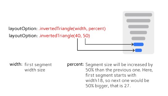
layoutOption:
It has three options to layout your view accordingly.
- invertedTriangle(CGFloat, Int)
- triangle(CGFloat, Int)
- straight(CGFloat)
struct ContentViewStraightSectionedView: View {
    @State var selectedProgress: Int = 2

    var body: some View {
          SSVerticalSegmentsSlider(
            selectedProgress: self.$selectedProgress,
            layoutOption: .straight(80))
    }
}


Other Properties:
These other properties will help you to configure this control based on your use case. We also would like to know about new use-cases or ideas from you that can fit in this control to fulfill your needs & others.


License
SSVerticalSegmentsSlider is released under the MIT license. See LICENSE for details.