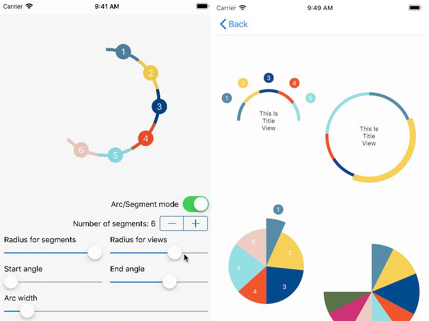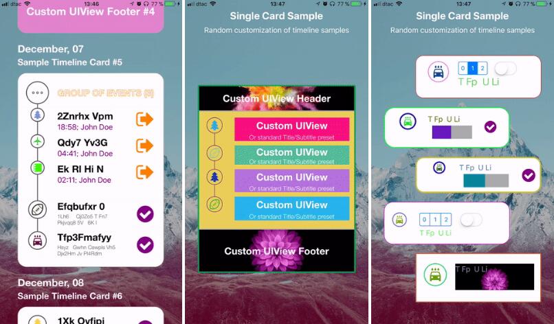
TimelineCards
Autogenerated timelines presented as cards,Single or bundled into feed
Installation
CocoaPods wtf is that?
- Add
pod 'TimelineCards'to yourPodfile; - Then run
pod updatein Terminal; - Re-open your project using
.xcworkspace, putimport TimelineCardsin the swift files you plan to create awesome cards from (or use bridging in Obj-C projects); - Rebuild and enjoy.
Old School Way
Drop folder with .swift source files to your project. Done.
Usage
TL;DR
Go to Demo project, it has a lot of things demonstrated! If you get confused with anything, you're welcome to continue reading.
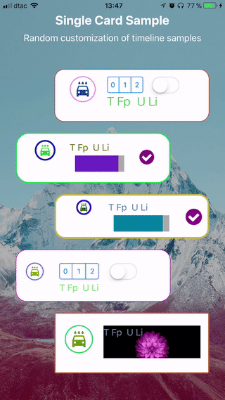
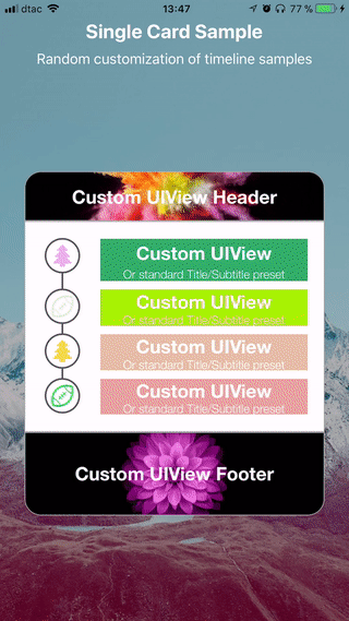
Single Card
Cards in TimelineCards kit are highly customizable views that present ordered set of data. They were designed to describe events or milestones, but nothing prevents you from using them for different purposes, given that every element can have unlimited complexity.
Cards support elements grouping, although current version doesn't support recursively nested groups (and probably never will).
Creation
If you want to present a single static timeline — TimelineCard object is just what you need. Let's create it:
// Let's say you want card to be 80% of its superview's width
let timelineWidth: CGFloat = view.bounds.width * 0.8

let demoCard = TimelineCard(width: timelineWidth)
demoCard.dataProvider = self
demoCard.eventsHandler = self
view.addSubview(demoCard) // Calls `reloadData()` implicitly

// Optionally
demoCard.reloadData()
Height of the card will be calculated automatically based on its data source, and available after reloadData() method execution, or after card is added to superview.
Customization
The creation code above is enough for a simple card with neutral (but nice) appearance to work. Nevertheless, card appearance can be customized in a number of ways. Here are some examples:
demoCard.backgroundColor = .white
demoCard.borderAppearance = (.orange, 2.0) // color and width
demoCard.cornerRadius = 20.0
demoCard.lineColor = .darkGray
demoCard.itemShapeHeight = 30.0 // basically diameter of milestone "circle" thing
demoCard.timelinePathWidth = 2.0 // width of drawn timeline itself
demoCard.margins = (20, 10, 20, 10) // css-like notation
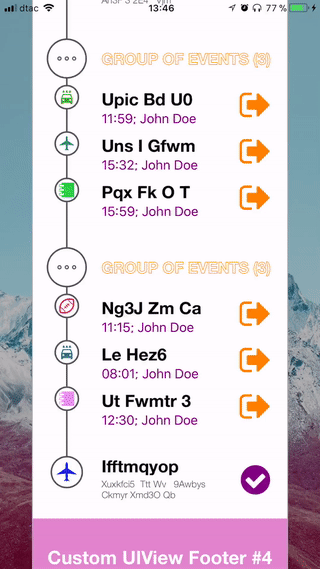
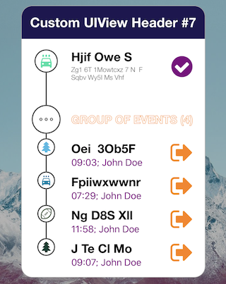
You can also set card header and footer to be any custom UIView you'd like. Card will update its layout accordingly.
let header = UIView(frame: CGRect(x: 0, y: 0, width: detailsCard.bounds.width, height: 60))
header.backgroundColor = .purple
demoCard.headerView = header

let footer = UIView(frame: CGRect(x: 0, y: 0, width: detailsCard.bounds.width, height: 100))
footer.backgroundColor = .purple
demoCard.footerView = footer
As soon as you make any of the above updates, card rebuilds itself automatically. It you want to rule this process manually (saves resources), just turn this feature off:
demoCard.autoreload = false
Data Source and Events Handling
First, make your data provider comply with TimelineCardDataProvider and TimelineCardEventsHandler protocols by adding them to corresponding class declaration.
Implementing TimelineCardDataProvider
Now, let's send some data to your card when it requests so. You do this by creating array consisting of TimelineItem and/or TimelineItemGroup objects, which are the main data units that you use in TimelineCards kit. They both comply with TimelineSourceElement protocol — type that you must return in result.
func elementsForTimelineCard(_ timelineCard: TimelineCard, containerWidth: CGFloat) -> [TimelineSourceElement] {
	var cardSource = [] as [TimelineSourceElement]

	for someData in myDataModel.objects {
		if someData.isGroup {
			var childTimelineItems = [TimelineItem]()
			for childData in someData.children {
				let timelineItem = TimelineItem(...)
				childTimelineItems.append(timelineItem)
			}

			let timelineItemGroup = TimelineItemGroup(...)
			cardSource.append(timelineItemGroup)
		} else {
			let timelineItem = TimelineItem(...)
			cardSource.append(timelineItem)
		}
	}

	return cardSource
}
Note: containerWidth gives you info about width of containers that your custom item description views will be added to. Anything beyound this width limit will be invisible.
There are two options of creating TimelineItem and TimelineItemGroup.
- Using simple preset with only Title and Subtitle to be shown for item. You can still affect their appearance because you send attributed strings as parameters:
let attrubitedTitle = NSAttributedString(string: "Event title", attributes: [.foregroundColor : UIColor.white])
let attrubitedSubTitle = NSAttributedString(string: "Event subtitle", attributes: [.foregroundColor : UIColor.white])

let simpleItemOne = TimelineItem(title: attrubitedTitle, subtitle: attrubitedSubTitle, icon: UIImage(named: "icon.png"))

let simpleItemTwo = TimelineItem(title: simpleItemOne, subtitle: attrubitedSubTitle, icon: UIImage(named: "icon.png"))

// And, if you want them to be part of the group
let groupItem = TimelineItemGroup(title: attrubitedTitle, subtitle: attrubitedSubTitle, items: [simpleItemOne, simpleItemTwo], icon: UIImage(named: "icon.png"))
- Using custom view of any height (but limited to
containerWidth) to describe item in the way you want:
let itemDescView = UIView(frame: CGRect(x: 0, y: 0, width: containerWidth, height: 65.0))
itemDescView.backgroundColor = .lightGray
// Customize it the way you want!

let simpleItemOne = TimelineItem.init(customView: itemDescView, icon: UIImage(named: "icon.png"))

let simpleItemTwo = TimelineItem.init(customView: itemDescView, icon: UIImage(named: "sub_icon.png"))

// And, if you want them to be part of the group
let groupItem = TimelineItemGroup(customView: itemDescView, items: [simpleItemOne, simpleItemTwo], icon: UIImage(named: "sub_icon.png"))
This way you build array of uniquely customized items for the card.
Implementing TimelineCardEventsHandler
This one is pretty straight-forward ans self-describing. You just use thise methods to handle events from cards:
func didSelectElement(at index: Int, in timelineCard: TimelineCard)

func didSelectSubElement(at index: (Int, Int), in timelineCard: TimelineCard)

func didTouchHeaderView(_ headerView: UIView, in timelineCard: TimelineCard)

func didTouchFooterView(_ footerView: UIView, in timelineCard: TimelineCard)
Feed of Cards
Cards Feed is represented by TimelineFeed view, which is basically a vertical scroll of TimelineCard objects. It uses UITableView internally to offer memory-efficient reusability, which makes it possible to build feed consisting of large amount of cards.
Creation
Initialize new TimelineFeed object and set its dataSource and delegate:
let timelineWidth: CGFloat = view.bounds.width * 0.8

let timelineFeed = TimelineFeed(frame: CGRect(x: 0, y: 0, width: view.bounds.width * 0.8, height: view.bounds.height))
timelineFeed.center = view.center

timelineFeed.dataSource = self
timelineFeed.delegate = self

// Optional customization options
timelineFeed.paddingBetweenCards = 20.0
timelineFeed.topMargin = 20.0
timelineFeed.bottomMargin = 20.0

view.addSubview(timelineFeed)
timelineFeed.reloadData()
Data Source and Events Handling
Make your data provider comply with TimelineFeedDataSource and TimelineFeedDelegate protocols by adding them to corresponding class declaration.
Implementing TimelineFeedDataSource
Start with method that tells feed how many cards you want it to present:
func numberOfCards(in timelineFeed: TimelineFeed) -> Int {
	return timelinesCollection.items.count
}
Now, let's initialize new card every time feed asks us to for given index:
func card(at index: Int, in timelineFeed: TimelineFeed) -> TimelineCard {
	let timelineCard = TimelineCard(width: timelineFeed.bounds.width)
	// Customize as you'd do with Single Card
	return timelineCard
}
Note: DO NOT set dataProvider or eventHandler for TimelineCard object here. TimelineFeed is responsible for this.
Good! Now, whenever particular card is about to be reused in feed, it will kindly ask you to provide data for it. This is very similar to what we did for a Single Card. Just create some TimelineSourceElements:
func elementsForTimelineCard(at index: Int, containerWidth: CGFloat) -> [TimelineSourceElement] {
	var elements = [] as [TimelineSourceElement]

	// Creating those `TimelineItem` and/or `TimelineItemGroup` objects..

	return elements
}
Ok, cards are set up and running smoothly, but you can also add headers on top of any card, so that we can keep track of this endless scrolling madness. As for many other features, you have two options here.
- Keep it simple and use attributed Title and Subtitle preset (or just Title if you want to keep it minimal):
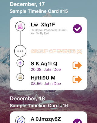
func titleAndSubtitle(at index: Int, in timelineFeed: TimelineFeed) -> (NSAttributedString, NSAttributedString?)? {

	let timelineData = timelinesCollection.items[index]

	let testTitle = NSAttributedString(string: "Timeline Card #\(index)", attributes: [.foregroundColor : UIColor.white, .font : UIFont(name: "HelveticaNeue-Bold", size: 23.0)])

	let testSubtitle = NSAttributedString(string: "Subtitle text", attributes: [.foregroundColor : UIColor.white])

	return (testTitle, testSubtitle)

	// Subtitle is optional
	//return (testTitle, nil)
}
- Use custom
UIView:
func headerViewForCard(at index: Int, in timelineFeed: TimelineFeed) -> UIView? {
	let customHeader = UIView(frame: CGRect(x: 0, y: 0, width: timelineFeed.bounds.width, height: 60.0))
	customHeader.backgroundColor = .purple
	return customHeader
}
Implementing TimelineFeedDelegate
Fairly simple and similar to event handling for a Single Card. The difference is that you get index of the card where event did occur.
func didSelectElement(at index: Int, timelineCardIndex: Int)

func didSelectSubElement(at index: (Int, Int), timelineCardIndex: Int)

func didTouchHeaderView(_ headerView: UIView, timelineCardIndex: Int)

func didTouchFooterView(_ footerView: UIView, timelineCardIndex: Int)
TODO
- [ ] Support for
.squareand.diamondmilestone shapes - [ ] Horizontal scrolling/paging
- [ ] Force-touch peek for embedded elements