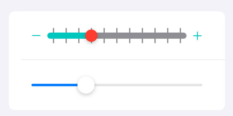
Custom SwiftUI sliders and tracks.
This package allows you to build highly customizable sliders and tracks for iOS, macOS and Mac Catalyst.
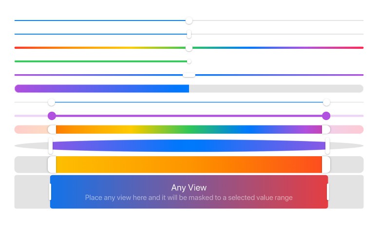
Features
- Build your own sliders and tracks using composition
- Highly customizable
- Horizontal and Vertical styles
- Range and XY values
- Different sizes for lower and upper range thumbs
How to use
Add this swift package to your project
[email protected]:SwiftUIExtensions/Sliders.git
Import and use
import Sliders
import SwiftUI

struct ContentView: View {
    @State var value = 0.5
    @State var range = 0.2...0.8
    @State var x = 0.5
    @State var y = 0.5

    var body: some View {
        Group {
            HSlider(value: $value)
            HRangeSlider(range: $range)
            XYSlider(x: $x, y: $y)
        }
    }
}
For more examples open /Examples/SlidersExamples.xcodeproj
Customizations
Use can use any SwiftUI view modifier to create custom tracks and thumbs.
Simple gradient value slider style
HSlider(value: $value, track:
    LinearGradient(gradient: Gradient(colors: [.red, .orange, .yellow, .green, .blue, .purple, .pink]), startPoint: .leading, endPoint: .trailing)
        .frame(height: 8)
        .cornerRadius(4)
)
Multivalue track
ZStack {
    HTrack(value: value1, view: Capsule().foregroundColor(.red)).opacity(0.5)
    HTrack(value: value2, view: Capsule().foregroundColor(.blue)).opacity(0.5)
    HTrack(value: value3, view: Capsule().foregroundColor(.green)).opacity(0.5)
}
.animation(.spring())
.frame(height: 8)
.background(Color.secondary.opacity(0.25))
Complex range slider style
HRangeSlider(range: $range, in: 0.0...1.0, step: 0.01,
    track:
        HRangeTrack(
            range: range,
            view: LinearGradient(gradient: Gradient(colors: [.yellow, .orange, .red]), startPoint: .leading, endPoint: .trailing),
            mask: Rectangle(),
            configuration: .init(
                offsets: 32
            )
        )
        .background(Color.secondary.opacity(0.25))
        .cornerRadius(16)
        .padding(.vertical, 8)
        .animation(.easeInOut(duration: 0.5)),
    lowerThumb:
        Capsule()
            .foregroundColor(.white),
    upperThumb:
        Capsule()
            .foregroundColor(.white),
    configuration: .init(
        thumbSize: CGSize(width: 32, height: 64),
        thumbInteractiveSize: CGSize(width: 44, height: 64)
    ),
    onEditingChanged: { print($0) }
)
.frame(height: 64)
Complex point slider style
XYSlider(x: $x, y: $y,
    track:
        RoundedRectangle(cornerRadius: 24)
            .foregroundColor(
                Color(hue: 0.67, saturation: y, brightness: 1.0)
            ),
    thumb:
        ZStack {
            Capsule().frame(width: 12).foregroundColor(.white)
            Capsule().frame(height: 12).foregroundColor(.white)
        }
        .compositingGroup()
        .rotationEffect(Angle(radians: x * 10))
        .shadow(radius: 3),
    configuration: .init(
        options: .interactiveTrack,
        thumbSize: CGSize(width: 48, height: 48)
    )
)
.frame(height: 256)
.shadow(radius: 3)
.padding()
SDKs
- iOS 13+
- Mac Catalyst 13.0+
- macOS 10.15+
- Xcode 11.0+
Roadmap
- Slider styles
- Circular sliders and tracks