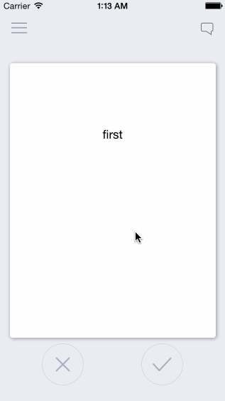
RKSwipeCards
This is for maximum customizability and / or learning purposes, not a pod or drop-in solution
The basics of a swipeable card interface inspired by Tinder and influenced by http://guti.in
This is meant to be taken and built off of, not as a simple drag and drop solution. New developers are often forced to use dependencies they don't understand and can't customize. This is the opposite. I've fully explained exactly how this works in detailed comments so that you can take it apart and customize it at will. For a pod/drag and drop solution, see https://github.com/modocache/MDCSwipeToChoose
Updates, Questions, and Requests
twitter <--- I am a very light twitterer, so I wont spam you
or Support
Relevant Article for deciding how to implement swipe cards into your app
https://medium.com/@cwRichardKim/adding-tinder-esque-cards-to-your-iphone-app-4047967303d1
On top of your current View Controllers

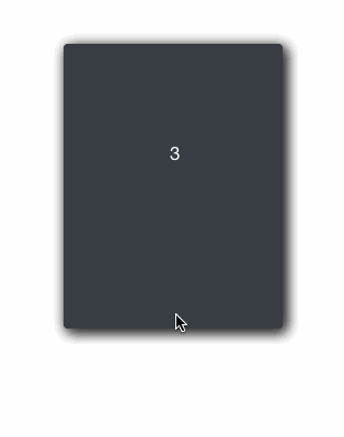
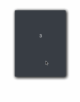
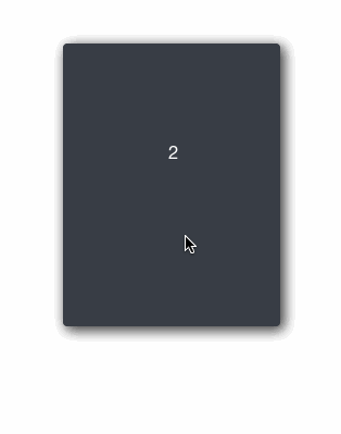
Features:
- Swipe cards left or right to call two separate actions
- Have multiple cards on screen depending on the number of items in an array
- Extremely simple, every component is explained
- Very easily customizeable
Customizeability Examples:
action margin (the distance from the middle required for an action to take place)

squeeze ratio (limit, strength)

rotation (strength, limit, angle)
+ More!
in DraggableView.h
- ACTION_MARGIN: distance from center where the action applies. Higher = swipe further in order for the action to be called
- SCALE_STRENGTH: how quickly the card shrinks. Higher = slower shrinking
- SCALE_MAX: upper bar for how much the card shrinks. Higher = shrinks less
- ROTATION_MAX: the maximum rotation allowed in radians. Higher = card can keep rotating longer
- ROTATION_STRENGTH: strength of rotation. Higher = weaker rotation
- ROTATION_ANGLE: Higher = stronger rotation angle
Each component is also explained thoroughly, so it is highly customizeable in many ways
How to use
files
- ViewController.h/m: example view controller (not necessary)
- DraggableViewBackground.h/m: UIView that holds the DraggableView. This can be put ontop of view controllers or you can set it as the main view of your view controller
- DraggableView.h/m: UIView of the draggable cards
- OverlayView.h/m: UIView of the X and √ images
Setup as View Controller (see ViewController.m)
DraggableViewBackground *draggableBackground = [[DraggableViewBackground alloc]initWithFrame:self.view.frame];
[self.view addSubview:draggableBackground];
Setup as UIView ontop of View Controller
CGRect frame = self.view.frame;
frame.origin.y = -self.view.frame.size.height; //optional: if you want the view to drop down
DraggableViewBackground *draggableBackground = [[DraggableViewBackground alloc]initWithFrame:frame];
draggableBackground.alpha = 0; //optional: if you want the view to fade in

[self.view addSubview:draggableBackground];

  //optional: animate down and in
[UIView animateWithDuration:0.5 animations:^{
    draggableBackground.center = self.view.center;
    draggableBackground.alpha = 1;
}];
Presenting Your Data
Loading Data
-
edit -(void)loadCards in DraggableViewBackground.m to dictate what information is loaded and how
-
"allCards" holds all the cards you want to show, "loadedCards" only shows the first few so that it doesn't load everything at once.
-
if card data is loaded after initWithFrame, then make sure the data is included in your custom data array (currently "exampleCardLabels") at the index: yourIndex and then write the code:
DraggableView* newCard = [self createDraggableViewWithDataAtIndex:yourIndex];
[allCards addObject:newCard];
whenever you need to.
-
I used exampleCardLabels as an example of how to load data, but feel free to change that
Presenting Data in View
- Customize the presentation of your data in -(DraggableView *)createDraggableViewWithDataAtIndex:(NSInteger)index in DraggableViewBackground.m (eg: make certain data appear on labels or photos in custom UIImageViews)
- to access any card directly, use [loadedCards objectAtIndex:yourIndex]; For example, the card that is currently visible is at [loadedCards firstObject];