SkyFloatingLabelTextField
SkyFloatingLabelTextField is a beautiful, flexible and customizable implementation of the space saving "Float Label Pattern". This design enables adding context to input fields that are visible at the time of typing, while minimizing the additional space used to display this additional context. This component is used in the Skyscanner TravelPro iOS application in several places, like when searching for flights.
On top of implementing the space-saving floating title, the component also supports using iconography, RTL text support (e.g. Arabic & Hebrew), various states (error, selected, highlighted states), and is very much customizable and extensible.
Versioning
Up until version 1.2 Swift 2.2 and 2.3 compatible (and there is a Swift 2.3 branch in case you need it).
From version 2.0 onwards only compatible with Swift 3.
Please be mindful of the version you're using.
Usage
To start using the component add it to your project using CocoaPods, Carthage or manually as per the Installation section.
The UI component can be used via the SkyFloatingLabelTextField class. To use icons on the right hand side, use the SkyFloatingLabelTextFieldWithIcon class. This control can be used very similar to UITextField - both from Interface Builder, or from code.
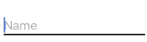
To create an instance of the class, use Interface builder, or do it from code. This example will create the following textbox with the placeholder and title:
let textField = SkyFloatingLabelTextField(frame: CGRectMake(10, 10, 200, 45))
textField.placeholder = "Name"
textField.title = "Your full name"
self.view.addSubview(textField)
Colors
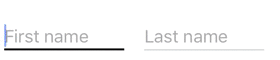
To customize the colors of the textfield, set a few properties - either from code, or from Interface builder. To use a textfield with an icon, utilize the SkyFloatingLabelTextFieldWithIcon class (and bundle the font class with your app). This example will change colors for the textfield on the right:
let lightGreyColor = UIColor(red: 197/255, green: 205/255, blue: 205/255, alpha: 1.0)
let darkGreyColor = UIColor(red: 52/255, green: 42/255, blue: 61/255, alpha: 1.0)
let overcastBlueColor = UIColor(red: 0, green: 187/255, blue: 204/255, alpha: 1.0)

let textField1 = SkyFloatingLabelTextField(frame: CGRectMake(10, 10, 120, 45))
textField1.placeholder = "First name"
textField1.title = "Given name"
self.view.addSubview(textField1)

let textField2 = SkyFloatingLabelTextField(frame: CGRectMake(150, 10, 120, 45))
textField2.placeholder = "Last name"
textField2.title = "Family name"

textField2.tintColor = overcastBlueColor // the color of the blinking cursor
textField2.textColor = darkGreyColor
textField2.lineColor = lightGreyColor
textField2.selectedTitleColor = overcastBlueColor
textField2.selectedLineColor = overcastBlueColor

textField2.lineHeight = 1.0 // bottom line height in points
textField2.selectedLineHeight = 2.0
self.view.addSubview(textField2)
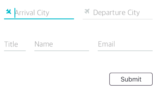
Icons and fonts
Use the SkyFloatingLabelTextFieldWithIcon field to display icons next to the textfields. You have the option of using a font or an image as the icon by setting the iconType property (Default = IconType.font). If using an image as icon, you will have to set the iconImage property. If using a font as icon, you will have to set the iconFont property and bundle your icon with your app (if it's not a built in one). Icons can be rotated and more precise positioning is also supported:
Using a font
let overcastBlueColor = UIColor(red: 0, green: 187/255, blue: 204/255, alpha: 1.0)
let textFieldFrame = CGRect(x: 150, y: 10, width: 120, height: 45)
let textField1 = SkyFloatingLabelTextFieldWithIcon(frame: textFieldFrame, iconType: .font)
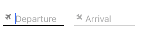
textField1.placeholder = "Departure"
textField1.title = "Flying from"
textField1.iconFont = UIFont(name: "FontAwesome", size: 15)
textField1.iconText = "\u{f072}" // plane icon as per https://fortawesome.github.io/Font-Awesome/cheatsheet/
self.view.addSubview(textField1)
let textField2 = SkyFloatingLabelTextFieldWithIcon(frame: textFieldFrame)
textField2.placeholder = "Arrival"
textField2.title = "Flying to"
textField2.tintColor = overcastBlueColor
textField2.selectedTitleColor = overcastBlueColor
textField2.selectedLineColor = overcastBlueColor
// Set icon properties
textField2.iconType = .font
textField2.iconColor = UIColor.lightGrayColor()
textField2.selectedIconColor = overcastBlueColor
textField2.iconFont = UIFont(name: "FontAwesome", size: 15)
textField2.iconText = "\u{f072}" // plane icon as per https://fortawesome.github.io/Font-Awesome/cheatsheet/
textField2.iconMarginBottom = 4.0 // more precise icon positioning. Usually needed to tweak on a per font basis.
textField2.iconRotationDegrees = 90 // rotate it 90 degrees
textField2.iconMarginLeft = 2.0
self.view.addSubview(textField2)
Using an image
let textFieldframe = CGRect(x: 150, y: 10, width: 120, height: 45)

let textField1 = SkyFloatingLabelTextFieldWithIcon(frame: textFieldframe, iconType: .image)
textField1.placeholder = "Departure"
textField1.title = "Flying from"
textField1.iconImage = UIImage(imageLiteralResourceName: "PlaneIcon")
self.view.addSubview(textField1)
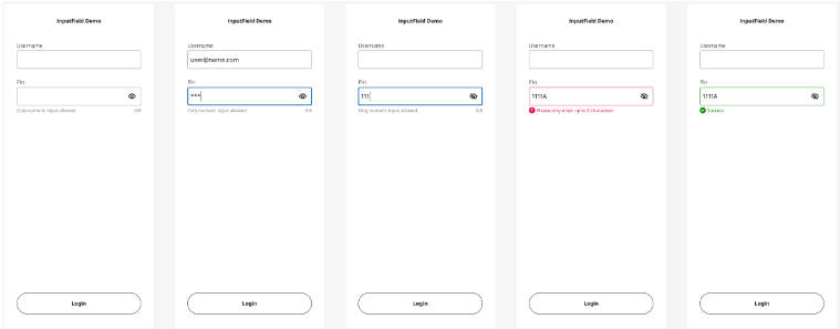
Error state and delegates
The textfield supports displaying an error state - this can be useful for example when validating fields on the fly. When the errorMessage property is set on the control, then the control is highlighted with the color set in the errorColor property.
To get notified of different events happening on the textfield - such as the text changing, editing starting or ending - just set the delegate property to a class implementing the standard UITextFieldDelegate protocol:
class MyViewController: UIViewController, UITextFieldDelegate {
override func viewDidLoad() {
super.viewDidLoad()
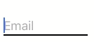
let textField1 = SkyFloatingLabelTextField(frame: CGRectMake(10, 10, 120, 45))
textField1.placeholder = "Email"
textField1.title = "Email address"
textField1.errorColor = UIColor.redColor()
textField1.delegate = self
self.view.addSubview(textField1)
}
/// Implementing a method on the UITextFieldDelegate protocol. This will notify us when something has changed on the textfield
func textField(textField: UITextField, shouldChangeCharactersInRange range: NSRange, replacementString string: String) -> Bool {
if let text = textField.text {
if let floatingLabelTextField = textField as? SkyFloatingLabelTextField {
if(text.characters.count < 3 || !text.containsString("@")) {
floatingLabelTextField.errorMessage = "Invalid email"
}
else {
// The error message will only disappear when we reset it to nil or empty string
floatingLabelTextField.errorMessage = ""
}
}
}
return true
}
}
Disabled state
The textfield also supports displaying a disabled state. When the isEnabled property is set on the control, then the control is highlighted with the color set in the disabledColor property.
    textField.disabledColor = disabledColor
    textField.isEnabled = false
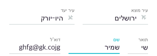
RTL language support
The component automatically detects the language writing direction. When the phone has a RTL language set (e.g. Arabic or Hebrew), then it automatically adjusts to support this style.
Alternatively, set the isLTRLanguage property to manually change the writing direction.
Further customizing the control by subclassing
The control was designed to allow further customization in subclasses. The control itself inherits from UITextField, so the standard overrides from there can all be used. A few other notable customization hooks via overriding are:
updateColors: override this method to customize colors whenever the state of the control changes- Layout overrides:
titleLabelRectForBounds(bounds:CGRect, editing:Bool): override to change the bounds of the top title placeholder viewtextRectForBounds(bounds: CGRect): override to change the bounds of the control (inherited fromUITextField)editingRectForBounds(bounds: CGRect): override to change the bounds of the control when editing / selected (inherited fromUITextField)placeholderRectForBounds(bounds: CGRect): override to change the bounds of the placeholder viewlineViewRectForBounds(bounds:CGRect, editing:Bool): override to change the bounds of the bottom line view
Documentation
See the SkyFloatingLabelTextField documentation on CocoaDocs.org for the full documentation.
Installation
CocoaPods
The control is available through CocoaPods. CocoaPods can be installed using Ruby gems:
$ gem install cocoapods
Then simply add SkyFloatingLabelTextField to your Podfile:
pod 'SkyFloatingLabelTextField', '~> 3.0'
Lastly, let CocoaPods fetch the latest version of the component by running:
$ pod update
Integrating into Objective C projects
When integrating the component into an Objective C project, in the Podfile add use_frameworks!. For example as shown in SkyFloatingLabelTextFieldObjectiveCExample:
use_frameworks!

target 'SkyFloatingLabelTextFieldObjectiveCExample' do
  pod 'SkyFloatingLabelTextField', '~> 3.0'
end
Then to use the component in your code, add the following line to your .h or .m files:
@import SkyFloatingLabelTextField;
Carthage
The component supports Carthage. Start by making sure you have the latest version of Carthage installed. Using Homebrew run this:
$ brew update
$ brew install carthage
Then add SkyFloatingLabelTextField to your Cartfile:
github "Skyscanner/SkyFloatingLabelTextField"
Finally, add the framework to the Xcode project of your App. Link the framework to your App and copy it to the App’s Frameworks directory via the “Build Phases” section.