CustomAlertView
CustomAlertView is a customizable and reusable alert view for SwiftUI applications. It allows you to easily display alerts with custom titles, messages, buttons, and images.


Features
- Customizable title, message, and buttons
- Option to add an image to the alert
- Easy to integrate with SwiftUI apps
- Fully customizable styling
- Support for primary and secondary buttons
Requirements
- iOS 13.0+ / macOS 10.0+ / tvOS 13.0+ / watchOS 6.0+
- Xcode 12.0+
- Swift 5.3+
Installation
Manual
- Download and unzip the source code.
- Drag and drop the “CustomAlertView.swift” file into your Xcode project
- Make sure that “Copy items if needed” and your project target are selected
- Click “Finish” to complete the installation
Usage
1. Add a `CustomAlertView` instance to your view hierarchy:
CustomAlertView(
title: "Success!",
message: "Your profile was updated successfully.",
primaryButtonLabel: "OK",
primaryButtonAction: {}
)
2. Customize the alert view by providing additional parameters:
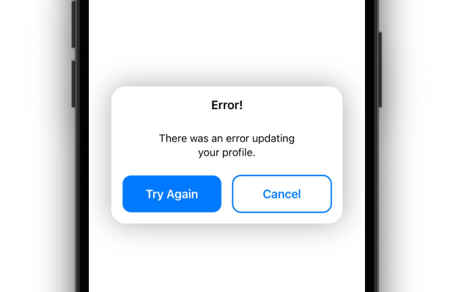
CustomAlertView(
title: "Error!",
message: "There was an error updating your profile.",
primaryButtonLabel: "Try Again",
primaryButtonAction: {},
secondaryButtonLabel: "Cancel",
secondaryButtonAction: {}
)
3. Present the alert view when necessary, for example, in response to a button tap event:
Button("Show Alert") {
self.showAlert = true
}
.alert(isPresented: self.$showAlert) {
CustomAlertView(
title: "Success!",
message: "Your profile was updated successfully.",
primaryButtonLabel: "OK",
primaryButtonAction: {}
)
}
Customization
The CustomAlertView can be customized in various ways:
- Title : A string that represents the alert view’s title. If nil, the image parameter will be used instead.
- Message: A string that represents the alert view’s message.
- Primary button label: A string that represents the primary button’s label text.
- Primary button action: A closure that represents the primary button’s action.
- Secondary button label: An optional string that represents the secondary button’s label text.
- Secondary button action: An optional closure that represents the secondary button’s action.
- Image: An optional Image instance that represents the alert view’s image.
- font: The font to use for the title and message
- titleColor: The color to use for the title text
- messageColor: The color to use for the message text
- primaryButtonColor: The color to use for the primary button background
- primaryButtonTextColor: The color to use for the primary button text
- secondaryButtonColor: The color to use for the secondary button background
- secondaryButtonTextColor: The color to use for the secondary button text
- blurStyle: The style of the background blur effect
Examples
The following examples demonstrate how to use the CustomAlertView in different scenarios:
CustomAlertView(
    title: "Success!",
    message: "Your profile was updated successfully.",
    primaryButtonLabel: "OK",
    primaryButtonAction: {}
)

CustomAlertView(
    title: "Error!",
    message: "There was an error updating your profile.",
    primaryButtonLabel: "Try Again",
    primaryButtonAction: {},
    secondaryButtonLabel: "Cancel",
    secondaryButtonAction: {}
)

CustomAlertView(
    title: "Confirmation",
    message: "Are you sure you want to delete this item?",
    primaryButtonLabel: "Yes",
    primaryButtonAction: {},
    secondaryButtonLabel: "No",
    secondaryButtonAction: {}
)

CustomAlertView(
    title: "Warning!",
    message: "You are about to perform a critical operation.",
    primaryButtonLabel: "Proceed",
    primaryButtonAction: {},
    secondaryButtonLabel: "Cancel",
    secondaryButtonAction: {}
)

CustomAlertView(
    message: "An error occurred.",
    primaryButtonLabel: "OK",
    primaryButtonAction: {},
    secondaryButtonLabel: nil,
    secondaryButtonAction: nil,
    image: Image(systemName: "exclamationmark.triangle")
)
or Check out the CustomAlertView_Previews file for examples of how to use CustomAlertView in your SwiftUI app.
Contact
If you have any questions or feedback, feel free to contact me at [email protected].