RadioGroup
A package to create generic radio group controls in SwiftUI using static member lookup.
Usage
Initializers are provided for Sequences of Identifiable elements
RadioPicker(items: numbers, selection: $selection) { item, isSelected in
    Text("Item: \(item.value)")
        .padding()
        .background(isSelected ? Color.blue : Color.gray)
        .cornerRadius(8)
}
and for Sequences with Elements where there is a Hashable KeyPath
RadioPicker(items: (1...5), id: \.self, selection: $selection) { item, isSelected in
    Text("Item: \(item.value)")
        .padding()
        .background(isSelected ? Color.blue : Color.gray)
        .cornerRadius(8)
}
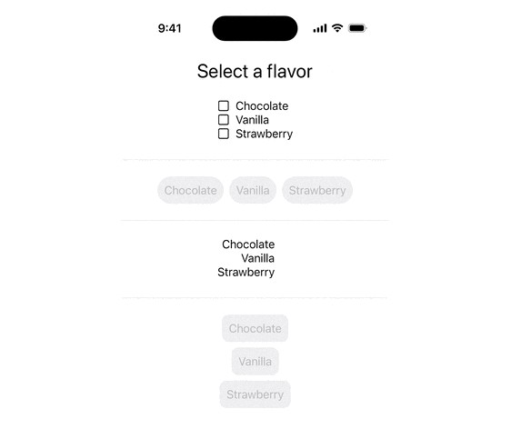
Initializers are also provided where the Elements are CustomStringConvertible or a String transform is provided. In these cases the styling for the items in the group will be provided by the .radioGroupStyle EnvironmentValue.
RadioGroup(flavors, id:\.self, selection: $selectedFlavor).radioGroupStyle(.roundedRect())
Custom styles
Create custom styles by extending the RadioGroupStyle protocol. Two example conformances are provided ButtonRadioGroupStyle and AccessoryImageRadioGroupStyle.
Preview