AlertToast-SwiftUI
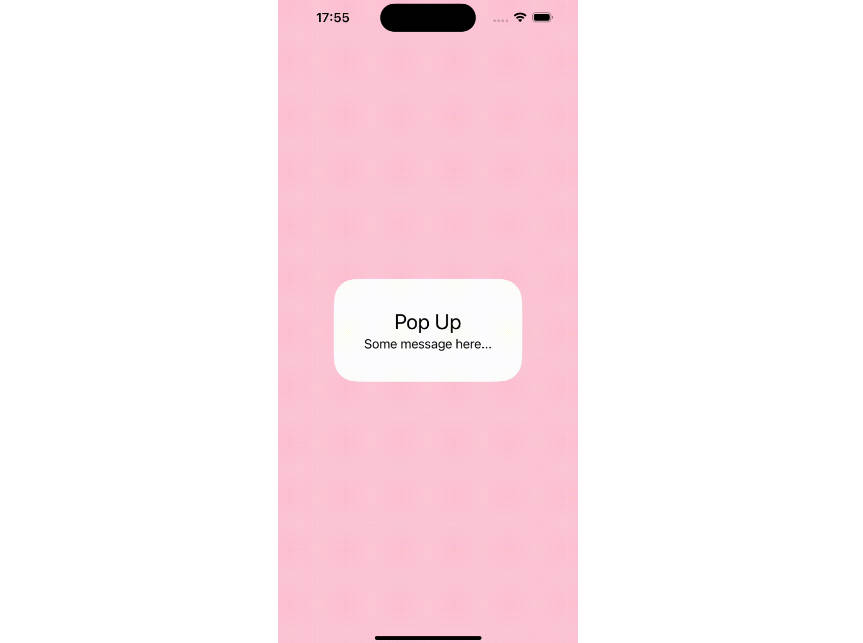
Popup like Apple Music & Feedback in AppStore.

- Built with pure SwiftUI.
Complete,ErrorSystemImage,Image,Loading, andRegular(Only Text).- Supports Light & Dark Mode.
- Works with any kind of view builder.
- Localization support.
- Supports font customization.
I tried to recreate Apple's alerts appearance and behavior as much as possible to be suitable for SwiftUI.
You can find these alerts in the AppStore after feedback and after you add a song to your library in Apple Music.
? Installation
Swift Package Manager
The Swift Package Manager is a tool for managing the distribution of Swift code. It’s integrated with the Swift build system to automate the process of downloading, compiling, and linking dependencies.
To integrate AlertToast into your Xcode project using Xcode 12, specify it in File > Swift Packages > Add Package Dependency...:
https://github.com/elai950/AlertToast.git
Manually
If you prefer not to use any of dependency managers, you can integrate AlertToast into your project manually. Put Sources/AlertToast folder in your Xcode project. Make sure to enable Copy items if needed and Create groups.
? Requirements
- iOS 13.0+ | macOS 11+
- Xcode 12.0+ | Swift 5+
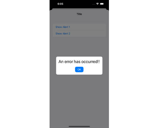
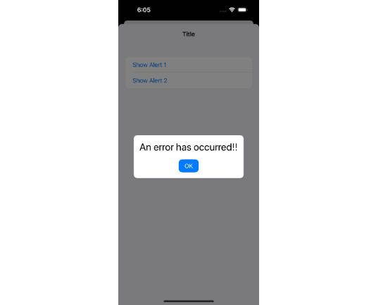
? Usage
The usage is very simple. Use the .presentAlert view modifier that expects returning AlertToast.
After 2 seconds the alert will be dismissed or by tapping on the alert view.
- Assign a state variable to
isPresentingparameter. - Default duration is 2. Set 0 to disable auto dismiss.
- Set
tapToDismisstofalseto disable dismiss by tap. - Return
AlertToastand fulfill the parameters you want.
Usage example with regular alert
import AlertToast
import SwiftUI

struct ContentView: View{

    @State private var showAlert = false

    var body: some View{
        VStack{

            Button("Show Alert"){
                 showAlert.toggle()
            }
        }
        .presentAlert(isPresenting: $showAlert){
            AlertToast(type: .regular, title: "Message Sent!")
        }
    }
}
Complete Modifier Example
.presentAlert(isPresenting: $showAlert, duration: 2, tapToDismiss: true, alert: {

   //AlertToast Goes Here

}, completion: { dismissed in
   //Completion block after dismiss (returns true)
})
Parameters
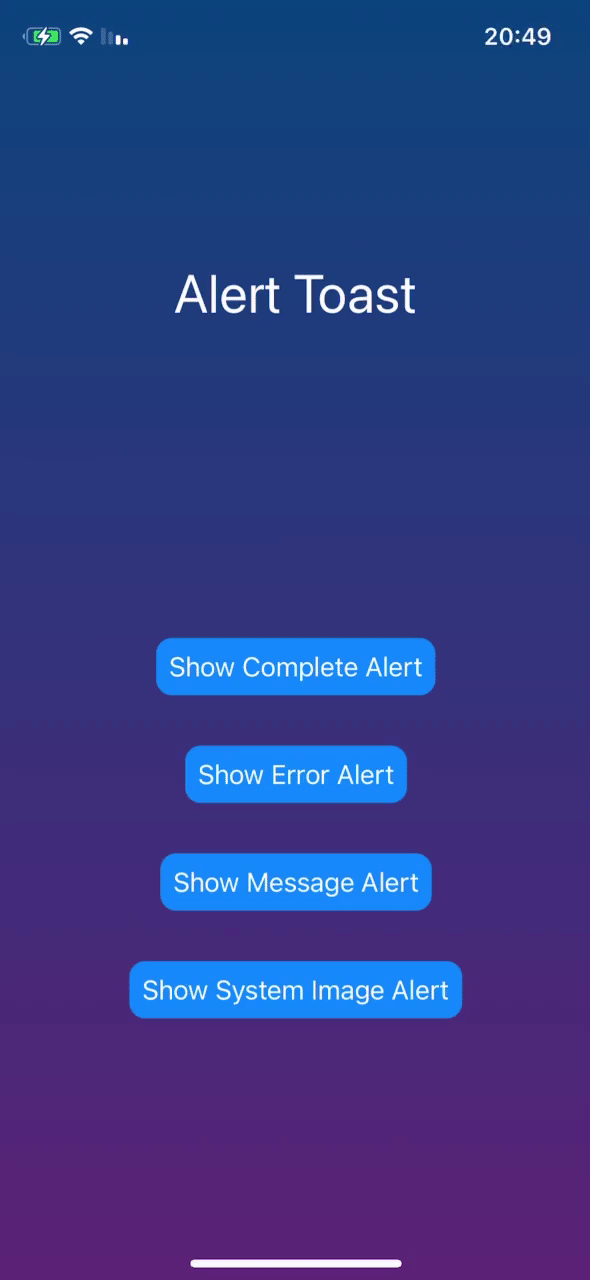
Available Alert Types:
- Regular: text only (Title and Subtitle).
- Complete: animated checkmark.
- Error: animated xmark.
- System Image: name image from
SFSymbols. - Image: name image from Assets.
- Loading: Activity Indicator (Spinner).
Alert dialog view modifier (with default settings):
.presentAlert(isPresenting: Binding<Bool>, duration: Double = 2, tapToDismiss: true, alert: { () -> AlertToast }, completion: { (Bool) -> () })
A full AlertToast implementation:
AlertToast(type: AlertType, title: Optional(String), subTitle: Optional(String), titleFont: Optional(Font), subTitleFont: Optional(Font), boldTitle: Optional(Bool))
Simple Text Alert:
AlertToast(type: .regular, title: Optional(String), subTitle: Optional(String))
Complete/Error Alert:
AlertToast(type: .complete(Color)/.error(Color), title: Optional(String), subTitle: Optional(String))
System Image Alert:
AlertToast(type: .systemImage(String, Color), title: Optional(String), subTitle: Optional(String))
Image Alert:
AlertToast(type: .image(String), title: Optional(String), subTitle: Optional(String))
Loading Alert:
AlertToast(type: .loading, title: Optional(String), subTitle: Optional(String))
You can add many .presentAlert on a single view.