VideoPlayerContainer
VideoPlayerContainer is a video player component with SwiftUI. Compared with the system built-in one VideoPlayer, the VideoPlayerContainer provides much more flexible and extendable abilities that are able to cover most of the common scenarios that you can see on the app such as Tik Tok or Youtube.
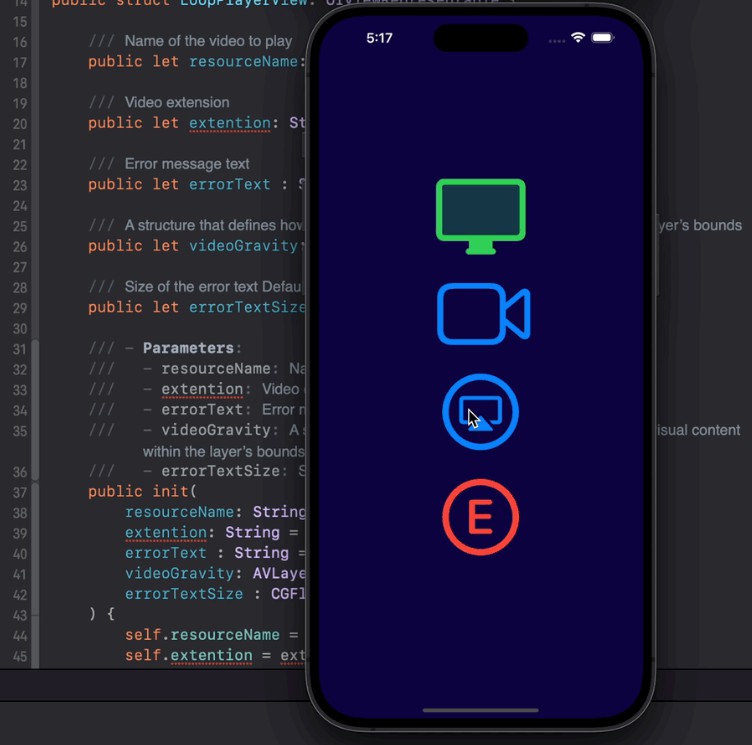
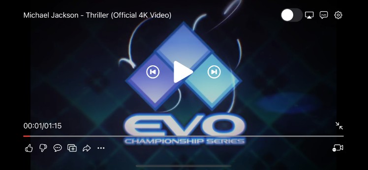
Showcase


Example

After cloning the repo and opening up the Xcode project, you can see multiple schemes as examples. Run it respectively to feel what abilities this framework can offer and how easy to use this framework to meet your demands.
Installation
VideoPlayerContainer supports multiple methods for installing the library in a project.
Installation with CocoaPods
To integrate VideoPlayerContainer into your Xcode project using CocoaPods, specify it in your Podfile:
pod 'VideoPlayerContainer', :git => 'https://github.com/MickeyHub/VideoPlayerContainer.git'
Installation with Swift Package Manager
Once you have your Swift package set up, adding VideoPlayerContainer as a dependency is as easy as adding it to the dependencies value of your Package.swift.
dependencies: [
    .package(url: "https://github.com/MickeyHub/VideoPlayerContainer.git", .upToNextMajor(from: "1.0.0"))
]
Requirements
Since I used some of the new features like custom Layout, the current version is required a minimum iOS version of 16.0, and macOS version of 13.0. But I’m considering lowering the minimum version support to iOS 14.0 and macOS 12.4
Core Concept
Context
Context is the core component and fully accessible from all of the other components in the VideoPlayerContainer, it holds a service locator which we can use to fetch other services to borrow expertise from other components.
Widget
Widget is a View that’s inside the VideoPlayerContainer which means it can access the context and in most cases, it has a specific service to handle all of its logic code.
Service
Service represents two roles, one role is a ViewModel in MVVM architecture, ViewModel handles all of the Output and Input for View. Another role is responsible for communication with other services. We encourage people to write Service and Widget in one source file. This way, we can use fileprivate, and private to distinguish which APIs are used only for its Widget and which APIs are open to other services.
Overlay
Overlay In the VideoPlayerContainer, overlays are the sub-containers put inside the main container layer by layer and it’s the place where widgets sit. We have 5 built-in overlays, from bottom to top, these are render, feature, plugin, control, and toast. In addition, we allow users to insert their own overlay

Render Overlay
Render overlay is sitting at the far bottom of the container. It provides playback service and gesture services.
- Use
context[RenderService.self]to fetchRenderServiceor usecontext[GestureService.self]to fetch theGestureServicerespectively in your customWidget. - With RenderService, access the player instance which is an
AVPlayer. - Set up the gravity of the render canvas.
- With
GestureService, observe predefined events liketap,double-tap,long-press,drag.rotation,hover, andpinch. - For
tap,double-tap, you can know if the touch is located on the left part or right part of the screen. - For
drag, you can know if the dragging event is done horizontally or vertically(left/right).
Feature Overlay
Feature overlay is used to pop up a panel from 4 directions (left, right, top, bottom). We provide two styles as well: cover or squeeze. With squeeze style, when the popup panel shows up, the render canvas will be squeezed to the other side, like Youtube’s comments Panel in fullscreen mode.
Plugin Overlay
Plugin Overlay is a sub-container without constraints on it. When you want to show up a widget that’s not suitable for other overlays and you don’t want to insert your own custom overlay, that’s the right place for you, like a thumbnail preview widget for the seek bar on dragging or a simple widget that’s visible only in a short time after being triggered.
Control Overlay
Control overlay is the most sophisticated overlay and the place where most work will be done. The control overlay is divided into 5 parts: left, right, top, bottom, and center. Before going on, please allow me introduce a concept called status:
We predefined 3 statuses as the screen style, with halfscreen, fullscreen, and portrait. The status changes are 100% decided by you. But generally, halfscreen describes the status of the portrait device. fullscreen describes the landscape device and portrait describes the video the height is higher than the width.
For these 5 parts, you can configure them for different statuses which is quite common. For example, in halfscreen status, the screen is small and we can’t attach many widgets to it but in fullscreen status. The video player container makes up the whole screen. We can attach many widgets to it to provide more and more functions.
For these parts, for these statuses, you can customize their shadow, transition, and layout. and other services can fetch the ControlService by context[ControlService.self] to call present or dismiss programmatically depending on the display style configured.

Toast Overlay
Toast Overlay is a simple overlay that you can use to pop up view on the left side which will be disappeared after a few seconds configured.
Usage: Add VideoPlayer
Let’s say, we are going to code a player view in a video scene, here. We need to import VideoPlayerContainer, and create a Context for the Video Player or the whole video scene.
import VideoPlayerContainer

struct ContentView: View {

    @StateObject var context = Context()

    var body: some View {
    }
}
Now, you need to create the PlayerView to make it visible on the scene. here, we use the Type PlayerWidget. It’s the main container and requires a context instance to initialize it.
var body: some View {
    PlayerWidget(context)
}
The VideoPlayerContainer is now attached to the scene. But you can’t see it cuz we never do any configuration work and also don’t pass the video resource item to play. Let’s do some more work ( specify the frame and play a video)
var body: some View {
    PlayerWidget(context)
        .frame(height: 300)
        .onAppear {

            /// play video
            let item = AVPlayerItem(url: Bundle.main.url(forResource: "demo", withExtension: "mp4")!)
            context[RenderService.self].player.replaceCurrentItem(with: item)
            context[RenderService.self].player.play()
        }
}
Run it, and the video will be playing. Now, as you can see in other apps. We want to attach some widgets to it, like a PlaybackButton in the center.
Usage: Write Widgets
As I said above, we need to write a PlaybackButton and attach it to the center of the Player View. First of all, we need to create a SwiftUI source file named PlaybackButtonWidget and write a basic UI
struct PlaybackButtonWidget: View {
    var body: some View {
    	Image(systemName: "play.fill")
            .resizable()
            .scaledToFit()
            .foregroundColor(.white)
            .frame(width: 50, height: 50)
            .disabled(!service.clickable)
            .onTapGesture {
                /// tap handler
            }
    }
}
This is a view showing a Play icon. Now, we need to attach it to the Player View.
var body: some View {
    PlayerWidget(context)
        .frame(height: 300)
        .onAppear {

            /// add widgets to the center for halfscreen status
            let controlService = context[ControlService.self]
            controlService.configure(.halfScreen(center)) {[
                PlaybackButtonWidget()
            ]}

            /// play video
            let item = AVPlayerItem(url: Bundle.main.url(forResource: "demo", withExtension: "mp4")!)
            context[RenderService.self].player.replaceCurrentItem(with: item)
            context[RenderService.self].player.play()
        }
}
Now, you can see an icon in the center, and by default, then you can tap the screen to make it visible or invisible. However, you can see that we don’t fill in the logic code to make the icon work (play and pause). How?
When we created the player view and passed in the context instance, the context instance will be put in the environment. Thus, all of the widgets inside the video player container will have access to the context. Instead of accessing context directly on the Widget, we prefer using Service as the ViewModel to handle all the functions of the Widget.
class PlaybackService: Service {

    private var rateObservation: NSKeyValueObservation?

    private var statusObservation: NSKeyValueObservation?

    @ViewState fileprivate var playOrPaused = false

    @ViewState fileprivate var clickable = false

    required init(_ context: Context) {
        super.init(context)

        let service = context[RenderService.self]
        rateObservation = service.player.observe(\.rate, options: [.old, .new, .initial]) { [weak self] player, change in
            self?.playOrPaused = player.rate > 0
        }

        statusObservation = service.player.observe(\.status, options: [.old, .new, .initial]) { [weak self] player, change in
            self?.clickable = player.status == .readyToPlay
        }
    }

    fileprivate func didClick() {

        let service = context[RenderService.self]
        if service.player.rate == 0 {
            service.player.play()
        } else {
            service.player.pause()
        }
    }
}

struct PlaybackWidget: View {
    var body: some View {
        WithService(PlaybackService.self) { service in
            Image(systemName: service.playOrPaused ? "pause.fill" : "play.fill")
                .resizable()
                .scaledToFit()
                .foregroundColor(.white)
                .frame(width: 50, height: 50)
                .disabled(!service.clickable)
                .onTapGesture {
                    service.didClick()
                }
        }
    }
}
As you can see above, it’s a completed Widget.
- We use
fileprivatemodifier to mark APIs that’s only available for its belonging Widget - We use
@ViewStateto mark the variable that’s able to trigger the SwiftUI update mechanism (like @Published, @State) - We use
WithServiceas the Widget’s root View to make sure any@ViewStatevariable changes will make the whole Widget involved in the update mechanism - We use
@ViewStatevariable to condition which image to use in the Widget. (ViewModel’s Output) - We call service method to complete the widget’s work (ViewModel’s Input)
Idea / Bug / Improvement
Feel free to report issues and let’s improve it together ?
License
VideoPlayerContainer is released under the MIT license. See LICENSE for details.