FeaturesKit

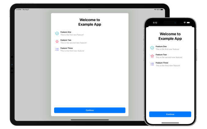
FeaturesKit provides developers for Apple platforms with the ability to display a list of configured features in their apps. This is built using SwiftUI so can be displayed natively from a SwiftUI app or using a UIHostingController in a UIKit app, and has been designed to mimic the style of built-in Apple screens.
This has been localised into multiple languages and the buttons will automatically adapt to your appʼs accent color.
Requirements
- iOS/iPadOS 15.0+
- macOS 13.0+
- tvOS 15.0+
- watchOS 8.0+
- Xcode 12.0+
Integration
Swift Package Manager
FeaturesKit can be added to your app via Swift Package Manager in Xcode. Add to your project like so:
dependencies: [
    .package(url: "https://github.com/adamfootdev/FeaturesKit.git", from: "1.0.0")
]
Usage
To start using the framework, you’ll need to import it first:
import FeaturesKit
FKItem
This is a struct containing details relating to items that appear on the feature list screen. It can be created as follows:
let item = FKItem(title: "New Feature", description: "This is a cool new feature!", systemImage: "checkmark.circle", imageTint: .green)
The systemImage value is optional and will be hidden if a value is not provided. The imageTint value is also optional and will default to the accent color if not provided.
FeaturesView
The features view allows you to display a list of features that are available in your app with a custom title at the top. Create an instance of the view using the following:
FeaturesView("What's New in Example App", items: [item]) {
    print("Continue button tapped")
}
There is also the ability to hide the continue button, set a custom title for the continue button and provide a custom action for the continue button.